SVG滤镜的投影被截断了。

3

我正在尝试为以下SVG形状制作投影:

<svg style="overflow:visible; ">
<defs>
    <marker orient="auto" refY="4" refX="2" markerHeight="13" markerWidth="13" id="_x0000_s1094end">
        <path style="fill:yellow; " d="M2,2 L2,6 L6,4 L2,2" />
    </marker>
</defs>
<path d="M 288,164 L 108,176" style="stroke-width:8; stroke:yellow; marker-end:url(#_x0000_s1094end); " y="4" x="4"/>
</svg>

enter image description here

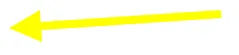
添加阴影后,形状应该如下所示(忽略箭头和其阴影以外的内容):

enter image description here

我尝试了以下SVG:

<svg style="overflow:visible; ">
<defs>
    <marker orient="auto" refY="4" refX="2" markerHeight="13" markerWidth="13" id="_x0000_s1094end">
        <path style="fill:yellow; " d="M2,2 L2,6 L6,4 L2,2" />
    </marker>
    <filter id="f1" x="0" y="0" width="500%" height="500%">
        <feOffset result="offOut" in="SourceAlpha" dx="-8" dy="-8" />
        <feBlend in="SourceGraphic" in2="offOut" mode="normal" />
    </filter>
</defs>
<path d="M 288,164 L 108,176" style="stroke-width:8; stroke:yellow; marker-end:url(#_x0000_s1094end); " y="4" x="4" filter="url(#f1)"/>
</svg>

http://fiddle.jshell.net/md3rT/
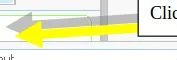
我得到的结果是这样的:

enter image description here

生成的SVG被截断了。

还有,如何改变阴影的不透明度?

提前感谢!

2个回答

5
为了停止截断,只需使过滤器覆盖形状(阴影在上方和左侧,因此过滤器需要覆盖该区域)。
    <filter id="f1" x="-180%" y="-500%" width="500%" height="1000%">
        <feOffset result="offOut" in="SourceAlpha" dx="-8" dy="-8" />
        <feBlend in="SourceGraphic" in2="offOut" mode="normal" />
    </filter>

如果您希望阴影不是不透明的,可以尝试使用非不透明的渲染来实现。对于一般的投影效果,您需要类似以下内容的代码…

<feGaussianBlur in="alpha-channel-of-feDropShadow-in" stdDeviation="stdDeviation-of-feDropShadow"/> 
  <feOffset dx="dx-of-feDropShadow" dy="dy-of-feDropShadow" result="offsetblur"/> 
  <feFlood flood-color="flood-color-of-feDropShadow" flood-opacity="flood-opacity-of-feDropShadow"/> 
  <feComposite in2="offsetblur" operator="in"/> 
  <feMerge> 
    <feMergeNode/>
    <feMergeNode in="in-of-feDropShadow"/> 
  </feMerge>

虽然在Firefox和Chrome中,你可以使用SVG过滤器效果 <feDropShadow> 过滤器或CSS的drop-shadow过滤器代替。


谢谢您的建议,截断问题已经解决。然而使用洪水过滤器并没有起作用。洪水过滤器将整个过滤区域(即x="-180%" y="-500%" width="500%" height="1000%")填充了指定的颜色。 - Surender Thakran
1
请查看 http://jsfiddle.net/2DpBz/,以获取使用后者模板的投影效果的实际示例。 - Erik Dahlström
1
Surender - 这个可以工作 - 请确保您已经用实际值替换了Robert的所有占位符(即“alpha-channel-of-feDropShadow-in”需要替换为“SourceAlpha”。 - Michael Mullany

2
这是我认为你正在寻找的内容。它扩展了过滤器区域,使投影保持不模糊,并将阴影的不透明度调低至50%。(我还发现如果不为内联SVG提供明确的尺寸,浏览器可能会出问题。)
<svg x="0px" y="0px" width="500px" height="300px" style="overflow:visible;" viewBox="0 0 500 300">
    <defs>
        <marker orient="auto" refY="4" refX="2" markerHeight="13" markerWidth="13" id="_x0000_s1094end">
            <path style="fill:yellow; " d="M2,2 L2,6 L6,4 L2,2" />
        </marker>
        <filter id="f1" x="-50%" y="-100%" width="200%" height="400%">
            <feOffset result="offOut" in="SourceAlpha" dx="-8" dy="-8" />
            <feComponentTransfer>
                <feFuncA type="discrete" tableValues="0 .5"/>
            </feComponentTransfer>
            <feComposite operator="over" in="SourceGraphic"/>
        </filter>
    </defs>
    <path d="M 288,164 L 108,176" style="stroke-width:8; stroke:yellow; marker-end:url(#_x0000_s1094end); " y="4" x="4" filter="url(#f1)"/>

</svg>

网页内容由stack overflow 提供, 点击上面的
可以查看英文原文,
原文链接