在同一水平线上从顶部显示两个div

3

这是我的代码

.floating-box {
  display: inline-block;
  width: 150px;
  margin: 10px;
  border: 3px solid #73AD21;
}

.after-box {
  border: 3px solid red;
}
<h2>The New Way - using inline-block</h2>

<div class="floating-box">Floating box</div>
<div class="floating-box">
  <pre>
    testing
    testing
    testing
    testing
    testing
    testing
    testing
    </div>
    <div class="floating-box">Floating box</div>
    <div class="floating-box">Floating box</div>
    <div class="floating-box">Floating box</div>
    <div class="floating-box">Floating box</div>
    <div class="floating-box">Floating box</div>
    <div class="floating-box">Floating box</div>
    
    <div class="after-box">Another box, after the floating boxes...</div>

我希望能够拥有这样的视图:

enter image description here

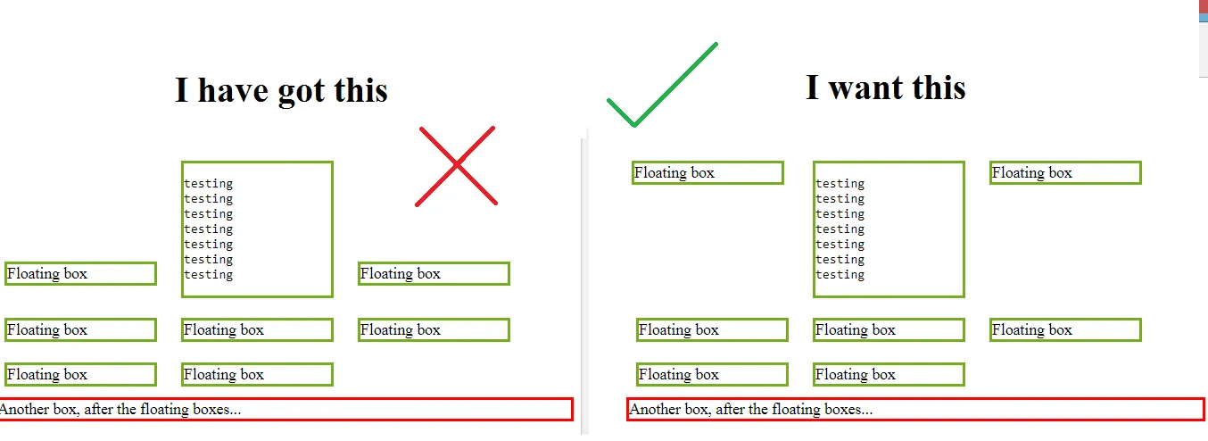
有没有什么方法可以做到这一点?如果有,怎么实现呢?

3个回答

2

在CSS的 .floating-box 类中添加 vertical-align: top; 属性即可。新的CSS将会是:

.floating-box {
  display: inline-block;
  width: 150px;
  margin: 10px;
  border: 3px solid #73AD21;
  vertical-align: top;
}

0

使用display:inline-tablevertical-align:top来定义.floating-box类。 因此,新的CSS将是-

.floating-box {
  display: inline-table;
  width: 150px;
  margin: 10px;
  border: 3px solid #73AD21;
  vertical-align: top;
}

或者,您也可以仅使用float: left而不是display:inline-tablevertical-align:top来完成。但是,为此,您需要指定一个高度(例如,height: 150px),这将导致很多空白空间。


0

Flexbox 是你的好朋友。我不知道你想要多灵活或流畅,但它应该足够接近。

特别注意 calc() 函数。它会处理你设置的边框厚度和边距。

*{box-sizing: border-box;}

.flex {
  display: flex;
  align-items: flex-start;
  flex-wrap: wrap;
  justify-content: flex-start;
}

.flex > div {
  flex-grow: 1;
  width: calc(33% - 6px - 20px);
  max-width: calc(33% - 6px - 20px);
}

.floating-box {
  margin: 10px;
  border: 3px solid #73AD21;
}

.after-box {
  border: 3px solid red;
}
<h2>The New Way - using inline-block</h2>

<div class="flex">
  <div class="floating-box">Floating box</div>
  <div class="floating-box">
    <pre>
testing
testing
testing
testing
testing
testing
testing
</div>
<div class="floating-box">Floating box</div>


</div>

<div class="after-box">Another box, after the floating boxes...</div>


网页内容由stack overflow 提供, 点击上面的
可以查看英文原文,
原文链接