我想仅使用CSS将HTML元素定位于水平中间和垂直黄金比例。元素的高度必须是绝对灵活的,因此我不能仅将
示意图如下: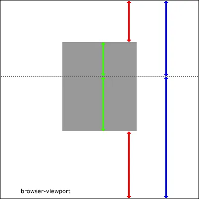 在该图像中,相同颜色的箭头之间的比率为黄金比(38.2%:61.8%)。虚线仅为想象。
top属性和元素高度设置为百分比值。有没有办法做到这一点?示意图如下:
在该图像中,相同颜色的箭头之间的比率为黄金比(38.2%:61.8%)。虚线仅为想象。我相信数学计算如下(仅讨论垂直居中):
查看Fiddle(感谢Daniel制作)
CSS
div {
    position: absolute; /* or fixed */
    top: 23.6%; /* height is 100% of viewport * 38.2% (blue)  * 61.8% (red) */
    bottom: 38.2%; /* height is 100% of viewport * 61.8% (blue) * 61.8% (red) */
}
这应该可以使您的绿色比例正确。高度可以根据视口大小灵活调整。
编辑:更多解释。请注意,蓝色箭头最初将高度的100%分为38.2和61.8,红色顶部箭头将是顶部蓝色部分(38.2)的61.8,因此为23.6。底部红色箭头将成为底部蓝色部分(61.8)的61.8,因此为38.2。现在进行双重检查:23.6 + 38.2 = 61.8(即两个红色箭头的总距离)。因此,它们的比率为23.6/61.8 = 38.2%,38.2/61.8 = 61.8%(红色箭头符合您的黄金比例)。绿色为100-61.8(红色箭头总计)= 38.2(总绿色面积)。顶部绿色箭头为38.2(顶部蓝色)-23.6(顶部红色)=14.6。底部绿区为61.8(底部蓝色)-38.2(底部红色)=23.6(底部绿色)。让我们检查一下绿色配比:14.6 / 38.2 = 38.2%,23.6 / 38.2 = 61.8%(绿色箭头符合您的黄金比例)。这是您图片的黄金比例爱好者HTML / CSS版本(我知道您的图片是用于说明目的,但这很有趣):
HTML
<div class="golden"></div>
<div class="dotted"></div>
<div class="blue top arrow"></div>
<div class="blue bottom arrow"></div>
<div class="red top arrow"></div>
<div class="red bottom arrow"></div>
<div class="green top arrow"></div>
<div class="green bottom arrow"></div>
CSS
html {
    background-color: #000;
    width: 100%;
    height: 100%;
}

body {
    background-color: #fff;
    width: 38.2%;
    height: 100%;
    margin: 0 30.9%;
    position: relative;
}

.golden {
    position: absolute;
    top: 23.6%;
    bottom: 38.2%;
    width: 38.2%;
    background-color: #ddd;
    left: 50%;
    margin-left: -19.1%;
}

.dotted {
    position: absolute;
    top: 38.2%;
    height: 0;
    width: 100%;
    border-top: 1px dotted #444;
}

.blue {
    position: absolute;
    right: 14.6%;
    width: 2px;
    background-color: #00f;
}

.blue.top {
    height: 38.2%;
    top: 0;
}

.blue.bottom {
    height: 61.8%;
    bottom: 0;
}

.red {
    position: absolute;
    right: 38.2%;
    width: 2px;
    background-color: #f00;
}

.red.top {
    height: 23.6%;
    top: 0;
}

.red.bottom {
    height: 38.2%;
    bottom: 0;
}

.green {
    position: absolute;
    right: 50%;
    width: 2px;
    background-color: #83f92c;
    border-color: #83f92c;
}

.green.top {
    height: 14.6%;
    top: 23.6%;
}

.green.bottom {
    height: 23.6%;
    bottom: 38.2%;
}

.arrow:before,
.arrow:after {
    content: '';
    position: absolute;
    display: block;
    left: 0;
    width: 0;
    height: 0;
    margin-left: -6px;
    border-right:  7px solid transparent;
    border-left:   7px solid transparent;
}

.arrow:before {top: 0;}
.arrow:after {bottom: 0;}

.blue:before {border-bottom: 10px solid #00f;}
.red:before  {border-bottom: 10px solid #f00;}
.green:before {border-bottom: 10px solid #83f92c;}

.blue:after {border-top: 10px solid #00f;}
.red:after  {border-top: 10px solid #f00;}
.green:after {border-top: 10px solid #83f92c;}
编辑 11-10-11: 根据提问者的评论,我第一次的解释是不正确的。我提供这个事实,我的解决方案仍然可以工作,假设白色区域是控制高度的内容容器(如果对任何人有用的话)。在这种情况下,执行以下操作:
HTML
<div class="content">
    ...place some arbitrary length content here...
    [copy above HTML here]
</div>
CSS--首先,删除上面的html和body CSS。然后添加:
.content {
    position: relative;
   /* this is the only vital point, you can also style it
      similar to the body css in the first version above, minus the height */
}
终于在八年后找到了答案 :D
这是因为新的CSS技术 :)
请查看我的CodePen: https://codepen.io/eHtmlu/pen/ExjZrQb
或者在stackoverflow上查看相同的实例:
/***********************************/
/* Here is where the magic happens */
.container {
  display: flex; /* we need the flex technique */
  flex-direction: column; /* and we need it vertically */
  align-items: center; /* horizontally we just center the box */
}

.container::before {
  content: " ";
  flex-grow: .38196601; /* This is the magic number that places the box vertically in the golden ratio */
}
/* That's it!! */
/* except you want to place it relatively to the viewport - see below, where we position the container element */
/***********************************/


/* To place the container at the golden ratio of the viewport, we need to set the height of "html" and "body" to 100% and margin to 0. Then we use the same technique as we used for the box. */
html,
body {
  height: 100%;
  margin: 0;
}

body {
  display: flex;
  flex-direction: column;
  align-items: center;
}

body::before {
  content: " ";
  flex-grow: .38196601;
}


/* The rest are just a few environmental and styling settings */

.container {
  border: #000 solid 1px;
  height: 20em;
  width: 30em;
  margin: 0 auto;
}

.box {
  width: 10em;
  padding: 1em;
  border-radius: .5em;
  box-shadow: 0 0 1em rgba(0, 0, 0, .5);
  text-align: center;
}<div class="container">
<div class="box">This box is located vertically in the golden ratio of the container element.</div>
</div>好的,我已经测试过了,它似乎可以工作。不过,这个技巧需要两个
inner 和 dummy 的内容完全相同。dummy 用于给 outer div 高度,以便 inner div 可以按该高度的百分比定位。这有点儿瑕疵但没有使用 JavaScript。
<div class="outer">
    <div class="inner">
        Something<br>too<br>more<br>more<br>more<br>more
    </div>
    <div class="dummy">
        Something<br>too<br>more<br>more<br>more<br>more
    </div>
</div>
.outer{
    position: absolute;
    top: 38.2%;
}

.inner{
    width: 200px;
    background-color: blue;
    position: absolute;
    top: -38.2%;
}

.dummy{
    width: 200px;
   visibility: hidden;
}
margin-top: 38.2%;将你的内容定位在距离顶部38.2%的位置。我认为不可能根据元素的高度来减少边距以使其在虚线上方定位。CSS中没有类似于38.2% - (this.height*0.382)的东西。也许LessCSS可以通过其变量实现更多功能,但是你也可以使用JS,这当然不是纯CSS的解决方案。对于水平定位,你可以在body上简单地使用text-align: center;,并将其设置回左侧以适应内容。可能需要为内容设置display: inline-block;。 - Smamatti