我使用了弹性盒子属性来让我的部分看起来像这样:
如何让这在所有浏览器上都能正常工作?

在Chrome上运行良好,但我注意到在Firefox和Safari上有一些差异。
这是Chrome的外观:
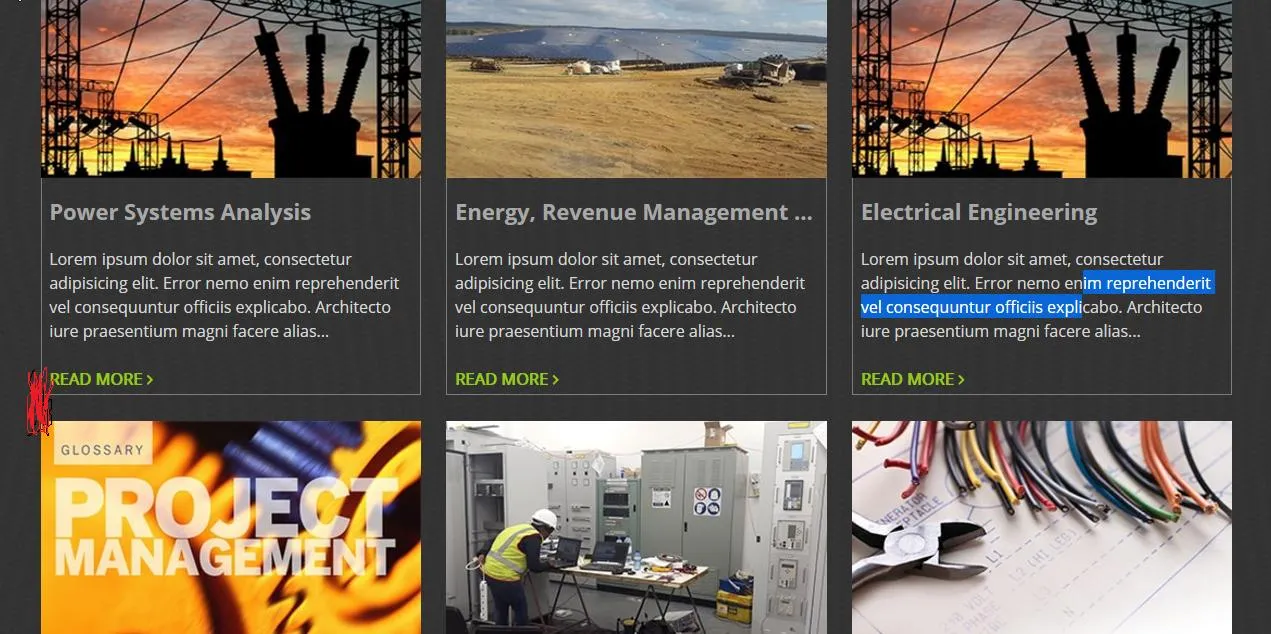
但在Firefox上,我无法像我想要的那样应用1%的边距,如红色信号所示:


    <section id="services">

        // here goes the title of the container

        <div class="main-container col-lg">

               // here go all the box

         <div class="services-container">

               // this one of the boxes
         </div>
        </div>
    </section>
并且 CSS:
#services {
    background-image: url("img/Services-background.jpg");
    background-color: red;
}
.col-lg {
    display: flex;
    flex-wrap: wrap;
    justify-content: center;
    margin: initial;
    max-width: 100%;
}
.services-container {
    color: #d6d6d6;
    margin: 1%;
    max-width: 100%;
    width: 30%;
}
如何让这在所有浏览器上都能正常工作?