CSS绝对定位内容区不会增长

4

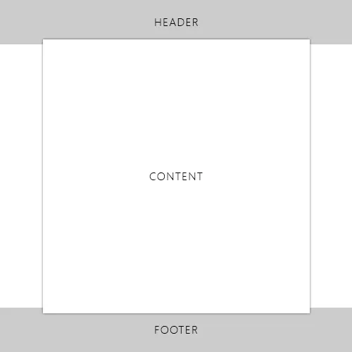
我正在尝试创建一个设计的HTML页面。但有一个问题困扰着我。 CSS和HTML结构如下图所示。 我希望页脚在页面底部,当内容区域增长时,应将页脚推到下方。但如果没有内容,则内容区域应保持到页脚。 实际上,内容区域覆盖了标题栏和页脚区域。 我不知道我是否将其结构化正确。

enter image description here

    <html xmlns="http://www.w3.org/1999/xhtml">
    <head>
<style>
html, body { height:100%;}
body {
    background: #EBEBEB;
    margin: 0px;
    padding: 0px;
}
#wrapper {
    width:100%;
    height:100%;
    margin: 0 auto;
    position:relative;
}
#header {
    width:100%;
    height:147px;
    background:#999;
    border-bottom:solid 5px #ddd;
    position:absolute;
}
#footer {
    bottom:0;
    width:100%;
    height:170px;
    position:absolute;
    background-color:#ccc;
    border-top:solid 5px #ddd;
}
#contentArea {
    width:300px;
    max-height:100%;
    position:absolute;
    z-index:999;
    left:0;
    right:0;
    top:0;
    bottom:0;
    margin-left:auto;
    margin-right:auto;
    margin-top:120px;
    margin-bottom:100px;
    background:#FFF;
    border:solid 1px red;
}
</style
</head>

<body>

<div id="wrapper">
    <div id="header">Header</div>
    <div id="footer">footer</div>
    <div id="contentArea">
        Lorem Ipsum is simply dummy text of the printing and typesetting industry. Lorem Ipsum has been the industry's standard dummy text ever since the 1500s, when an unknown printer took a galley of type and scrambled it to make a type specimen book. It has survived not only five centuries, but also the leap into electronic typesetting, remaining essentially unchanged. It was popularised in the 1960s with the release of Letraset sheets containing Lorem Ipsum passages, and more recently with desktop publishing software like Aldus PageMaker including versions of Lorem Ipsum.  Lorem Ipsum is simply dummy text of the printing and typesetting industry. Lorem Ipsum has been the industry's standard dummy text ever since the 1500s, when an unknown printer took a galley of type and scrambled it to make a type specimen book. It has survived not only five centuries, but also the leap into electronic typesetting, remaining essentially unchanged. It was popularised in the 1960s with the release of Letraset sheets containing Lorem Ipsum passages, and more recently with desktop publishing software like Aldus PageMaker including versions of Lorem Ipsum. 
    </div>
</div>

</body></html>

你可以在这里检查代码。


我可以问一下,为什么您在HTML的结构中先放置头部和底部,再放置内容吗? - andyw_
5个回答

1
你可以使用margin来实现!
另外一个建议是:在主要部分中使用position:relative;
<html>
  <head>
    <style>
    *{
        font-family:"Trebuchet MS", Helvetica, sans-serif;
        text-align:center;
    }
    #header,#footer{
        position:relative;
        height:150px;
        background:#ccc;
        border:solid 1px #bbb;
    }
    #footer{
        bottom:0;
    }
    #body{
        position:relative;
        margin-top:-50px;
        margin-bottom:-50px;
        min-height:250px;
        background:#aaa;
        width:70%;
        margin-right:auto;
        margin-left:auto;
        padding:50px 15px;
        box-shadow:0px 0px 10px 1px #aaa;
        border:solid 1px #999;
        opacity:0.92;
        z-index:999;
    }
    </style>
  </head>
  <body>
    <div id='header'>
        HEADER
    </div>
    <div id='body'>
        BODY
    </div>
    <div id='footer'>
        FOOTER
    </div>
  </body>
</html>

http://jsfiddle.net/mostafaznv/2zfjc/


0
你的边距有几个问题:
#contentArea {
    margin-top:152px;
    margin-bottom:175px;
}

如果你计算一下,头部高度是147像素,外边框再加5像素。底部高度是170像素,外边框再加5像素。由于你正在使用绝对定位,所有设置都是相对于最近的已定位父元素——即包装器来设置的。

0

可能是这样的:

<html xmlns="http://www.w3.org/1999/xhtml">
    <head>
        <style>
            html, body {
                height: 100%;
                width: 100%;    
                margin: 0;
                padding: 0; }
            .header {
                height: 140px;
                width: 100%;
                background: #999;
                border-bottom: solid 5px #ddd; }
            .content {
                height: calc(100% - 280px);
                width: 100%;
                background: #EBEBEB; }
            .content-fixed {
                position: fixed;
                height: auto;
                width: 300px;
                top: 90px;
                left: calc(50% - 150px);
                border: 1px solid red;
                background-color: #FFF;
            }
            .footer {
                height: 140px;
                width: 100%;
                background-color: #ccc;
                border-top: solid 5px #ddd; }        
        </style>
    </head>
    <body>
        <div class="header"></div>
        <div class="content"></div>
        <div class="content-fixed">
            Lorem Ipsum is simply dummy text of the printing and typesetting industry. Lorem Ipsum has been the industry's standard dummy text ever since the 1500s, when an unknown printer took a galley of type and scrambled it to make a type specimen book. It has survived not only five centuries, but also the leap into electronic typesetting, remaining essentially unchanged. It was popularised in the 1960s with the release of Letraset sheets containing Lorem Ipsum passages, and more recently with desktop publishing software like Aldus PageMaker including versions of Lorem Ipsum. Lorem Ipsum is simply dummy text of the printing and typesetting industry. Lorem Ipsum has been the industry's standard dummy text ever since the 1500s, when an unknown printer took a galley of type and scrambled it to make a type specimen book. It has survived not only five centuries, but also the leap into electronic typesetting, remaining essentially unchanged. It was popularised in the 1960s with the release of Letraset sheets containing Lorem Ipsum passages, and more recently with desktop publishing software like Aldus PageMaker including versions of Lorem Ipsum.
        </div>
        <div class="footer"></div>
    </body>
</html>

http://jsfiddle.net/LOLKFC/vMz5s/


0
我在容器底部添加了一个新的div,并将其设置为绝对定位,并添加了一个新的CSS。
关于新的CSS:
html, body { height:100%;}
body {
    background: #EBEBEB;
    margin: 0px;
    padding: 0px;
}
#wrapper {
    width:100%;
    height:100%;
    /*margin: 0 auto; when you make the width 100% the margin auto is useless */
    position:relative;
}
#header, #footer {
    width:100%;
    height:147px;
    background:#999;
    border-bottom:solid 5px #ddd;
}
#contentArea {
    margin: -30px auto;
width: 300px;
background: #FFF;
border: solid 1px red;
position: relative;
}
#contentArea .containerFooter{
    width: 300px;
height: 0px;
position: absolute;
bottom: 0;
left: 0;
background: #fff;
}

对于新的HTML:

<div id="wrapper">
    <div id="header"></div>
    <div id="contentArea">
        Lorem Ipsum is simply dummy text of the printing and typesetting industry. Lorem Ipsum has been the industry's standard dummy text ever since the 1500s, when an unknown printer took a galley of type and scrambled it to make a type specimen book. It has survived not only five centuries, but also the leap into electronic typesetting, remaining essentially unchanged. It was popularised in the 1960s with the release of Letraset sheets containing Lorem Ipsum passages, and more recently with desktop publishing software like Aldus PageMaker including versions of Lorem Ipsum.  Lorem Ipsum is simply dummy text of the printing and typesetting industry. Lorem Ipsum has been the industry's standard dummy text ever since the 1500s, when an unknown printer took a galley of type and scrambled it to make a type specimen book. It has survived not only five centuries, but also the leap into electronic typesetting, remaining essentially unchanged. It was popularised in the 1960s with the release of Letraset sheets containing Lorem Ipsum passages, and more recently with desktop publishing software like Aldus PageMaker including versions of Lorem Ipsum. 
        <div class="containerFooter"></div></div>
    <div id="footer"></div>
</div>

看看我的更新http://jsfiddle.net/CDeLe/62/


0

好的,

这里是我想要的正确代码。

    html, body { height:100%;}
body { height:100%; margin: 0px;}
#wrap {
    width:100%;
    height:100%;
    margin: 0 auto;
}
#header {
    width:100%;
    height:50px;
    background:blue;
}
#footer {
    width:100%;
    height:50px;
    background:green;
    position:relative;
    margin-top:-30px;
}
#content {
    background:#ebebeb;
    width:450px;
    height: 100%;
    display:table;
    margin:auto;
    padding:10px;
    position:relative;
    z-index:20;
    top:-15px;
    box-shadow: 0px 0px 3px #666;
}

HTML

<div id="wrap">
<div id="header">header</div>
<div id="content">Lorem Ipsum is simply dummy text of the printing and typesetting industry. Lorem Ipsum has been the industry's standard dummy text ever since the 1500s, when an unknown printer took a galley of type and scrambled it to make a type specimen book. </div>
    <div id="footer">footer</div>
</div>

http://jsfiddle.net/angel3m/h6YYa/


网页内容由stack overflow 提供, 点击上面的
可以查看英文原文,
原文链接