有人要求在plot_ly图表中添加动态数量的曲线。 这是基于最近已删除的问题。希望下面的答案能够帮助其他遇到类似情况的人。
2个回答
2
一种方法是通过 selectInput 选择所有可能包含在时间序列中的变量。然后绘制那些旁边有复选框的变量。完整代码。
library(shiny)
library(shinydashboard)
library(DT)
library(plotly)
library(gapminder)
library(tidyr)
dfa <- gapminder[,c(1,3,4)]
df <- dfa %>% pivot_wider(names_from = country, values_from = lifeExp)
cols <- colnames(df)[-1]
ui <- dashboardPage(
dashboardHeader(),
dashboardSidebar(
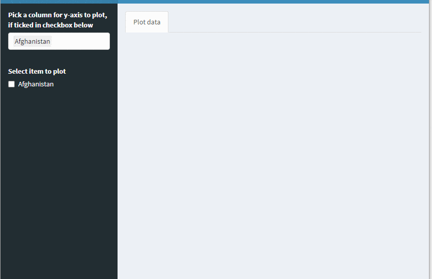
selectInput("col","Pick a column for y-axis to plot, if ticked in checkbox below", choices = cols, selected = cols[1], multiple = TRUE),
checkboxGroupInput("chk", "Display Plot", choices = cols[1])
),
dashboardBody(
tabsetPanel(id="tabs",
tabPanel("Plot data" , plotlyOutput("tseries"))
))
)
server <- function(input, output, session) {
observeEvent(input$col, {
updateCheckboxGroupInput(session, "chk","Select item to plot", choices = input$col)
})
output$tseries <- renderPlotly({
if (is.null(input$chk)) { ### nothing selected to plot
fig <- NULL
}else {
n <- length(input$chk)
lapply(1:n, function(i) {
if (i==1){ ### one item plot
fig <<- plot_ly(df, type = 'scatter', mode = 'lines') %>%
add_trace(x = ~year, y = ~.data[[input$chk[1]]], showlegend = F)
}else { ### additional items to plot
fig <<- fig %>% add_trace(x = ~year, y = ~.data[[input$chk[i]]], showlegend = F)
}
})
}
fig
})
}
shinyApp(ui, server)
- YBS
2
如上所述,这是我早期回答此处的重复内容。
然而,@YBS的方法过于复杂,我想提供一种直接比较的可能性。在ggplot或plotly中使用长格式的data.frame是首选方法(例如使用data.table::melt从宽格式转换为长格式)。这样我们就可以使用plot_ly的split、name或color参数基于数据创建多个轨迹:
library(shiny)
library(shinydashboard)
library(plotly)
library(gapminder)

DF <- gapminder[, c(1, 3, 4)]

ui <- dashboardPage(
  dashboardHeader(),
  dashboardSidebar(
    selectizeInput(
      "col",
      "Pick a column for y-axis to plot, if ticked in checkbox below",
      choices = NULL,
      selected = NULL,
      multiple = TRUE
    ),
    checkboxGroupInput("chk", "Display Plot", choices = DF$country[1])
  ),
  dashboardBody(tabsetPanel(id = "tabs",
                            tabPanel(
                              "Plot data" , plotlyOutput("tseries")
                            )))
)

server <- function(input, output, session) {
  freezeReactiveValue(input, "col")

  # server-side selectize for improved performance
  updateSelectizeInput(
    session,
    "col",
    choices = DF$country,
    selected = DF$country[1],
    server = TRUE
  )

  observeEvent(input$col, {
    updateCheckboxGroupInput(
      session,
      "chk",
      "Select item to plot",
      choices = input$col,
      selected = input$col
    )
  })

  output$tseries <- renderPlotly({
    if (is.null(input$chk)) {
      plotly_empty(type = 'scatter', mode = 'lines')
    } else {
      plot_ly(
        DF[DF$country %in% input$chk, ],
        type = 'scatter',
        mode = 'lines',
        x = ~ year,
        y = ~ lifeExp,
        split = ~ country
      )
    }
  })
}

shinyApp(ui, server)
- ismirsehregal
1
1我认为这确实是一个更加优雅的答案。另外,你之前的答案也可以改进一下。 - YBS
网页内容由stack overflow 提供, 点击上面的可以查看英文原文,
原文链接
原文链接