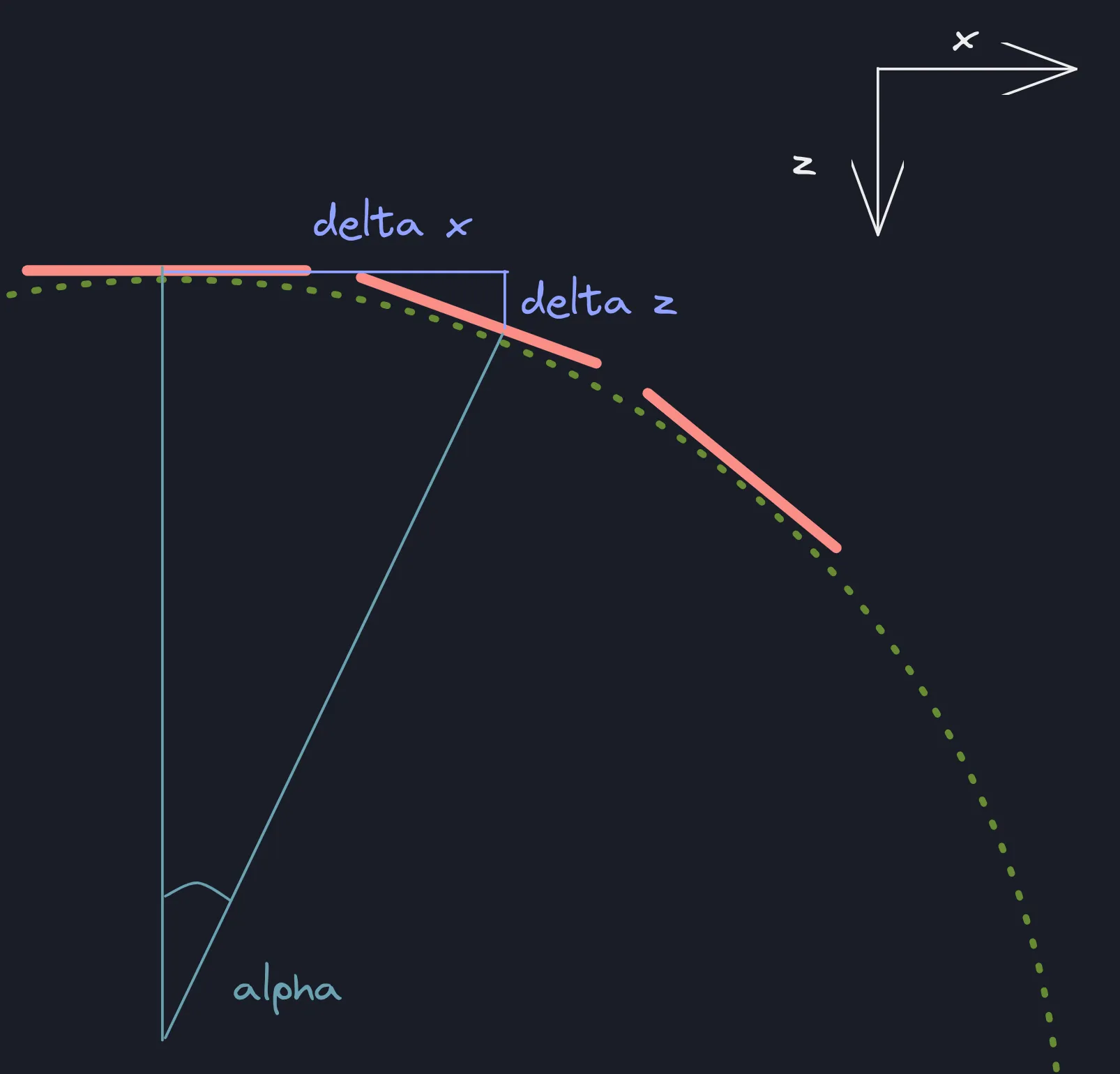
如何在ReactJS中使用CSS实现这种曲线效果?

3

我需要制作一个轮播,看起来像这样我需要的轮播

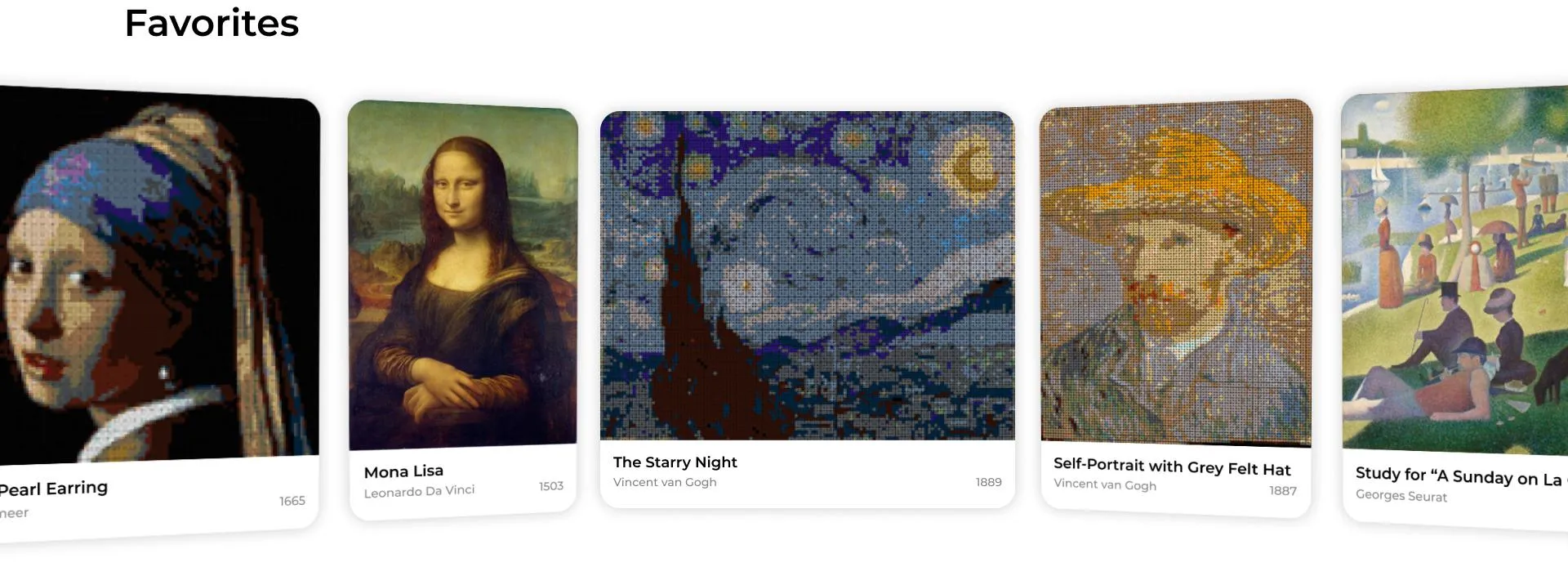
我已经使用ReactJS和CSS做了类似的事情到目前为止我已经能够制作的轮播

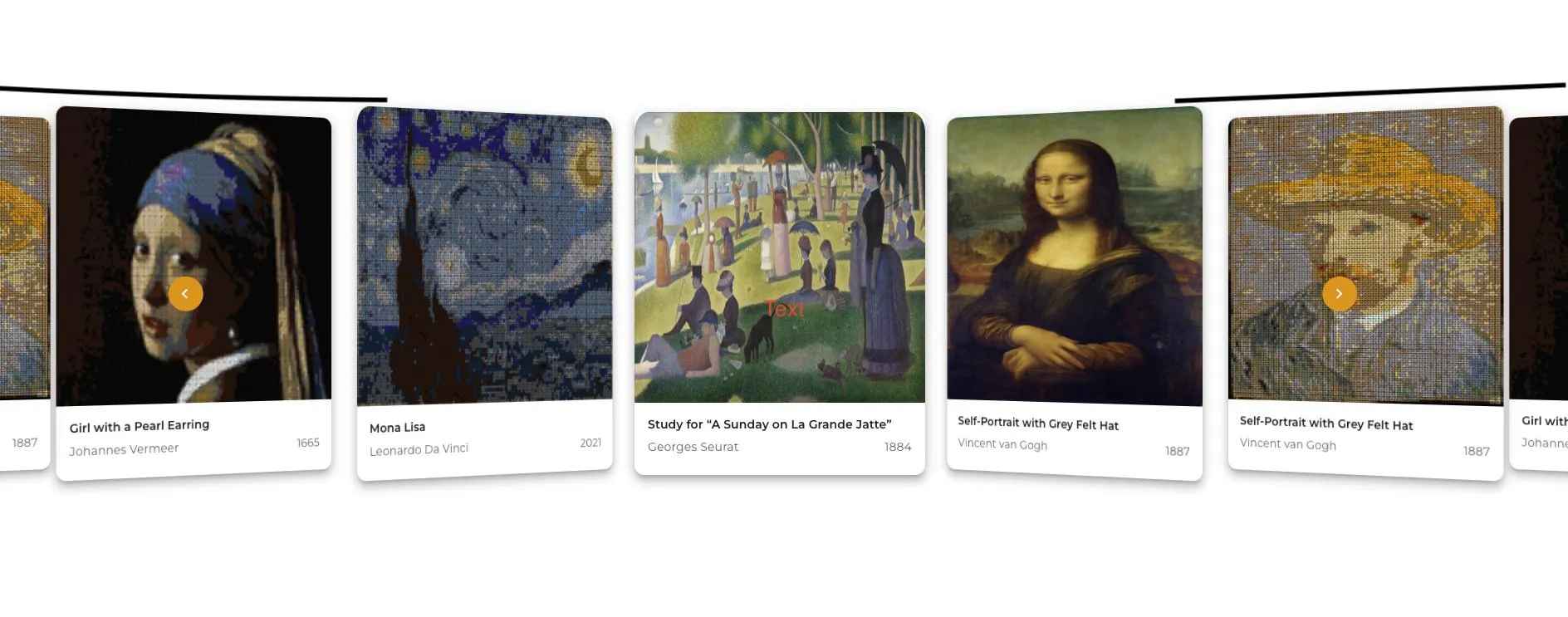
但是我还没有能够得到完全一样的曲线效果。这是我正在制作的轮播的代码。

Carousel.js

import React, { useState } from "react";
import Slide from "../CarouselSlide/Slide";
import styles from "./Carousel.module.css";

const Carousel = ({ slides }) => {
  const [slideIndex, setSlideIndex] = useState(0);

  const handlePrevSlide = () => {
    setSlideIndex((prev) => (prev === 0 ? slides.length - 1 : prev - 1));
  };

  const handleNextSlide = () => {
    setSlideIndex((prev) => (prev + 1) % slides.length);
  };

  return (
    <section className={`${styles.slidesWrapper} w-full`}>
      <div className={styles.slides}>
        <button
          className={`${styles.prevSlideBtn} cursor-pointer`}
          onClick={handlePrevSlide}
        >
          <svg
            width="113"
            height="122"
            viewBox="0 0 113 122"
            fill="none"
            xmlns="http://www.w3.org/2000/svg"
          >
            <g filter="url(#filter0_d_429_1959)">
              <circle cx="51.8531" cy="60.8531" r="20.8531" fill="#F49B00" />
              <path
                d="M53.998 56.2952L49.4501 60.8531L53.998 65.411L52.5979 66.8111L46.6399 60.8531L52.5979 54.8951L53.998 56.2952Z"
                fill="white"
              />
            </g>
          </svg>
        </button>

        {[...slides, ...slides, ...slides].map((slide, i) => {
          let offset = slides.length + (slideIndex - i);

          if (typeof slide === "string") {
            return (
              <Slide
                image={slide.image}
                title={slide.title}
                author={slide.author}
                year={slide.year}
                offset={offset}
                key={i}
              />
            );
          } else {
            return (
              <Slide
                image={slide.image}
                title={slide.title}
                author={slide.author}
                year={slide.year}
                offset={offset}
                key={i}
              />
            );
          }
        })}
        <button
          className={`${styles.nextSlideBtn} cursor-pointer`}
          onClick={handleNextSlide}
        >
          <svg
            width="122"
            height="122"
            viewBox="0 0 122 122"
            fill="none"
            xmlns="http://www.w3.org/2000/svg"
          >
            <g filter="url(#filter0_d_429_1955)">
              <circle cx="61.147" cy="60.8531" r="20.8531" fill="#F49B00" />
              <path
                d="M57.0161 65.411L61.5641 60.8531L57.0161 56.2952L58.4162 54.8951L64.3743 60.8531L58.4162 66.8111L57.0161 65.411Z"
                fill="white"
              />
            </g>
          </svg>
        </button>
      </div>
    </section>
  );
};

export default Carousel;

Carousel.module.css

.slidesWrapper {
  @apply min-h-[630px] flex items-center justify-center overflow-hidden;
}

.slidesWrapper *,
.slidesWrapper *::before,
.slidesWrapper *::after {
  @apply relative;
}

.slides {
  @apply grid;
}

.prevSlideBtn,
.nextSlideBtn {
  @apply appearance-none absolute z-[5]  self-center;
}

.prevSlideBtn {
  @apply -left-[37rem];
}

.nextSlideBtn {
  @apply -right-[35rem];
}

幻灯片代码 Slide.js

import { useRef, useEffect } from "react";
import CardContent from "@mui/material/CardContent";
import Typography from "@mui/material/Typography";
import CardMedia from "@mui/material/CardMedia";
import Card from "@mui/material/Card";
import styles from "./Slide.module.css";

const Slide = ({ image, title, author, year, offset }) => {
  return (
    <div
      className={styles.slide}
      style={{
        "--offset": offset,
        "--dir": offset === 0 ? 0 : offset > 0 ? 0.8 : -0.8,
      }}
    >
      <div className={styles.slideContent}>
        <Card sx={{ boxShadow: 8, borderRadius: 3 }}>
          <CardMedia
            component="img"
            alt="Self-Portrait with Grey Felt Hat"
            image={image}
            sx={{
              height: 350,
              maxWidth: 350,
              objectFit: "fill",
            }}
          />
          <CardContent>
            <Typography
              gutterBottom
              variant="subtitle2"
              fontWeight="bold"
              component="div"
            >
              {title || "Self-Portrait with Grey Felt Hat"}
            </Typography>
            <div className="flex">
              <Typography variant="body2" color="text.secondary">
                {author || "Vincent van Gogh"}
              </Typography>
              <Typography
                component="div"
                variant="body2"
                color="text.secondary"
                className="ml-auto"
              >
                {year || "1887"}
              </Typography>
            </div>
          </CardContent>
        </Card>
      </div>
    </div>
  );
};

export default Slide;

Slide.module.css

.slideContent {
  @apply transition-transform duration-[0.5s] ease-[ease-in-out] grid content-center rounded-[15px];
  transform-style: preserve-3d;
  transform: perspective(3000px) translateX(calc(100% * var(--offset)))
    rotateY(calc(-45deg * var(--dir)));
}

.slide {
  grid-area: 1 / -1;
}

我尝试使用:nth-child() CSS 伪类来调整特定幻灯片的高度。但是它似乎没有起作用。

3个回答

4

你的问题不是关于React,而是关于CSS变换。

看一下下面的实现。

你可以调整透视值来调整最终效果。

.container {
    height: 200px;
    transform-style: preserve-3d;
    perspective-origin: 600px center;
    perspective: 800px;
    margin-top: 50px;
}

.card {
    border: solid 1px blue;
    background-color: lightblue;
    border-radius: 10px;
    height: 200px;
    width: 200px;
    position: absolute;
    transform-style: preserve-3d;
    transform: rotateY(var(--angle));
    transform-origin: center 0 1200px; 
    left: 500px;
}

#c1 {
    --angle: 20deg;
}
#c2 {
    --angle: 10deg;
}
#c3 {
    --angle: 0deg;
}
#c4 {
    --angle: -10deg;
}
#c5 {
    --angle: -20deg;
}
<div class="container">
    <div class="card" id="c1">CARD 1</div>
    <div class="card" id="c2">CARD 2</div>
    <div class="card" id="c3">CARD 3</div>
    <div class="card" id="c4">CARD 4</div>
    <div class="card" id="c5">CARD 5</div>
</div>


4

Swiper滑块有类似的效果。您可以在coverflowEffect选项中更改角度或深度。我复制并稍微修改了基本示例:

<!DOCTYPE html>
<html lang="en">

<head>
  <meta charset="utf-8" />
  <title>Swiper demo</title>
  <meta name="viewport" content="width=device-width, initial-scale=1, minimum-scale=1, maximum-scale=1" />
  <!-- Link Swiper's CSS -->
  <link rel="stylesheet" href="https://cdn.jsdelivr.net/npm/swiper@8/swiper-bundle.min.css" />

  <!-- Demo styles -->
  <style>
    html,
    body {
      position: relative;
      height: 100%;
    }

    body {
      background: #eee;
      font-family: Helvetica Neue, Helvetica, Arial, sans-serif;
      font-size: 14px;
      color: #000;
      margin: 0;
      padding: 0;
    }

    .swiper {
      width: 100%;
      padding-top: 50px;
      padding-bottom: 50px;
    }

    .swiper-slide {
      background-position: center;
      background-size: cover;
      width: 100px;
      height: 100px;
    }

    .swiper-slide img {
      display: block;
      width: 100%;
      height: 100%;
      object-fit: cover;
    }
  </style>
</head>

<body>
  <!-- Swiper -->
  <div class="swiper mySwiper">
    <div class="swiper-wrapper">
      <div class="swiper-slide">
        <img src="https://swiperjs.com/demos/images/nature-1.jpg" />
      </div>
      <div class="swiper-slide">
        <img src="https://swiperjs.com/demos/images/nature-2.jpg" />
      </div>
      <div class="swiper-slide">
        <img src="https://swiperjs.com/demos/images/nature-3.jpg" />
      </div>
      <div class="swiper-slide">
        <img src="https://swiperjs.com/demos/images/nature-4.jpg" />
      </div>
      <div class="swiper-slide">
        <img src="https://swiperjs.com/demos/images/nature-5.jpg" />
      </div>
      <div class="swiper-slide">
        <img src="https://swiperjs.com/demos/images/nature-6.jpg" />
      </div>
      <div class="swiper-slide">
        <img src="https://swiperjs.com/demos/images/nature-7.jpg" />
      </div>
      <div class="swiper-slide">
        <img src="https://swiperjs.com/demos/images/nature-8.jpg" />
      </div>
      <div class="swiper-slide">
        <img src="https://swiperjs.com/demos/images/nature-9.jpg" />
      </div>
    </div>
    <div class="swiper-pagination"></div>
  </div>

  <!-- Swiper JS -->
  <script src="https://cdn.jsdelivr.net/npm/swiper@8/swiper-bundle.min.js"></script>

  <!-- Initialize Swiper -->
  <script>
    var swiper = new Swiper(".mySwiper", {
      effect: "coverflow",
      grabCursor: true,
      centeredSlides: true,
      slidesPerView: "auto",
      spaceBetween: 10,
      loop: true,
      loopedSlides: 8,
      coverflowEffect: {
        rotate: 80,
        depth: -100,
        modifier: .2,
        scale: 1.2,
      },
      pagination: {
        el: ".swiper-pagination",
        clickable: true,
      },
    });
  </script>
</body>

</html>


1

我不会给你一个现成的代码,但是我会尝试解释问题。

这张图片展示了你想要实现的内容 enter image description here

粉色线条代表幻灯片,绿色虚线圆圈代表旋转木马。对于每个幻灯片,你需要计算:

  • delta z,即每个幻灯片在Z轴上的中心距离
  • delta x,即每个幻灯片在X轴上的中心距离
  • alpha角度,你可以通过以下公式计算:tan alpha = delta z / delta x(这不是精确值,但对于更大的圆形半径,误差将非常小)

当你有了这些数据后,CSS实现将变得容易,只需通过delta X进行X轴变换,通过delta Z进行Z轴变换,并通过alpha角度进行Y轴旋转。


网页内容由stack overflow 提供, 点击上面的
可以查看英文原文,
原文链接