用CSS从div中剪出多个圆形

3
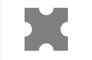
我需要用html+css实现以下内容(顶部不含glyphicon): 每个侧面都被咬掉圆形的正方形 目前,我卡在这里了。
background-image: -webkit-radial-gradient(0px 45px, circle closest-corner, rgba(0, 0, 0, 0) 0, rgba(0, 0, 0, 0) 13px, gray 14px);  

这段代码看起来似乎走了一条错误的方向,因为我无法添加第二个半圆。( http://jsfiddle.net/F7K4S/ )


2
这些圆圈是真的被切掉了吗?也就是说,它们后面的东西会透过来吗,还是只是白色的?正方形始终保持相同大小和形状吗?您介意使用SVG作为背景吗? - yunzen
2
它们可以只是实心的白色半圆形,还是需要一个真正的切口? - thirtydot
2
有时候最简单的方法就是使用一张图片。这个“形状”更适合使用图片,或者更好的方式是使用内联SVG。 - Paulie_D
1
@Paulie_D 你可能是对的,但我在想我们如何衡量(与性能相关的)哪个解决方案更好。 - web-tiki
4个回答

5
如果您有一个纯色背景,您可以使用伪元素和边框半径的CSS解决方案。 演示
输出:

enter image description here


编辑 1:

如@Paulie_D所提到的,这种形状可以是响应式的:demo


编辑2:

您也可以使用盒子阴影来最小化标记(只需要一个div和一个伪元素)

演示


第一个示例的代码:

HTML:

<div class="cutout"><div></div></div>

CSS:

.cutout {
    height: 88px;
    width: 88px;
    position:relative;
    background:#808080;

}
.cutout:after, .cutout:before, .cutout >div:before, .cutout >div:after{
    content:'';
    position:absolute;
    width:30px;
    height:30px;
    border-radius: 50%;
    background:#fff;
}
.cutout:before{
    left:-15px;
    top:29px;
}
.cutout:after{
    left:29px;
    top:-15px;
}
.cutout >div:before{
    top:29px;
    right:-15px;
}
.cutout >div:after{
    bottom:-15px;
    left:29px;
}

每次我来这里,你似乎总是比我领先半步 :D。 - Samih
1
@Samih,那是因为我已经在这里逗留了一段时间,开始习惯并喜欢这种类型的问题了 ;) - web-tiki
2
在原始答案的基础上,这个版本对div大小进行了响应:http://jsfiddle.net/Paulie_D/ELAdQ/34/ - Paulie_D
Paulie,你的响应式版本在Chrome中可以工作,但在Firefox和IE11中会出现问题。 - Kelderic
1
@AndyM 那是因为你需要添加供应商前缀 http://jsfiddle.net/webtiki/ELAdQ/42/ - web-tiki

5

好的,你已经有一个使用伪元素的好答案。

如果您想保留使用径向渐变背景的想法,则答案是这样的

.cutout {
    height: 88px;
    width: 88px;

    /* the inverse circle "cut" */
    background-image: 
        radial-gradient(circle at 44px 0px, rgba(0, 0, 0, 0) 0, rgba(0, 0, 0, 0) 13px, blue 14px),
        radial-gradient(circle at 0 24px, rgba(0, 0, 0, 0) 0, rgba(0, 0, 0, 0) 13px, red 14px),
        radial-gradient(circle at 44px 24px, rgba(0, 0, 0, 0) 0, rgba(0, 0, 0, 0) 13px, green 14px),
        radial-gradient(circle at 44px 20px, rgba(0, 0, 0, 0) 0, rgba(0, 0, 0, 0) 13px, blue 14px);
    background-size: 88px 20px, 44px 48px, 44px 48px, 88px 20px;
    background-position: 0px 0px, 0px 20px, 44px 20px, 0px 68px;
    background-repeat: no-repeat;
}

演示代码

我设置了不同的颜色,以便于看清楚每个元素的作用。

此外,我将您的标记升级为符合w3c标准,在现代浏览器中得到了良好的支持。


3
您还可以通过在伪影中绘制背景来使这些圆形透明:http://jsfiddle.net/ELAdQ/40/
body {
    padding: 50px;
    background:linear-gradient(to bottom left, gray, white, gray, white, gray, white, gray, white);
}
.cutout {
    height: 88px;
    width: 88px;
    position:relative;
    overflow:hidden;
}
.cutout:after, .cutout:before, .cutout >div:before, .cutout >div:after {
    content:'';
    position:absolute;
    width:30px;
    height:30px;
    border-radius: 50%;
    box-shadow: 0 0 0 30px #808080
}
.cutout:before {
    left:-15px;
    top:29px;
}
.cutout:after {
    left:29px;
    top:-15px;
}
.cutout >div:before {
    top:29px;
    right:-15px;
}
.cutout >div:after {
    bottom:-15px;
    left:29px;
}

限制条件:如果伪阴影不重叠其他伪元素,则此方法有效。如果需要更多的实现,可点击:http://codepen.io/gc-nomade/pen/rikLp


2

我的圆太大了,但你可以理解:

http://jsfiddle.net/eZHx8/1/

两个额外的容器:

<div  class="cutout">
    <div class="left-right"></div>
    <div class="top-bottom"></div>
</div>

还有一些CSS:

    body {
    padding: 50px;
}

.cutout {
    height: 88px;
    width: 88px;
    background-color: gray;
    position: relative;
}

.top-bottom:before, .top-bottom:after, .left-right:before, .left-right:after {
    content: '';
    width: 45px;
    height: 45px;
    border-radius: 30px;
    background-color: white;
    position: absolute;
}

.top-bottom:before {

    top: -22px;
    left: 22px;
}

.top-bottom:after {
    bottom: -22px;
    left: 22px;
}

.left-right:before {
    top: 22px;
    left: -22px;
}

.left-right:after {
    bottom: 22px;
    right: -22px;
}

网页内容由stack overflow 提供, 点击上面的
可以查看英文原文,
原文链接