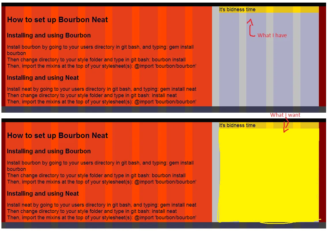
我正在测试Bourbon Neat,我在外部容器中有两列,我想让这些列的高度相等(与最高的列一样高)。在短列上使用@include fill-parent无效,它只会使其宽度与外部容器一样。我可以在JavaScript中实现它,但是Neat不应该处理这个吗?
这是我的HTML:
<section class="blog">

<article>
    <h1>How to set up Bourbon Neat</h1>
    <h2>Installing and using Bourbon</h2>
    <p>Install bourbon by going to your users directory in git bash, and typing: gem install bourbon</p>
    <p>Then change directory to your style folder and type in git bash: bourbon install</p>
    <p>Then, import the mixins at the top of your stylesheet(s): @import 'bourbon/bourbon'</p>
    <h2>Installing and using Neat</h2>
    <p>Install neat by going to your users directory in git bash, and typing: gem install neat</p>
    <p>Then change directory to your style folder and type in git bash: install neat</p>
    <p>Then, import the mixins at the top of your stylesheet(s): @import 'bourbon/bourbon'</p>
</article>

<aside>
    <!--<img src="style/images/cupman.gif" alt="It's bidness time">-->
    <p>It's bidness time</p>
</aside>
以下是我的SASS代码:
`$visual_grid: true
$visual-grid-color: blue
$visual-grid-index: front
$visual-grid-opacity: 0.1
@import 'bourbon/bourbon'
@import 'neat/neat'
@import 'variables'
///////////////////////////
html
@include linear-gradient(black, gray)
height: 100%
body
background-color: $baseColor
font-family: $type
body *
-webkit-box-sizing: border-box
-moz-box-sizing: border-box
box-sizing: border-box
//////////////////////////////
.blog
@include outer-container
aside
@include span-columns(4)
background: $thirdColor
//height: 100%
//@include fill-parent()
article
@include span-columns(8)
background-color: $fourthColor
padding: 5px
margin-top: 40px
background-color: $secondColor
`
 谢谢阅读。
谢谢阅读。
编辑:目前,我只是使用jQuery手动平衡列大小,但如果有更好的方法(哈哈)可以处理,请告诉我。