如何给按钮添加边框?能否在不使用图片的情况下实现?
安卓 - 按钮边框
253
- jeffreyveon
1
同样的方式,如此:https://dev59.com/cVvUa4cB1Zd3GeqPxdY2#7626628 - asenovm
11个回答
474
步骤1:创建名为my_button_bg.xml的文件
步骤2:将此文件放置在res/drawables.xml中
步骤3:插入以下代码
<?xml version="1.0" encoding="utf-8"?>
<shape xmlns:android="http://schemas.android.com/apk/res/android"
  android:shape="rectangle">
  <gradient android:startColor="#FFFFFF"
    android:endColor="#00FF00"
    android:angle="270" />
  <corners android:radius="3dp" />
  <stroke android:width="5px" android:color="#000000" />
</shape>
步骤 4:在需要的地方使用代码"android:background="@drawable/my_button_bg",例如下面:
<Button
    android:layout_width="wrap_content"
    android:layout_height="wrap_content"
    android:text="Your Text"
    android:background="@drawable/my_button_bg"
    />
- Pedantic
7
1感谢。对此表示赞赏。将其保存为XML文件并将其存入drawable文件夹后,我们该如何使用它? - Android Killer
1@AndroidPower 你可以使用 R.drawable.FILE_NAME。 - slayton
2这段代码放在哪里?是放在 .axml 文件中按钮的标记代码中吗?还是应该放在类似 styles.xml 的文件中? - theJerm
我只使用了描边(并将其设置为白色)来勾勒一个带有白色的按钮。在4.4中效果很好,但在4.0.3中按钮会变黑 - 有什么想法吗? - Kibi
2@Kibi 抱歉,有人编辑了我的答案并给出了错误的建议。我已经更改了它,但我很震惊有人可以编辑一个被接受的答案并改变其有用性。 - Pedantic
显示剩余2条评论
117
• Android官方解决方案
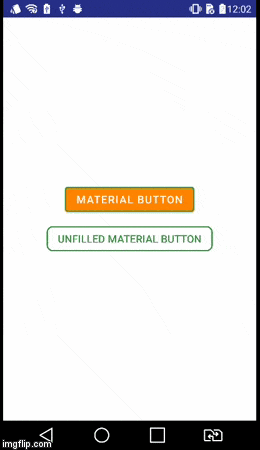
自从引入了Android Design Support v28,使用MaterialButton轻松创建有边框的按钮。该类在构造函数中提供更新的Material风格的按钮。使用app:strokeColor和app:strokeWidth可以创建自定义边框,如下所示:
1. 如果你使用androidx:
build.gradle
dependencies {
    implementation 'androidx.appcompat:appcompat:1.1.0'
    implementation 'com.google.android.material:material:1.0.0'
}
<com.google.android.material.button.MaterialButton
    style="@style/Widget.AppCompat.Button.Colored"
    android:layout_width="wrap_content"
    android:layout_height="wrap_content"
    android:text="MATERIAL BUTTON"
    android:textSize="15sp"
    app:strokeColor="@color/green"
    app:strokeWidth="2dp" />
• 未填充边框按钮:
<com.google.android.material.button.MaterialButton
    style="@style/Widget.AppCompat.Button.Borderless"
    android:layout_width="wrap_content"
    android:layout_height="wrap_content"
    android:text="UNFILLED MATERIAL BUTTON"
    android:textColor="@color/green"
    android:textSize="15sp"
    app:backgroundTint="@android:color/transparent"
    app:cornerRadius="8dp"
    app:rippleColor="#33AAAAAA"
    app:strokeColor="@color/green"
    app:strokeWidth="2dp" />
2. 当您使用 appcompat 时:
build.gradle
dependencies {
    implementation 'com.android.support:design:28.0.0'
}
style.xml
确保你的应用程序主题继承自Theme.MaterialComponents而不是Theme.AppCompat。
<style name="AppTheme" parent="Theme.MaterialComponents.Light.DarkActionBar">
    <!-- Customize your theme here. -->
</style>
• 带边框按钮:
<android.support.design.button.MaterialButton
    android:layout_width="wrap_content"
    android:layout_height="wrap_content"
    android:text="MATERIAL BUTTON"
    android:textSize="15sp"
    app:strokeColor="@color/green"
    app:strokeWidth="2dp" />
• 未填充的有边框按钮:
<android.support.design.button.MaterialButton
    style="@style/Widget.AppCompat.Button.Borderless"
    android:layout_width="wrap_content"
    android:layout_height="wrap_content"
    android:text="UNFILLED MATERIAL BUTTON"
    android:textColor="@color/green"
    android:textSize="15sp"
    app:backgroundTint="@android:color/transparent"
    app:cornerRadius="8dp"
    app:rippleColor="#33AAAAAA"
    app:strokeColor="@color/green"
    app:strokeWidth="2dp" />
可视化结果
- aminography
9
我已经想出来了,请参见https://developer.android.com/guide/topics/ui/look-and-feel/themes#Customize。 - Someone Somewhere
正如您所提到的,可以定义一个继承自无边框样式的样式,然后根据基础样式添加首选属性。 - aminography
有点离题,但是在 GIF 底部的操作栏中,第四个图标是什么?(而且看起来 GIF 是从真实设备中截取的,很酷) - i336_
1也许我错了,但对我来说,在•未填充的边框按钮中,我不得不将app:backgroundTint="@color/transparent"更改为app:backgroundTint="@android:color/transparent"。 - xarly
7使用<com.google.android.material.button.MaterialButton style="@style/Widget.MaterialComponents.Button.OutlinedButton"对我起作用。 - pw2
显示剩余4条评论
49
在您的drawable文件夹中创建一个名为
button_border.xml的文件。
res/drawable/button_border.xml
<?xml version="1.0" encoding="utf-8"?>
<shape xmlns:android="http://schemas.android.com/apk/res/android"
    android:shape="rectangle" >

    <solid android:color="#FFDA8200" />

    <stroke
        android:width="3dp"
        android:color="#FFFF4917" />

</shape>
在您的XML活动布局中添加按钮并设置背景android:background="@drawable/button_border"。
<Button
    android:layout_width="wrap_content"
    android:layout_height="wrap_content"
    android:background="@drawable/button_border"
    android:text="Button Border" />
- Karina Sen
21
创建 drawable/button_green.xml 文件:
<?xml version="1.0" encoding="utf-8"?>
<shape xmlns:android="http://schemas.android.com/apk/res/android"
  android:shape="rectangle">
  <gradient
    android:startColor="#003000"
    android:centerColor="#006000"
    android:endColor="#003000"
    android:angle="270" />
  <corners android:radius="5dp" />
  <stroke android:width="2px" android:color="#007000" />
</shape>
并将其指出为 @drawable/button_green:
<Button
        android:id="@+id/button1"
        android:layout_width="wrap_content"
        android:layout_height="wrap_content"
        android:layout_margin="10dp"
        android:background="@drawable/button_green"
        android:text="Button" />
- vitperov
20
请看此处关于创建形状可绘制资源的信息:http://developer.android.com/guide/topics/resources/drawable-resource.html#Shape
完成后,在按钮的XML中设置
android:background="@drawable/your_button_border"。- dymmeh
9
如果您的按钮不需要透明背景,那么您可以使用Frame Layout来创建一个边框的视觉效果。只需调整FrameLayout的“padding”属性即可改变边框的厚度。
<FrameLayout
        android:layout_width="wrap_content"
        android:layout_height="wrap_content"
        android:padding="1sp"
        android:background="#000000">
        <Button
            android:layout_width="wrap_content"
            android:layout_height="wrap_content"
            android:text="Your text goes here"
            android:background="@color/white"
            android:textColor="@color/black"
            android:padding="10sp"
            />
</FrameLayout>
我不确定形状XML文件是否具有可以动态编辑的边框颜色。但是我知道使用此解决方案,您可以通过设置FrameLayout背景动态更改边框颜色。
- Rock Lee
7
在您的XML布局中:
<Button
    android:id="@+id/cancelskill"
    android:layout_width="0dp"
    android:layout_height="wrap_content"
    android:layout_marginLeft="25dp"
    android:layout_weight="1"
    android:background="@drawable/button_border"
    android:padding="10dp"
    android:text="Cancel"
    android:textAllCaps="false"
    android:textColor="#ffffff"
    android:textSize="20dp" />
在drawable文件夹中,创建一个用于按钮边框样式的文件:
<shape xmlns:android="http://schemas.android.com/apk/res/android"
    android:shape="rectangle" >
    <stroke
        android:width="1dp"
        android:color="#f43f10" />
</shape>
在您的Activity中:
    GradientDrawable gd1 = new GradientDrawable();
    gd1.setColor(0xFFF43F10); // Changes this drawbale to use a single color instead of a gradient
    gd1.setCornerRadius(5);
    gd1.setStroke(1, 0xFFF43F10);

    cancelskill.setBackgroundDrawable(gd1);

    cancelskill.setOnClickListener(new View.OnClickListener() {

        @Override
        public void onClick(View v) {
            cancelskill.setBackgroundColor(Color.parseColor("#ffffff"));
            cancelskill.setTextColor(Color.parseColor("#f43f10"));

            GradientDrawable gd = new GradientDrawable();

            gd.setColor(0xFFFFFFFF); // Changes this drawbale to use a single color instead of a gradient
            gd.setCornerRadius(5);
            gd.setStroke(1, 0xFFF43F10);
            cancelskill.setBackgroundDrawable(gd);

            finish();
        }
    });
- Raseem Ayatt
5
我知道已经晚了一年,但是您也可以创建一个9路径图像。
有一个随附于Android SDK的工具可帮助创建这种图像。
请参见此链接:http://developer.android.com/tools/help/draw9patch.html。
PS:该图像也可以无限缩放。
- himura
4
<com.google.android.material.button.MaterialButton
                android:id="@+id/addBtn"
                style="@style/Widget.MaterialComponents.Button.OutlinedButton"
                android:layout_width="150dp"
                android:layout_height="80dp"
                android:gravity="center"
                android:backgroundTint="@android:color/transparent"
                android:textColor="@color/blue"
                app:cornerRadius="8dp"
                app:strokeColor="@color/blue"
                app:strokeWidth="2dp"/>
- Team chang
4
使用Material组件库,只需使用带有Widget.MaterialComponents.Button.OutlinedButton样式的MaterialButton即可。您可以使用strokeColor和strokeWidth属性自定义颜色和宽度。
使用 Jetpack Compose,使用
<com.google.android.material.button.MaterialButton
   ....
   style="?attr/materialButtonOutlinedStyle"
   app:strokeColor="@color/colorPrimary"/>

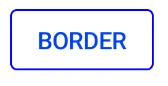
使用 Jetpack Compose,使用
OutlinedButton。
使用 border 属性自定义宽度和颜色。OutlinedButton(
onClick = { },
border = BorderStroke(1.dp, Color.Blue),
) {
Text(text = "BORDER")
}
- Gabriele Mariotti
网页内容由stack overflow 提供, 点击上面的可以查看英文原文,
原文链接
原文链接
- 相关问题
- 26 安卓无边框按钮
- 3 安卓GridLayout边框
- 4 安卓布局、图像按钮和灰色边框
- 8 安卓按钮边框颜色
- 3 安卓ImageButton边框?
- 28 安卓无边框对话框
- 26 安卓按钮的边框颜色
- 6 安卓按钮是否可以指定边框?
- 4 安卓发光边框
- 4 安卓按钮涟漪效果边框颜色