由于某些原因,当您输入并清除所有文本后再次输入时,接受的答案会崩溃。因此,我复制了TextField的实际实现,并更改了高度并删除了填充。
@Composable
fun SearchTextField(
value: String,
onValueChange: (String) -> Unit,
modifier: Modifier = Modifier,
enabled: Boolean = true,
readOnly: Boolean = false,
textStyle: TextStyle = LocalTextStyle.current,
label: @Composable (() -> Unit)? = null,
placeholder: @Composable (() -> Unit)? = null,
leadingIcon: @Composable (() -> Unit)? = null,
trailingIcon: @Composable (() -> Unit)? = null,
supportingText: @Composable (() -> Unit)? = null,
isError: Boolean = false,
visualTransformation: VisualTransformation = VisualTransformation.None,
keyboardOptions: KeyboardOptions = KeyboardOptions.Default,
keyboardActions: KeyboardActions = KeyboardActions.Default,
singleLine: Boolean = false,
maxLines: Int = if (singleLine) 1 else Int.MAX_VALUE,
minLines: Int = 1,
interactionSource: MutableInteractionSource = remember { MutableInteractionSource() },
shape: Shape = TextFieldDefaults.filledShape,
colors: TextFieldColors = TextFieldDefaults.textFieldColors()
) {
val textColor = textStyle.color.takeOrElse {
MaterialTheme.colorScheme.onSurface
}
val customTextSelectionColors = TextSelectionColors(
handleColor = MaterialTheme.colorScheme.primary,
backgroundColor = MaterialTheme.colorScheme.primary.copy(alpha = 0.4f)
)
CompositionLocalProvider(LocalTextSelectionColors provides customTextSelectionColors) {
@OptIn(ExperimentalMaterial3Api::class)
(BasicTextField(
value = value,
modifier = modifier.height(40.dp),
onValueChange = onValueChange,
enabled = enabled,
readOnly = readOnly,
cursorBrush = SolidColor(MaterialTheme.colorScheme.primary),
visualTransformation = visualTransformation,
keyboardOptions = keyboardOptions,
keyboardActions = keyboardActions,
interactionSource = interactionSource,
singleLine = singleLine,
maxLines = maxLines,
minLines = minLines,
decorationBox = @Composable { innerTextField ->
TextFieldDefaults.TextFieldDecorationBox(
value = value,
visualTransformation = visualTransformation,
innerTextField = innerTextField,
placeholder = placeholder,
label = label,
leadingIcon = leadingIcon,
trailingIcon = trailingIcon,
supportingText = supportingText,
shape = shape,
singleLine = singleLine,
enabled = enabled,
isError = isError,
interactionSource = interactionSource,
colors = colors,
contentPadding = PaddingValues(0.dp)
)
}
))
}
}


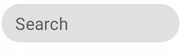
TextField是具有某些规格的 Material 组件。如果您想更改高度,则必须减小TextSize。否则,可以构建自己的BasicTextField并删除一些填充。 - Gabriele Mariotti