我能在SVG中混合渐变吗?

4

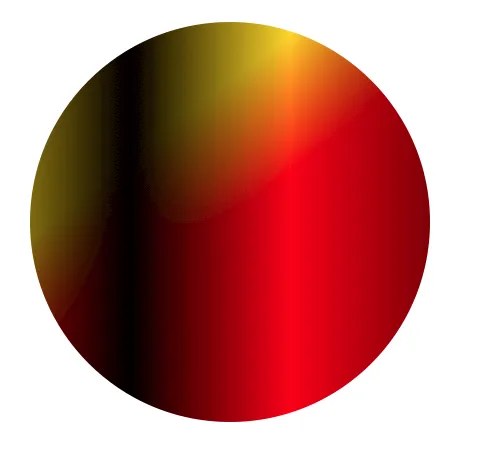
我想用两种渐变来填充SVG形状,其中一种与另一种呈45度角:

<linearGradient id="wave" x1="0%" x2="100%" y1="0%" y2="0%"
spreadMethod="pad">
    <stop offset="0%"   stop-color="gray" />
    <stop offset="25%"  stop-color="black"/>
    <stop offset="65%"  stop-color="white"/>
    <stop offset="100%" stop-color="gray" />
</linearGradient>
<linearGradient id="red-yellow" x1="0%" x2="100%" y1="0%" y2="100%"
spreadMethod="pad" gradientTransform="rotate(7)">
    <stop offset="0%"   stop-color="gold" />
    <stop offset="30%"  stop-color="gold"/>
    <stop offset="50%"  stop-color="red"/>
    <stop offset="100%" stop-color="red" />
</linearGradient>

有没有一种方法可以混合(相乘)这些渐变色?最终结果应该是一个矩形(或任意形状),从左上角的“金色”变成右下角的“红色”,并且值(如HSV中的值)从左到右依次变为中等、低、高、中等。

你能不能把灰色的色调放在上面,然后用透明度替换白色呢? - Noctua
是的,我可以。如果你想得到积分,随意发布答案,否则我可能会因为尴尬而删除这个问题 :P - kai
我只会发布我的评论,我不太了解任何SVG符号 :P - Noctua
2个回答

6

您可以使用SVG滤镜进行此操作,并进行乘法、筛选、变亮或变暗混合。 (虽然它只会在Chrome / Safari中完全正确地工作,因为它们支持使用feImage将对象导入滤镜以及feImage导入的正确大小 - 如果您还希望在Firefox中使用,请使用内联数据URI作为输入,而不是对象引用)以下是使用乘法混合的示例:

<svg width="600px" height="600px" viewbox="0 0 600 600">
  <defs>
<linearGradient id="wave" x1="0%" x2="100%" y1="0%" y2="0%"
spreadMethod="pad">
    <stop offset="0%"   stop-color="gray" />
    <stop offset="25%"  stop-color="black"/>
    <stop offset="65%"  stop-color="white"/>
    <stop offset="100%" stop-color="gray" />
</linearGradient>
<linearGradient id="red-yellow" x1="0%" x2="100%" y1="0%" y2="100%"
spreadMethod="pad" gradientTransform="rotate(7)">
    <stop offset="0%"   stop-color="gold" />
    <stop offset="30%"  stop-color="gold"/>
    <stop offset="50%"  stop-color="red"/>
    <stop offset="100%" stop-color="red" />
</linearGradient>
     <rect id="wave-rect" x="0" y="0" width="400" height="400" fill="url(#wave)"/>
      <rect id="ry-rect" x="0" y="0" width="400" height="400" fill="url(#red-yellow)"/>
      <filter id="blend-it" x="0%" y="0%" width="100%" height="100%">
        <feImage xlink:href="#wave-rect" result="myWave" x="100" y="100"/>
        <feImage xlink:href="#ry-rect" result="myRY"  x="100" y="100"/>
        <feBlend in="myWave" in2="myRY" mode="multiply" result="blendedGrad"/>
        <feComposite in="blendedGrad" in2="SourceGraphic" operator="in"/>
    </filter>
  </defs>

  <circle filter="url(#blend-it)" cx="300" cy="300" r="200"/>

</svg>

enter image description here


尽管Noctua解决了我的问题(而且由于它必须在Firefox中工作,我将使用它),但这更加详细和正确。谢谢! - kai

1
你可以将灰色调放在顶部,但使用透明度代替白色。这样应该会合并两者。

网页内容由stack overflow 提供, 点击上面的
可以查看英文原文,
原文链接