我目前正在构建一个响应式网站,需要固定菜单,在整个网站滚动时不会滚动。问题是它是一个流体布局,我希望“固定位置”的菜单项相对于包含父元素而不是浏览器窗口进行固定。是否有任何方法可以做到这一点?
11个回答
21
虽然这是一个旧问题,但它首先出现在谷歌上,所以我将发布我找到的可供他人使用的工作答案。
这需要包括固定div在内的3个div。
HTML
<div class="wrapper">
    <div class="parent">
        <div class="child"></div>
    </div>
</div>
CSS
.wrapper { position:relative; width:1280px; }
    .parent { position:absolute; }
        .child { position:fixed; width:960px; }
- Leo
6
3这确实有效...但是如果对包装器应用任何类型的变换,它会破坏子元素的固定性。 :( - Alkanshel
在这里找到了解决变换问题的方法--https://dev59.com/tHE85IYBdhLWcg3wvGER但是即使使用上述技巧,这两种样式的组合仍然会破坏它。"-webkit-perspective: 1000; -webkit-transform-style: preserve-3d;" - Alkanshel
对我来说没问题!这个相对->绝对->固定的链条让我开心。谢谢! - lemoid
至少我不得不在 .child 中添加 -webkit-transform: translate3d(0,0,0); 但正如之前提到的,有几种解决方法。 - lemoid
1这应该被选为正确答案。因为它固定了一个div,滚动另一个div,并在布局中保持了正确的纵横比和顺序,完全响应式。在像素完美的项目中非常有用。向Leo致敬。 - Luis
1我不确定这在2014年是否有效,但在2022年已经失效了。无论您在固定元素上设置什么位置,它仍然相对于窗口。 - Glenn Maynard
13
Gavin,
你遇到的问题是对定位的误解。如果你希望它相对于父元素“固定”,那么你真正想要的是将你的#fixed设置为position:absolute,这将更新其相对于父元素的位置。
这个问题全面描述了定位类型及其如何有效使用。
总之,你的CSS应该是
#wrap{
    position:relative;
}
#fixed{
    position:absolute;
    top:30px;
    left:40px;
}
- Fuzzical Logic
3
16我理解您的问题是,您不希望该元素滚动。这对于静态页面来说是可以的,但我正在构建一个响应式页面。当窗口变得较小时,该元素需要随着父元素移动。我尝试使用右侧定位的百分比,但它并不总是停留在正确的区域。因此,我的想法是将其绝对定位在父元素内部,但如何使其不滚动呢? - Gavin Wood
2然后,位置必须固定,但如果它被固定,就不能根据父元素定位。如果您希望父元素滚动,但子元素不滚动,则无法相对于父元素定位。(即
fixed会忽略父元素,除非父元素也是fixed)如果我正确理解您的问题,那么JavaScript和CSS的组合将是您唯一的选择。 - Fuzzical Logic2寻找问题的解决方案并不是“误解”。 - Glenn Maynard
10
尝试在父元素上使用
position:sticky;。- Lohit Bisen
7
一个简单的解决方案,不需要使用JavaScript,也不会破坏CSS变换,就是简单地有一个与你的滚动元素大小相同的非滚动元素,绝对定位在它上面。
基本的HTML结构如下: CSS:
基本的HTML结构如下: CSS:
<style>
    .parent-to-position-by {
        position: relative;
        top: 40px; /* just to show it's relative positioned */
    }
    .scrolling-contents {
        display: inline-block;
        width: 100%;
        height: 200px;
        line-height: 20px;
        white-space: nowrap;
        background-color: #CCC;
        overflow: scroll;
    }
    .fixed-elements {
        display: inline-block;
        position: absolute;
        top: 0;
        left: 0;
    }
    .fixed {
        position: absolute; /* effectively fixed */
        top: 20px;
        left: 20px;
        background-color: #F00;
        width: 200px;
        height: 20px;
    }
</style>
HTML
<div class="parent-to-position-by">
<div class="fixed-elements">
<div class="fixed">
I am "fixed positioned"
</div>
</div>
<div class="scrolling-contents">
Lots of contents which may be scrolled.
</div>
</div>
parent-to-position-by是相对于哪个来定位固定的内容。scrolling-contents将延伸到这个的大小,并包含其主要内容。fixed-elements只是一个绝对定位的,与scrolling-contents覆盖了相同的空间。- 通过使用
fixed类的绝对定位的,它实现了与父相对固定定位相同的效果。(或者相对于滚动内容,因为它们延伸到整个空间)
- KernelDeimos
1
问题在于,当鼠标滚轮位于红色固定元素上方时,无法使用它。
~
这并非每个实现都存在的问题,但在您想要覆盖可滚动内容的“淡出”效果的情况下,就会出现这种情况。 - leifparker
3
这是可能的,如果您使用边距而不是定位来移动固定的
<div> :#wrap{ position:absolute;left:100px;top:100px; }
#fixed{
position:fixed;
width:10px;
height:10px;
background-color:#333;
margin-left:200px;
margin-top:200px;
}
And this HTML:
<div id="wrap">
   <div id="fixed"></div>
</div>
试着在这个jsfiddle中玩一下。
- JCOC611
1
你已将包装器设置为绝对定位。我需要我的包装器是相对定位并居中的。因此,我已经按如下设置:#wrapper {position:relative;
width:90%;
}
#fixed {position:fixed; right:0; top:0;} //应该是#wrapper父元素的0位置 - Gavin Wood
2
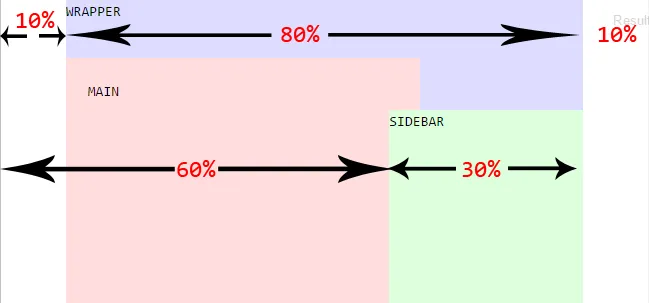
一个简单的方法是使用百分比值将您的固定 DIV 相对于页面的其余部分定位。
请查看这里的 jsfiddle,其中固定 DIV 是侧边栏。
下面简要描述了上面的布局:
请查看这里的 jsfiddle,其中固定 DIV 是侧边栏。
div#wrapper {
    margin: auto;
    width: 80%;
}

div#main {
    width: 60%;
}

div#sidebar {
    position: fixed;
    width: 30%;
    left: 60%;
}
下面简要描述了上面的布局:
- afable
1
你可以使用绝对定位来修复包装器。
并且给内部的div一个固定位置。
尝试这个,它可能对你有用。
.wrapper{
 position:absolute;
 left:10%;// or some valve in px
 top:10%; // or some valve in px
 }
和
在其中
.wrapper .fixed-element{
position:fixed;
width:100%;
height:100%;
margin-left:auto; // to center this div inside at center give auto margin
margin-right:auto;
}
尝试这个,它可能对你有用。
- Mandar Kawtakwar
1
将位置从fixed更改为sticky即可。
position: sticky
- Mohamad Hendy
1
这里提供一种更通用的解决方案,不依赖于菜单/标题的高度。它是完全响应式的,纯CSS解决方案,在IE8+、Firefox、Chrome、Safari和Opera上表现良好。支持内容滚动而不影响菜单/标题。
使用以下链接进行测试:Working Fiddle HTML代码:
使用以下链接进行测试:Working Fiddle HTML代码:
<div class="Container">
    <div class="First">
        <p>The First div height is not fixed</p>
        <p>This Layout has been tested on: IE10, IE9, IE8, FireFox, Chrome, Safari, using Pure CSS 2.1 only</p>
    </div>
    <div class="Second">
        <div class="Wrapper">
            <div class="Centered">
                <p>The Second div should always span the available Container space.</p>
                <p>This content is vertically Centered.</p>
            </div>
        </div>
    </div>
</div>
CSS:
*
{
    margin: 0;
    padding: 0;
}

html, body, .Container
{
    height: 100%;
}

    .Container:before
    {
        content: '';
        height: 100%;
        float: left;
    }

.First
{
    /*for demonstration only*/
    background-color: #bf5b5b;
}

.Second
{
    position: relative;
    z-index: 1;
    /*for demonstration only*/
    background-color: #6ea364;
}

    .Second:after
    {
        content: '';
        clear: both;
        display: block;
    }

/*This part his relevant only for Vertically centering*/
.Wrapper
{
    position: absolute;
    width: 100%;
    height: 100%;
    overflow: auto;
}
    .Wrapper:before
    {
        content: '';
        display: inline-block;
        vertical-align: middle;
        height: 100%;
    }

.Centered
{
    display: inline-block;
    vertical-align: middle;
}
- avrahamcool
1
样例解决方案。请检查,是否符合您的需求。
<div class="container">
   <div class="relative">
      <div class="absolute"></div>
      <div class="content">
        <p>
          Content here
        </p>
      </div>
    </div>
 </div>
而对于CSS
.relative {
  position: relative;
}

.absolute {
  position: absolute;
  top: 15px;
  left: 25px;
}
在 CodePen 上查看 https://codepen.io/FelySpring/pen/jXENXY
- Fely Spring
网页内容由stack overflow 提供, 点击上面的可以查看英文原文,
原文链接
原文链接