我希望了解在设计附加的安卓屏幕时,使用Linear Layout或Table Layout的最佳方法。
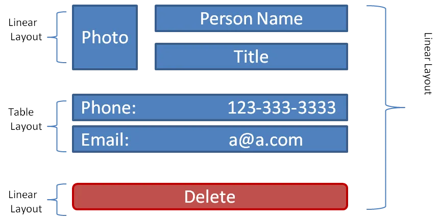
我正在使用Linear Layout作为主要布局,然后在其中添加子Linear布局和Table布局。这是最好的做法吗?
我希望了解在设计附加的安卓屏幕时,使用Linear Layout或Table Layout的最佳方法。
我正在使用Linear Layout作为主要布局,然后在其中添加子Linear布局和Table布局。这是最好的做法吗?
使用RelativeLayout或GridLayout(仅适用于ICS及以上版本)。
这应该能让你开始。虽然不完全符合您的要求,但希望它已经接近了。我没有测试代码,所以甚至不知道它是否编译。不过离最终代码应该不会太远。:)
<RelativeLayout>
  <!-- Image, may want to size this as a square using dp pixels say, 64dpx64dp -->
  <ImageView android:id="@+id/PhotoImageView" android:layout_width="wrap_content" android:layout_height="wrap_content" android:layout_alignParentTop="true" android:layout_alignParentLeft="true" />

  <!-- TextViews at the right of the image. Stacked, caution this might end up being taller than the ImageView itself. -->
  <TextView android:id="@+id/PersonNameTextView" android:layout_width="wrap_content" android:layout_height="wrap_content" android:layout_alignParentRight="true" android:layout_toRightOf="@id/PhotoImageView" />
  <TextView android:id="@+id/TitleTextView" android:layout_width="wrap_content" android:layout_height="wrap_content" android:layout_alignParentRight="true" android:layout_toRightOf="@id/PhotoImageView" android:layout_below="@id/PersonNameTextView" />

  <!-- Stacked TextViews below, you can split this out to side by side TextViews but that's more work. -->
  <TextView android:id="@+id/PhoneTextView" android:layout_width="match_parent" android:layout_height="wrap_content" android:layout_below="@id/PhotoImageView" />
  <TextView android:id="@+id/EmailTextView" android:layout_width="match_parent" android:layout_height="wrap_content" android:layout_below="@id/PhoneTextView" />

  <!-- Delete button placed at the bottom. -->
  <Button android:id="@+id/DeleteButton" android:layout_width="match_parent" android:layout_height="wrap_content" android:layout_alignParentBottom="true" />
</RelativeLayout>