我希望将我的HTML页面分成4个不同的垂直部分。
我希望每个部分都有不同的背景颜色,因此我使用了div,但是每个背景颜色未覆盖每个部分的侧面。
** 我的期望结果: 我不想在HTML中看到身体背景颜色的红色。
body {
  background-color: red;
}

.intro {
  background-color: #674AB3;
}

.edu {
  background-color: #A348A6;
}

.Skills {
  background-color: #9F63C4;
}

.end {
  background-color: #9075D8;
}<div class="intro">
<hr>
</div>
<div class="edu">
<hr>
</div>
<div class="Skills">
<hr>
</div>
<div class="end">
<hr>
</div>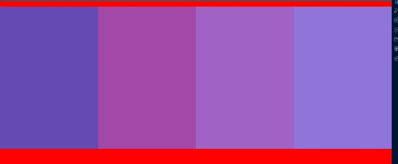