设计ListPicker Blend/Xaml

9

我正在使用一个ListPicker,但是在设计方面遇到了困难。我已经包含了我所做的测试:

 <ControlTemplate x:Key="listpicker_style" TargetType="toolkit:ListPicker">
        <StackPanel>
            <VisualStateManager.VisualStateGroups>
                <VisualStateGroup x:Name="PickerStates">
                    <VisualState x:Name="Normal"/>
                    <VisualState x:Name="Highlighted">
                        <Storyboard>
                            <ObjectAnimationUsingKeyFrames
                                Storyboard.TargetName="UserControl"
                                Storyboard.TargetProperty="Foreground"
                                Duration="0">
                                <DiscreteObjectKeyFrame
                                    Value="{StaticResource PhoneTextBoxForegroundBrush}"
                                    KeyTime="0"/>
                            </ObjectAnimationUsingKeyFrames>
                            <ObjectAnimationUsingKeyFrames
                                Storyboard.TargetName="Border"
                                Storyboard.TargetProperty="Background"
                                Duration="0">
                                <DiscreteObjectKeyFrame
                                    Value="{StaticResource PhoneTextBoxEditBackgroundColor}"
                                    KeyTime="0"/>
                            </ObjectAnimationUsingKeyFrames>
                            <ObjectAnimationUsingKeyFrames
                                Storyboard.TargetName="Border"
                                Storyboard.TargetProperty="BorderBrush"
                                Duration="0">
                                <DiscreteObjectKeyFrame
                                    Value="{StaticResource PhoneTextBoxEditBorderBrush}"
                                    KeyTime="0"/>
                            </ObjectAnimationUsingKeyFrames>
                        </Storyboard>
                    </VisualState>
                    <VisualState x:Name="Disabled">
                        <Storyboard>
                            <ObjectAnimationUsingKeyFrames
                                Storyboard.TargetName="Border"
                                Storyboard.TargetProperty="Background"
                                Duration="0">
                                <DiscreteObjectKeyFrame
                                    Value="{StaticResource TransparentBrush}"
                                    KeyTime="0"/>
                            </ObjectAnimationUsingKeyFrames>
                            <ObjectAnimationUsingKeyFrames
                                Storyboard.TargetName="Border"
                                Storyboard.TargetProperty="BorderBrush"
                                Duration="0">
                                <DiscreteObjectKeyFrame
                                    Value="{StaticResource PhoneDisabledBrush}"
                                    KeyTime="0"/>
                            </ObjectAnimationUsingKeyFrames>
                            <ObjectAnimationUsingKeyFrames
                                Storyboard.TargetName="UserControl"
                                Storyboard.TargetProperty="Foreground"
                                Duration="0">
                                <DiscreteObjectKeyFrame
                                    Value="{StaticResource PhoneDisabledBrush}"
                                    KeyTime="0"/>
                            </ObjectAnimationUsingKeyFrames>
                        </Storyboard>
                    </VisualState>
                </VisualStateGroup>
            </VisualStateManager.VisualStateGroups>
            <ContentControl
                Content="{TemplateBinding Header}"
                ContentTemplate="{TemplateBinding HeaderTemplate}"
                Foreground="{StaticResource PhoneSubtleBrush}"
                FontSize="{StaticResource PhoneFontSizeNormal}"
                HorizontalContentAlignment="{TemplateBinding HorizontalContentAlignment}"
                Margin="0 0 0 8"/>
            <Grid>
                <Rectangle Fill="#FFEAC726" HorizontalAlignment="Left" Height="52" Margin="0,0,-7,0" Stroke="Black" VerticalAlignment="Top" Width="83"/>
                <Rectangle Fill="#FF685B1F" HorizontalAlignment="Left" Height="9" Margin="0,0,-7,0" Stroke="Black" VerticalAlignment="Top" Width="83"/>
                <Rectangle Fill="#FF685B1F" HorizontalAlignment="Left" Height="9" Margin="0,43,-7,0" Stroke="Black" VerticalAlignment="Top" Width="83"/>
                <Border x:Name="Border"
                    Background="{TemplateBinding Background}"
                    BorderBrush="{TemplateBinding BorderBrush}"
                    BorderThickness="{TemplateBinding BorderThickness}" Opacity="0">
                    <UserControl x:Name="UserControl" Foreground="{TemplateBinding Foreground}" Margin="7,-3,-7,3">
                        <StackPanel>
                            <TextBlock x:Name="MultipleSelectionModeSummary" Margin="8 8 0 8" />
                            <Canvas x:Name="ItemsPresenterHost" MinHeight="46">
                                <ItemsPresenter x:Name="ItemsPresenter">
                                    <ItemsPresenter.RenderTransform>
                                        <TranslateTransform x:Name="ItemsPresenterTranslateTransform"/>
                                    </ItemsPresenter.RenderTransform>
                                </ItemsPresenter>
                            </Canvas>
                        </StackPanel>
                    </UserControl>
                </Border>
            </Grid>
        </StackPanel>
    </ControlTemplate>

基本上我想要实现的是创建一个看起来像滚动条的列表选择器。当您点击它时,滚动条会展开并显示所有选项。因此,我对使用全屏外观不感兴趣。
我还尝试过其他类似的方法,但效果很差,例如使用设计的用户控件作为滚动条的顶部和底部进行动画处理。但是,列表选择器的设计一直无法完成。
因此,我的问题是,是否有人有列表选择器的设计,使用用户控件,以便我可以覆盖它们,或者您可以指导我如何正确地操作列表选择器。我已经使用了Blend、Expression Design、Illustrator和XAML,因此任何使用它们中的任何一种设计列表选择器的方法都将不胜感激!
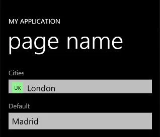
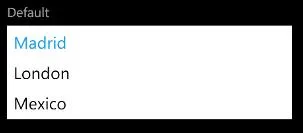
视觉示例
因此,想法是这样的:

enter image description here

当文本位于滚动区域内时,单击它会展开一个包含可滚动选择元素列表的滚动条。

用户控件

滚动条的用户控件

概览图像

所选项目:

list

点击元素会出现一个列表:

expand

这是列表选择器的工作方式,我希望将其设计为滚动式,可以从头开始设计,也可以使用listpicker description工具。但我还没有成功地使扩展看起来好看。

1
你有一个可视化的例子可以指引给别人吗?我很难从你的描述中准确地想象出你的目标。但我相信这是可以做到的。 - Chris W.
1
所以每个项目都是一个单独的滚动条?然后当点击一个项目(一个滚动条)时,滚动条会展开显示更多内容?抱歉,朋友,我还不完全清楚你想做什么哈哈。 - Chris W.
2
因此,滚动条一开始只显示最少量的内容,然后如果用户点击该滚动内容,则滚动条会垂直展开以在其中提供列表选择器? - Chris W.
1
抱歉,我还没有时间回到这个问题上来,目前工作任务太多了,不过我会尽量在今天回来解决的。 - Chris W.
1
哦,我不担心分数,我更想看到你得到解决。周一通常很忙,但我会看看是否能找到一些时间。 - Chris W.
显示剩余13条评论
1个回答

1
我尽可能地让它变得简单。思路是:在不同状态下动画化“翻译”和“缩放”属性,而其他如高度等则不会。因此,让我们创建以下布局:
 <StackPanel Width="500">
        <Grid x:Name="HeaderGrid" Height="100" Background="Red" Tapped="HeaderGrid_Tapped"/>
        <Grid VerticalAlignment="Top" x:Name="ContentGrid" Height="400" Background="BlanchedAlmond" RenderTransformOrigin="0.5,0">
            <Grid.RenderTransform>
                <CompositeTransform/>
            </Grid.RenderTransform>
            <ScrollViewer>
                <ItemsControl>
                    <ItemsControl.ItemTemplate>
                        <DataTemplate>
                            <TextBlock Text="{Binding}" Tapped="TextBlock_Tapped"/>
                        </DataTemplate>
                    </ItemsControl.ItemTemplate>
                    <ItemsControl.Items>
                        <x:String>One</x:String>
                        <x:String>Two</x:String>
                        <x:String>Three</x:String>
                    </ItemsControl.Items>
                </ItemsControl>
            </ScrollViewer>
        </Grid>
        <Grid x:Name="BottomGrid" Height="100" Background="Red" Tapped="HeaderGrid_Tapped" RenderTransformOrigin="0.5,0.5">
            <Grid.RenderTransform>
                <CompositeTransform/>
            </Grid.RenderTransform>
        </Grid>
    </StackPanel>

现在让我们为页面添加一些视觉状态,控制或您所需的内容。
<VisualStateManager.VisualStateGroups>
        <VisualStateGroup x:Name="VisualStateGroup">
            <VisualStateGroup.Transitions>
                <VisualTransition GeneratedDuration="0:0:0.5"/>
            </VisualStateGroup.Transitions>
            <VisualState x:Name="Expanded"/>
            <VisualState x:Name="Collapsed">
                <Storyboard>
                    <DoubleAnimation Duration="0" To="0" Storyboard.TargetProperty="(UIElement.RenderTransform).(CompositeTransform.ScaleY)" Storyboard.TargetName="ContentGrid" d:IsOptimized="True"/>
                    <DoubleAnimation Duration="0" To="-400" Storyboard.TargetProperty="(UIElement.RenderTransform).(CompositeTransform.TranslateY)" Storyboard.TargetName="BottomGrid" d:IsOptimized="True"/>
                </Storyboard>
            </VisualState>
        </VisualStateGroup>
    </VisualStateManager.VisualStateGroups>

最后是状态更改的代码后端。
private void HeaderGrid_Tapped(object sender, TappedRoutedEventArgs e)
    {
        CheckState();
    }
    private void TextBlock_Tapped(object sender, TappedRoutedEventArgs e)
    {
        var value = (sender as FrameworkElement).DataContext;

        CheckState();
    }
    private void CheckState()
    {
        if ((ContentGrid.RenderTransform as CompositeTransform).ScaleY > 0)
            VisualStateManager.GoToState(this, "Collapsed", true);
        else
            VisualStateManager.GoToState(this, "Expanded", true);
    }

现在您可以在文本出现和消失时添加渐变效果,并更改图像的颜色等。但是这个想法已经解决了。

看到了,我所想的甚至不需要代码后台等,只需将其放在一个自定义样式模板中,用作 Expanderview 的模板资源,然后在需要的地方调用它作为静态资源即可。 - Chris W.
我会看一下,但是你可以将代码放在用户控件中,并在需要的任何地方使用它。 - Juan Pablo Garcia Coello
事件必须更改,因为我有一个Silverlight应用程序(抱歉没有具体说明)。如果我将事件更改为tap,则代码可以正常运行。但是视觉状态没有改变。代码现在已放置在页面中,但是visualstatemanager没有任何效果? - JTIM

网页内容由stack overflow 提供, 点击上面的
可以查看英文原文,
原文链接