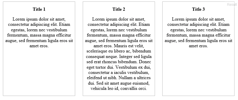
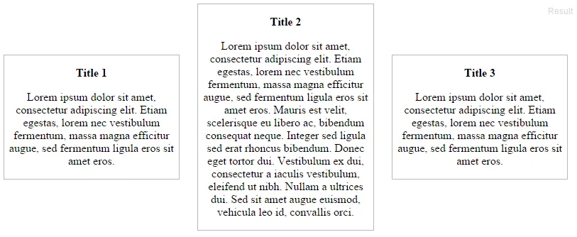
我一直在尝试使用Flexbox创建一个三列布局,其中块高度相等。如下图所示,第一张图片展示了预期的行为(具有讽刺意味的是,它只在IE11中有效)。在Microsoft Edge、Chrome和Firefox中,输出如第二张图片所示,这不是我想要实现的。
在Stackoverflow和Google上寻找解决方案后,我似乎找不到解决我的问题的方法。如果有人能够帮助我找出问题出在哪里,那将不胜感激!
JSFiddle: http://jsfiddle.net/uyvhrjjb/1/
CSS:
#threeblocks {
    width: 100%;
    overflow: hidden;
    display: -ms-flexbox;
    display: -webkit-flex;
    display: flex;
    -webkit-flex-direction: row;
    -ms-flex-direction: row;
    flex-direction: row;
    -webkit-flex-wrap: nowrap;
    -ms-flex-wrap: nowrap;
    flex-wrap: nowrap;
    -webkit-justify-content: space-between;
    -ms-flex-pack: justify;
    justify-content: space-between;
    -webkit-align-content: stretch;
    -ms-flex-line-pack: stretch;
    align-content: stretch;
    -webkit-align-items: stretch;
    -ms-flex-align: stretch;
    align-items: stretch;
}


#threeblocks .block {
    -webkit-order: 0;
    -ms-flex-order: 0;
    order: 0;
    -webkit-flex: 0 1 auto;
    -ms-flex: 0 1 auto;
    flex: 0 1 auto;
    -webkit-align-self: stretch;
    -ms-flex-item-align: stretch;
    align-self: stretch;
    width: 30%;
    margin: auto;
    border: 1px solid #B8B8B8;
}
HTML:
<div id="threeblocks">
    <div class="block" style="text-align: center">
        <p><strong>Title 1</strong></p>

        <p>Lorem ipsum dolor sit amet, consectetur adipiscing elit. Etiam egestas, lorem nec vestibulum fermentum, massa magna efficitur augue, sed fermentum ligula eros sit amet eros.</p>
    </div>

    <div class="block" style="text-align: center">
        <p><strong>Title 2</strong></p>

        <p>Lorem ipsum dolor sit amet, consectetur adipiscing elit. Etiam egestas, lorem nec vestibulum fermentum, massa magna efficitur augue, sed fermentum ligula eros sit amet eros. Mauris est velit, scelerisque eu libero ac, bibendum consequat neque. Integer sed ligula sed erat rhoncus bibendum. Donec eget tortor dui. Vestibulum ex dui, consectetur a iaculis vestibulum, eleifend ut nibh. Nullam a ultrices dui. Sed sit amet augue euismod, vehicula leo id, convallis orci.</p>
    </div>

    <div class="block" style="text-align: center">
        <p><strong>Title 3</strong></p>

         <p>Lorem ipsum dolor sit amet, consectetur adipiscing elit. Etiam egestas, lorem nec vestibulum fermentum, massa magna efficitur augue, sed fermentum ligula eros sit amet eros.</p>
    </div>

</div>