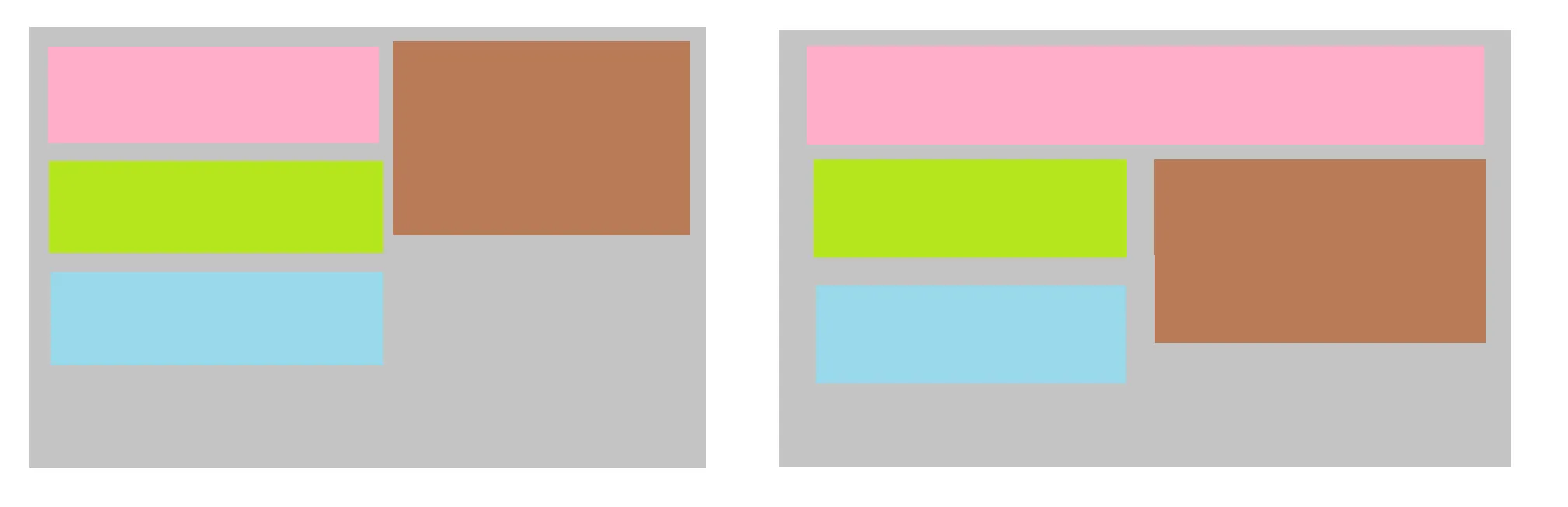
我只能用JavaScript和两个模板来实现这一点,如果粉色长度超过X,则使用第二个模板,但我想知道是否有办法仅使用CSS实现这一点?
我尝试过使用grid auto-fill/auto-fit with minmax、float、flex with wrap等方法,但是无法得到所需的结果。
.parent {
  width: 170px;
}

.flex {
  display: flex;
 }

div {
  outline: 2px solid rgba(255, 0,0, 0.3);
}<div>
<p>scenario A</p>
<div class="parent flex">
<div>
<div class="one">A short title</div>
<div class="three">Some text here</div>
<div class="three">some more text</div>
</div>
<div>
<button>A button</button>
</div>
</div>
</div>
<div>
<p>scenario B</p>
<div class="parent">
<div class="one">Testing a very long title</div>
<div class="flex">
<div>
<div class="three">Some text here</div>
<div class="three">some more text</div>
</div>
<div>
<button>A button</button>
</div>
</div>
</div>
</div>
<p>can a component achieve both a and b with only css?
float,但这取决于你的 HTML 结构。 - Paulie_D