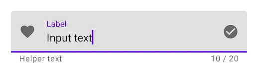
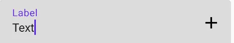
我想要移除TextField中的紫色线/指示器(参见以下图像)。这是可能的吗,还是我需要创建自己的自定义TextField来实现?
 colors = TextFieldDefaults.textFieldColors(
            focusedIndicatorColor = Color.Transparent,
            disabledIndicatorColor = Color.Transparent,
            unfocusedIndicatorColor = Color.Transparent,
            backgroundColor = Color.LightGray,
        )
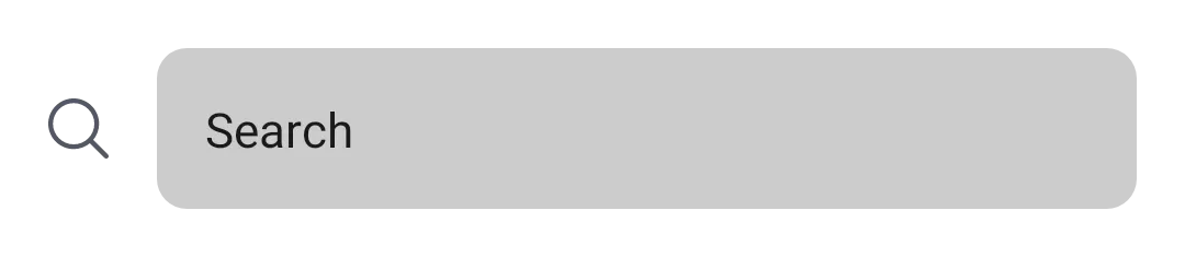
例子
TextField(
        value = searchText,
        onValueChange = { Log.d(HOME_COMPONENT, it) },
        label = { Text(text = "Search") },
        shape = RoundedCornerShape(10.dp),
        leadingIcon = {
            Image(
                painter = painterResource(id = R.drawable.ic_search),
                contentDescription = "search"
            )
        },
        colors = TextFieldDefaults.textFieldColors(
            focusedIndicatorColor = Color.Transparent,
            disabledIndicatorColor = Color.Transparent,
            unfocusedIndicatorColor = Color.Transparent,
            backgroundColor = Color.LightGray,
        )
    )
图片:

或者,如果您想根据您的UI/UX自定义组件,则使用BasicTextField
@Composable
fun ToolbarComponent() {
    var searchText by remember { mutableStateOf("") }
    Row(
        modifier = Modifier
            .padding(16.dp)
            .fillMaxWidth(), verticalAlignment = Alignment.CenterVertically
    ) {

        Icon(
            painter = painterResource(id = R.drawable.ic_search),
            contentDescription = "search",
            modifier = Modifier.size(20.dp),
            tint = iconTintColor
        )

        Spacer(modifier = Modifier.size(16.dp))

        BasicTextField(
            value = searchText,
            onValueChange = { searchText = it },
            modifier = Modifier
                .background(shape = RoundedCornerShape(10.dp), color = Color.LightGray)
                .fillMaxWidth()
                .padding(16.dp),
            decorationBox = {
                Text(text = "Search")
            }
        )
    }
}
编辑:2023年5月31日
在最新的稳定版本1.4.7中,TextFieldDefaults.textFieldColors已被弃用,现在我们可以使用TextFieldDefaults.colors来更改TextField的默认颜色。
 colors = TextFieldDefaults.colors(
                focusedIndicatorColor = Color.Transparent,
                unfocusedIndicatorColor = Color.Transparent,
                cursorColor = MaterialTheme.colorScheme.onSurface.copy(alpha = 0.5f),
                focusedContainerColor = Color.White,
                unfocusedContainerColor = Color.White,
            )
errorIndicatorColor = Color.Transparent。 - Arthur Khazbs从1.2.0-alpha04开始,您可以使用TextFieldDecorationBox和BasicTextField一起构建基于材料设计文本字段的自定义文本字段。
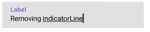
在您的情况下,您可以应用indicatorLine修饰符来定义focusedIndicatorLineThickness和unfocusedIndicatorLineThickness参数:
var text by remember { mutableStateOf("") }
val singleLine = true
val enabled = true
val interactionSource = remember { MutableInteractionSource() }
BasicTextField(
    value = text,
    onValueChange = { text = it },
    modifier = Modifier
        .indicatorLine(enabled, false,
            interactionSource,
            TextFieldDefaults.textFieldColors(),
            focusedIndicatorLineThickness = 0.dp,
            unfocusedIndicatorLineThickness = 0.dp
        )
        .background(
            TextFieldDefaults.textFieldColors().backgroundColor(enabled).value,
            TextFieldDefaults.TextFieldShape
        )
        .width(TextFieldDefaults.MinWidth),
    singleLine = singleLine,
    interactionSource = interactionSource
) { innerTextField ->
    TextFieldDecorationBox(
        value = text,
        innerTextField = innerTextField,
        enabled = enabled,
        singleLine = singleLine,
        visualTransformation = VisualTransformation.None,
        interactionSource = interactionSource,
        label = { Text("Label") }
    )
}
或者您可以使用 TextField 定义这些属性:
focusedIndicatorColor (聚焦时的指示器颜色)unfocusedIndicatorColor (未聚焦时的指示器颜色)disabledIndicatorColor (禁用时的指示器颜色)类似以下代码:
    TextField(
        ....
        colors = TextFieldDefaults.textFieldColors(
            backgroundColor = .....,
            focusedIndicatorColor =  Transparent,
            unfocusedIndicatorColor = Transparent)
    )
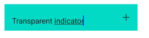
实际上(版本 alpha 7),这是我找到的最容易删除分隔符的版本。
将activeColor和inactiveColor设置为Color.Transparent,以隐藏TextField下面的指示线,无论其状态如何。
如果只将inactiveColor添加到Color.Transparent中,则仅在TextField未聚焦时该线条将不可见。
添加textStyle = TextStyle(color = Color.White)以显示颜色,无论TextField是否聚焦。
此解决方案将删除线条,但也会删除光标指示器。目前来说并不是最好的解决方案,但它也是Compose上的alpha版本。
TextField(
    value = MyValue,
    onValueChange = { },
    textStyle = TextStyle(color = Color.White),
    activeColor = Color.Transparent,
    inactiveColor = Color.Transparent,
    shape = RoundedCornerShape(20)
)
TextField,您可以将activeColor设置为Color.Transparent。activeColor不仅用于指示器,还用于标签底部指示器和光标。 var text: String by mutableStateOf("")
TextField(value = text, onValueChange = {
text = it
}, activeColor = Color.Transparent)
activeColor 是指当文本字段处于焦点状态时标签、底部指示器和光标的颜色。BaseTextField。
TextField是Compose UI的文本输入组合,遵循Material Design指南。BaseTextField是纯文本输入的基础,没有Material Design元素。从长远来看,目前还不清楚它们将提供多少配置,允许TextField偏离Material Design。最终,社区将创建更灵活的替代方案,适用于不想要近乎100%Material Design外观的项目。 - CommonsWare