我遇到了非移动设备的布局问题。 我有四列,以下是它们的顺序(宽度适用于sm/md/lg):
A(3-wide)
B(9-wide)
C(9-wide)
D(3-wide)
B列是一个高度不固定的大列,因此A列始终会比B列短。当视口扩展时,我的问题是我无法让D坐在A下面,尽管它们都是3列宽,并且在A下面有空白/未填充的空间。
我想要的:
BBB A
BBB D
BBB
CCC
我现在拥有什么:
BBB A
BBB
BBB
CCC D
无论我尝试使用推/拉、嵌套等方法,D都不会跳到A下面的空间里。
这是我的代码,简化为基础形式:
<link rel="stylesheet" href="https://maxcdn.bootstrapcdn.com/bootstrap/3.3.6/css/bootstrap.min.css">

<div class="container">
    <div class="row">
        <div class="col-xs-12 col-sm-3 pull-right">
            <p>(A) Right-aligned, 3-wide div that's pretty short</p>
        </div>
        <div class="col-xs-12 col-sm-9 pull-left">
            <h1>(B) Left-aligned, large variable height content div.</h1>
            <h1>(B)</h1>
            <h1>(B)</h1>
        </div>
    </div>
    <div class="row">
        <div class="col-xs-12 col-sm-9">
            <h3>(C) Left-aligned smaller content div</h3>
            <h3>(C)</h3>
            <h3>(C)</h3>
        </div>
        <div class="col-xs-12 col-sm-3">
            <h4>(D) Right-aligned, 3-wide div that I want to go below the first 3-wide div</h4>
            <h4>(D)</h4>
            <h4>(D)</h4>
            <h4>(D)</h4>
            <h4>(D)</h4>
            <h4>(D)</h4>
        </div>
    </div>
</div>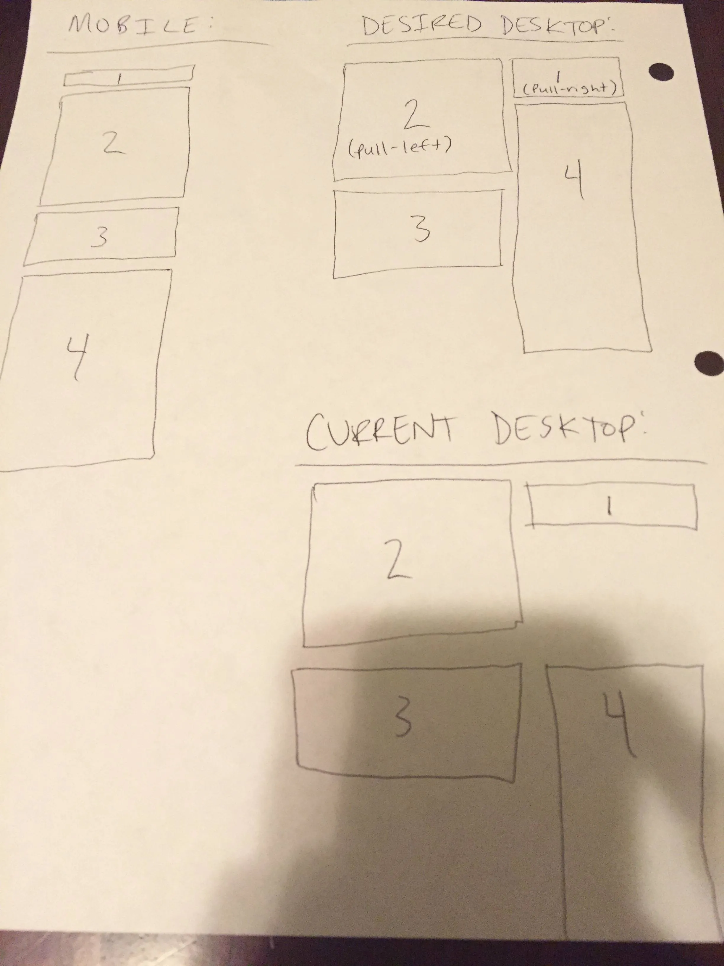 非常感谢任何帮助。提前致谢。
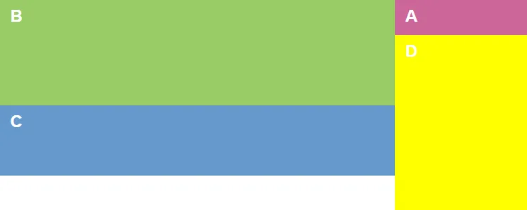
.pull-sm-float类基于Bootstrap的快速浮动。 - Gleb Kemarsky