.shape {
  position: relative;
  width: 200px;
  color: white;
  padding: 8px;
  margin: 4px;
}
.shape.wide {
  width: 300px;
}
.shape svg {
  position: absolute;
  height: 100%;
  width: 100%;
  top: 0px;
  left: 0px;
  z-index: -1;
}
.shape path {
  fill: rgb(128, 0, 128);
}
<div class='shape'>
<svg viewBox='0 0 1 1' preserveAspectRatio='none'>
<path d='M0,0 1,0 0.9,0.5 1,1 0,1z' />
</svg>
Some div with small content</div>
<div class='shape'>
<svg viewBox='0 0 1 1' preserveAspectRatio='none'>
<path d='M0,0 1,0 0.9,0.5 1,1 0,1z' />
</svg>
Some div with large content that wraps around into multiple lines</div>
<div class='shape'>
<svg viewBox='0 0 1 1' preserveAspectRatio='none'>
<path d='M0,0 1,0 0.9,0.5 1,1 0,1z' />
</svg>
Some div with large content that wraps
<br>around into multiple lines
<br>even spanning multiple lines</div>
<div class='shape'>
<svg viewBox='0 0 1 1' preserveAspectRatio='none'>
<path d='M0,0 1,0 0.9,0.5 1,1 0,1z' />
</svg>
Some div with
<br>large content that wraps
<br>around into multiple lines
<br>even spanning
<br>multiple lines</div>
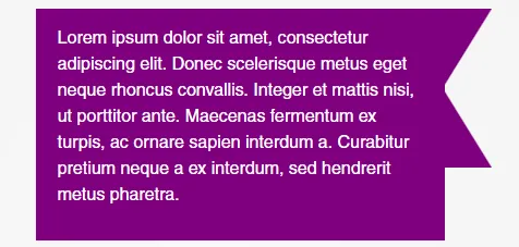
<div class='shape wide'>
<svg viewBox='0 0 1 1' preserveAspectRatio='none'>
<path d='M0,0 1,0 0.9,0.5 1,1 0,1z' />
</svg>
Some div with
<br>large content that wraps
<br>around into multiple lines
<br>even spanning
<br>multiple lines</div>