WPF CheckComboBox使用MahApps.Metro进行样式设置

4

我该如何使用MahApps.Metro样式WPF Extended Toolkit的CheckComboBox?

我的App.xaml文件包含以下内容:

<ResourceDictionary Source="pack://application:,,,/MahApps.Metro;component/Styles/Controls.xaml" />
<ResourceDictionary Source="pack://application:,,,/MahApps.Metro;component/Styles/Fonts.xaml" />
<ResourceDictionary Source="pack://application:,,,/MahApps.Metro;component/Styles/Colors.xaml" />
<ResourceDictionary Source="pack://application:,,,/MahApps.Metro;component/Styles/Accents/Blue.xaml" />
<ResourceDictionary Source="pack://application:,,,/MahApps.Metro;component/Styles/Accents/BaseLight.xaml" />

当我将 CheckComboBox 放在窗口上时,它看起来像这样:enter image description here。而简单的 ComboBox 看起来则是这样的:enter image description here。因此,这两个控件的样式是不同的。
2个回答

3

我创建了一个基于最新的WPF扩展工具包CheckComboBox样式的简单MahApps.Metro自定义样式。它可能不完美,但对我来说很有效™。

结果如下:

enter image description here

这里只是在主窗口的资源标记中简单地添加了样式:

<Window.Resources>
    <xctk:InverseBoolConverter x:Key="InverseBoolConverter" />

    <Style BasedOn="{StaticResource {x:Type xctk:SelectorItem}}" TargetType="{x:Type xctk:SelectorItem}">

        <Setter Property="Foreground" Value="{DynamicResource TextBrush}" />
        <Setter Property="Padding" Value="2" />
        <Setter Property="RenderOptions.ClearTypeHint" Value="Enabled" />
        <Setter Property="Background" Value="{DynamicResource WhiteBrush}" />
        <Setter Property="BorderThickness" Value="0" />

        <Setter Property="Template">
            <Setter.Value>
                <ControlTemplate TargetType="{x:Type xctk:SelectorItem}">
                    <Grid Margin="0,0.5" Background="{TemplateBinding Background}">
                        <Border x:Name="_background"
                                Background="{TemplateBinding Background}"
                                BorderBrush="{TemplateBinding BorderBrush}"
                                BorderThickness="{TemplateBinding BorderThickness}"
                                SnapsToDevicePixels="{TemplateBinding SnapsToDevicePixels}" />
                        <CheckBox Margin="0.5,0"
                                  VerticalAlignment="{TemplateBinding VerticalContentAlignment}"
                                  HorizontalContentAlignment="{TemplateBinding HorizontalContentAlignment}"
                                  Content="{TemplateBinding Content}"
                                  ContentTemplate="{TemplateBinding ContentTemplate}"
                                  ContentTemplateSelector="{TemplateBinding ContentTemplateSelector}"
                                  Foreground="{TemplateBinding Foreground}"
                                  IsChecked="{Binding IsSelected, RelativeSource={RelativeSource TemplatedParent}}"
                                  Padding="{TemplateBinding Padding}" />
                    </Grid>
                    <ControlTemplate.Triggers>
                        <Trigger Property="IsSelected" Value="true">
                            <Setter TargetName="_background" Property="Background" Value="{DynamicResource AccentColorBrush}" />
                            <Setter Property="Foreground" Value="{DynamicResource AccentSelectedColorBrush}" />
                        </Trigger>
                        <Trigger Property="IsMouseOver" Value="true">
                            <Setter TargetName="_background" Property="Background" Value="{DynamicResource AccentColorBrush2}" />
                        </Trigger>
                    </ControlTemplate.Triggers>
                </ControlTemplate>
            </Setter.Value>
        </Setter>
    </Style>

    <Style x:Key="CheckComboBoxToggleButton" TargetType="{x:Type ToggleButton}">
        <Setter Property="OverridesDefaultStyle" Value="true" />
        <Setter Property="IsTabStop" Value="false" />
        <Setter Property="Focusable" Value="false" />
        <Setter Property="Template">
            <Setter.Value>
                <ControlTemplate TargetType="{x:Type ToggleButton}">
                    <Grid>
                        <Border x:Name="Background"
                                Background="{TemplateBinding Background}"
                                BorderBrush="{TemplateBinding BorderBrush}"
                                BorderThickness="{TemplateBinding BorderThickness}"
                                SnapsToDevicePixels="{TemplateBinding SnapsToDevicePixels}" />
                        <Grid Margin="1">
                            <Grid.ColumnDefinitions>
                                <ColumnDefinition Width="*" />
                                <ColumnDefinition Width="0" MinWidth="{Binding RelativeSource={RelativeSource FindAncestor, AncestorType={x:Type Grid}}, Path=ActualHeight, Mode=OneWay}" />
                            </Grid.ColumnDefinitions>

                            <TextBox Margin="1"
                                     HorizontalAlignment="{TemplateBinding HorizontalContentAlignment}"
                                     VerticalAlignment="{TemplateBinding VerticalContentAlignment}"
                                     Background="Transparent"
                                     BorderThickness="0"
                                     Cursor="Arrow"
                                     Focusable="False"
                                     HorizontalScrollBarVisibility="Hidden"
                                     IsReadOnly="True"
                                     Padding="{TemplateBinding Padding}"
                                     SnapsToDevicePixels="{TemplateBinding SnapsToDevicePixels}"
                                     Text="{TemplateBinding Content}"
                                     VerticalScrollBarVisibility="Hidden" />
                            <Grid x:Name="ArrowBackground"
                                  Grid.Column="1"
                                  Background="Transparent">
                                <Path x:Name="Arrow"
                                      Width="8"
                                      Height="4"
                                      HorizontalAlignment="Center"
                                      VerticalAlignment="Center"
                                      Data="F1 M 301.14,-189.041L 311.57,-189.041L 306.355,-182.942L 301.14,-189.041 Z "
                                      Fill="{DynamicResource GrayBrush1}"
                                      IsHitTestVisible="false"
                                      SnapsToDevicePixels="{TemplateBinding SnapsToDevicePixels}"
                                      Stretch="Uniform" />
                            </Grid>
                        </Grid>
                    </Grid>
                    <ControlTemplate.Triggers>
                        <Trigger SourceName="ArrowBackground" Property="IsMouseOver" Value="True">
                            <Setter TargetName="ArrowBackground" Property="Background" Value="{DynamicResource GrayBrush5}" />
                        </Trigger>
                        <Trigger Property="IsMouseOver" Value="True">
                            <Setter TargetName="Background" Property="Background" Value="{DynamicResource GrayBrush8}" />
                        </Trigger>
                        <Trigger Property="IsPressed" Value="True">
                            <Setter TargetName="Background" Property="Background" Value="{DynamicResource GrayBrush7}" />
                        </Trigger>
                        <Trigger Property="IsEnabled" Value="false">
                            <Setter TargetName="Arrow" Property="Fill" Value="#AFAFAF" />
                        </Trigger>
                    </ControlTemplate.Triggers>
                </ControlTemplate>
            </Setter.Value>
        </Setter>
    </Style>

    <Style BasedOn="{StaticResource {x:Type xctk:CheckComboBox}}" TargetType="{x:Type xctk:CheckComboBox}">
        <Setter Property="MinHeight" Value="26" />
        <Setter Property="Foreground" Value="{DynamicResource TextBrush}" />
        <Setter Property="Background" Value="{DynamicResource ControlBackgroundBrush}" />
        <Setter Property="BorderBrush" Value="{DynamicResource TextBoxBorderBrush}" />
        <Setter Property="BorderThickness" Value="1" />
        <Setter Property="ScrollViewer.HorizontalScrollBarVisibility" Value="Auto" />
        <Setter Property="ScrollViewer.VerticalScrollBarVisibility" Value="Auto" />
        <Setter Property="Padding" Value="1" />
        <Setter Property="ScrollViewer.PanningMode" Value="Both" />
        <Setter Property="Stylus.IsFlicksEnabled" Value="False" />
        <Setter Property="VerticalContentAlignment" Value="Center" />
        <Setter Property="HorizontalContentAlignment" Value="Stretch" />
        <Setter Property="FontFamily" Value="{DynamicResource ContentFontFamily}" />
        <Setter Property="FontSize" Value="{DynamicResource ContentFontSize}" />
        <Setter Property="SnapsToDevicePixels" Value="True" />
        <Setter Property="Validation.ErrorTemplate" Value="{DynamicResource ValidationErrorTemplate}" />
        <Setter Property="ScrollViewer.CanContentScroll" Value="False" />
        <Setter Property="Controls:ControlsHelper.FocusBorderBrush" Value="{DynamicResource ComboBoxMouseOverInnerBorderBrush}" />
        <Setter Property="Controls:ControlsHelper.MouseOverBorderBrush" Value="{DynamicResource TextBoxMouseOverBorderBrush}" />
        <Setter Property="Template">
            <Setter.Value>
                <ControlTemplate TargetType="{x:Type xctk:CheckComboBox}">
                    <Grid x:Name="MainGrid" SnapsToDevicePixels="{TemplateBinding SnapsToDevicePixels}">
                        <Popup x:Name="PART_Popup"
                               AllowsTransparency="true"
                               Focusable="False"
                               IsOpen="{Binding IsDropDownOpen, Mode=TwoWay, RelativeSource={RelativeSource TemplatedParent}}"
                               Placement="Bottom"
                               PopupAnimation="{DynamicResource {x:Static SystemParameters.ComboBoxPopupAnimationKey}}"
                               StaysOpen="False">
                            <Grid MinWidth="{Binding ActualWidth, ElementName=MainGrid}" MaxHeight="{Binding MaxDropDownHeight, RelativeSource={RelativeSource TemplatedParent}}">
                                <Border x:Name="DropDownBorder"
                                        Height="Auto"
                                        Background="{DynamicResource WhiteBrush}"
                                        BorderBrush="{DynamicResource ComboBoxPopupBrush}"
                                        BorderThickness="{TemplateBinding BorderThickness}"
                                        Effect="{DynamicResource DropShadowBrush}" />
                                <ScrollViewer x:Name="DropDownScrollViewer"
                                              BorderThickness="0"
                                              Padding="1">
                                    <ItemsPresenter x:Name="PART_ItemsPresenter"
                                                    KeyboardNavigation.DirectionalNavigation="Contained"
                                                    SnapsToDevicePixels="{TemplateBinding SnapsToDevicePixels}" />
                                </ScrollViewer>
                            </Grid>
                        </Popup>

                        <Border Background="{TemplateBinding Background}"
                                BorderBrush="{TemplateBinding BorderBrush}"
                                BorderThickness="{TemplateBinding BorderThickness}"
                                SnapsToDevicePixels="{TemplateBinding SnapsToDevicePixels}" />

                        <ToggleButton x:Name="PART_DropDownButton"
                                      Margin="0"
                                      VerticalAlignment="Stretch"
                                      HorizontalContentAlignment="{TemplateBinding HorizontalContentAlignment}"
                                      VerticalContentAlignment="{TemplateBinding VerticalContentAlignment}"
                                      Background="{TemplateBinding Background}"
                                      BorderBrush="{TemplateBinding BorderBrush}"
                                      BorderThickness="{TemplateBinding BorderThickness}"
                                      Content="{TemplateBinding Text}"
                                      Focusable="False"
                                      Foreground="{TemplateBinding Foreground}"
                                      IsChecked="{Binding IsDropDownOpen, Mode=TwoWay, RelativeSource={RelativeSource TemplatedParent}}"
                                      IsHitTestVisible="{Binding IsDropDownOpen, RelativeSource={RelativeSource TemplatedParent}, Converter={StaticResource InverseBoolConverter}}"
                                      Padding="{TemplateBinding Padding}"
                                      SnapsToDevicePixels="{TemplateBinding SnapsToDevicePixels}"
                                      Style="{DynamicResource CheckComboBoxToggleButton}" />

                        <Border x:Name="FocusBorder"
                                Background="{x:Null}"
                                BorderBrush="{TemplateBinding BorderBrush}"
                                BorderThickness="{TemplateBinding BorderThickness}"
                                SnapsToDevicePixels="{TemplateBinding SnapsToDevicePixels}"
                                Visibility="Collapsed" />
                        <Border x:Name="DisabledVisualElement"
                                Background="{DynamicResource ControlsDisabledBrush}"
                                BorderBrush="{DynamicResource ControlsDisabledBrush}"
                                BorderThickness="{TemplateBinding BorderThickness}"
                                IsHitTestVisible="False"
                                Opacity="0.6"
                                SnapsToDevicePixels="{TemplateBinding SnapsToDevicePixels}"
                                Visibility="Collapsed" />
                    </Grid>

                    <ControlTemplate.Triggers>
                        <Trigger Property="IsMouseOver" Value="True">
                            <Setter TargetName="FocusBorder" Property="Visibility" Value="Visible" />
                            <Setter TargetName="FocusBorder" Property="BorderBrush" Value="{Binding RelativeSource={RelativeSource TemplatedParent}, Path=(Controls:ControlsHelper.MouseOverBorderBrush)}" />
                        </Trigger>
                        <Trigger Property="IsFocused" Value="True">
                            <Setter TargetName="FocusBorder" Property="Visibility" Value="Visible" />
                            <Setter TargetName="FocusBorder" Property="BorderBrush" Value="{Binding RelativeSource={RelativeSource TemplatedParent}, Path=(Controls:ControlsHelper.FocusBorderBrush)}" />
                        </Trigger>
                        <Trigger Property="IsKeyboardFocusWithin" Value="True">
                            <Setter TargetName="FocusBorder" Property="Visibility" Value="Visible" />
                            <Setter TargetName="FocusBorder" Property="BorderBrush" Value="{Binding RelativeSource={RelativeSource TemplatedParent}, Path=(Controls:ControlsHelper.FocusBorderBrush)}" />
                        </Trigger>
                        <Trigger Property="IsEnabled" Value="False">
                            <Setter TargetName="DisabledVisualElement" Property="Visibility" Value="Visible" />
                        </Trigger>
                    </ControlTemplate.Triggers>
                </ControlTemplate>
            </Setter.Value>
        </Setter>
    </Style>
</Window.Resources>

非常好的回答,加一分,但请注意您缺少了 
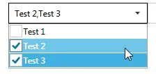
DisplayMemberPath。请参考我的回答:https://dev59.com/TpLea4cB1Zd3GeqP8_fW#45377886 - Jan 'splite' K.

2

excellent punker的回答 的基础上补充一点:

punker的回答缺少了DisplayMemberPath属性,但是不用担心! :) 只需要在CheckBox内添加<ContentPresenter />即可(同时删除TemplateBinding.Content,因为它会忽略DisplayMemberPath):

(...)
    <Style BasedOn="{StaticResource {x:Type xctk:SelectorItem}}" TargetType="{x:Type xctk:SelectorItem}">

(...)
      <Setter Property="Template">
        <ControlTemplate>
(...)                
          <CheckBox Margin="0.5,0"
                    VerticalAlignment="{TemplateBinding VerticalContentAlignment}"
                    HorizontalContentAlignment="{TemplateBinding HorizontalContentAlignment}"
                    ContentTemplate="{TemplateBinding ContentTemplate}"
                    ContentTemplateSelector="{TemplateBinding ContentTemplateSelector}"
                    Foreground="{TemplateBinding Foreground}"
                    IsChecked="{Binding IsSelected, RelativeSource={RelativeSource TemplatedParent}}"
                    Padding="{TemplateBinding Padding}">
            <ContentPresenter />
          </CheckBox>
(...)
      </ControlTemplate>
    </Style>
(...)

网页内容由stack overflow 提供, 点击上面的
可以查看英文原文,
原文链接