Angular Material - 更改选中的 mat-list-option 的颜色

10
如何更改mat-list-option中所选选项的颜色?目前我有类似这样的东西: 当前列表 enter image description here 
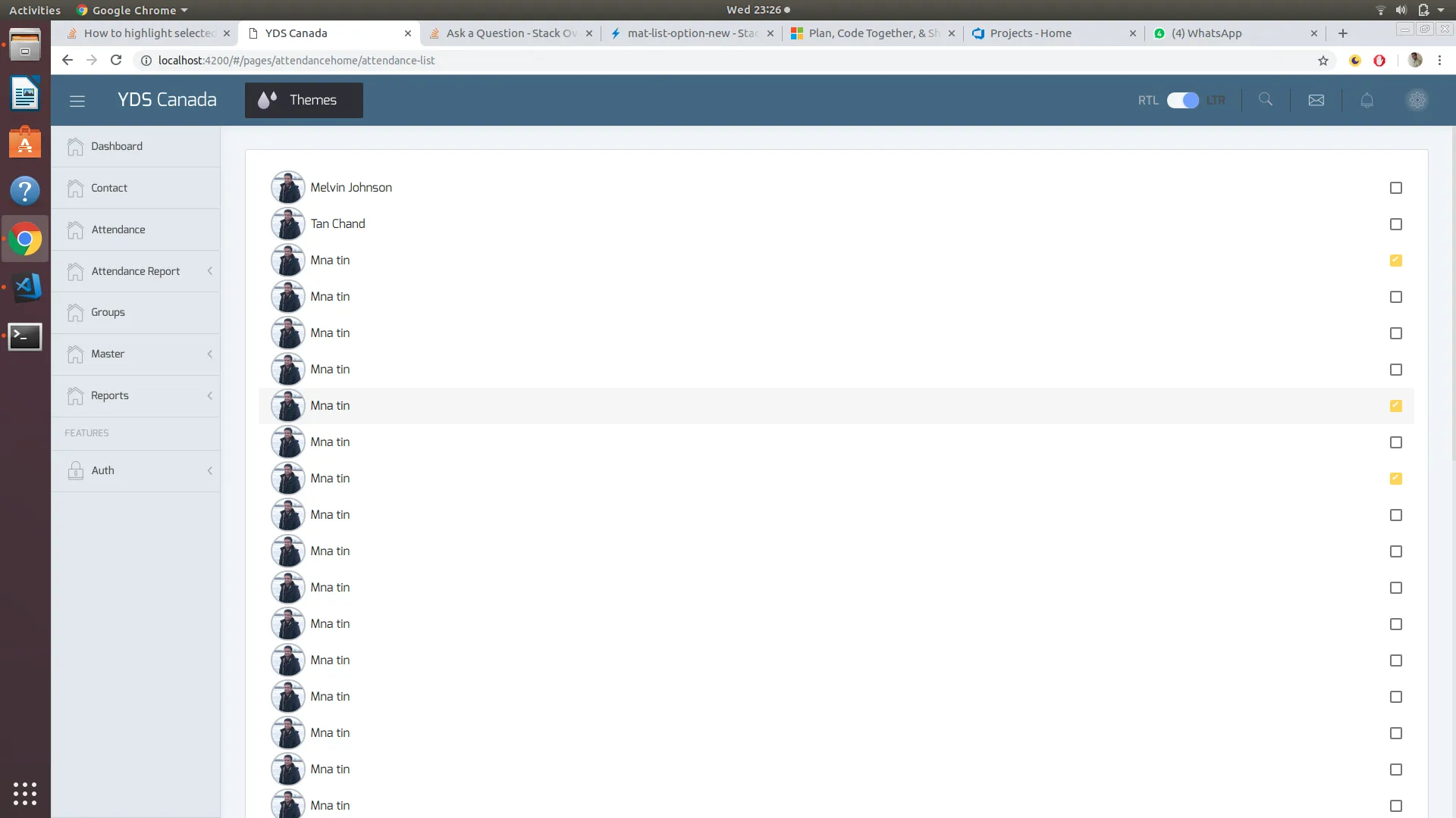
我想在选择时将整个选项或卡片的颜色更改为绿色。类似于这样:enter image description here 我的代码是这样的:
<mat-selection-list #list>
    <mat-list-option *ngFor="let yuvak of yuvaks">
    {yuvak.name}
    {yuvak.phonenumber}
     </mat-list-option>
</mat-selection-list>
5个回答

18
你可以使用来自mat-list-option标签的aria-selected="true"属性来选择目标选项,并为其提供相应的CSS属性。
mat-list-option[aria-selected="true"] {
  background: rgba(0, 139, 139, 0.7);
}

Stackblitz 工作演示


我还没有实现,但从演示中我认为这会起作用。不过,我在哪里可以找到关于类似aria-selected属性的文档? - Tanmay Parmar
请搜索网络,因为每当我检查 mat-list-option 时发现 DOM 更改时,我找到了这个属性的触发器,所以我继续使用该属性来样式化 mat-list-option 标记。 - Abhishek Kumar
@TanmayParmar请也为答案点赞,这对寻找答案的用户有帮助。 - Abhishek Kumar
很棒的解决方案。我一直在使用TypeScript中的一种方法,它接受一个项目并检查它是否在所选项目列表中,但是针对Angular已经提供的实际属性更好。感谢您指出这一点。 - SleekPanther

7

下拉菜单:

mat-list-option具有mat-option.mat-active,当选项处于活动状态时会触发,而mat-option.mat-selected则表示选中的选项。根据需要,添加以下内容到您的CSS中以修改活动或选中的样式。

.mat-option.mat-active {
  background: blue !important;
}

.mat-option.mat-selected {
  background: red !important;
}

我是一个有用的助手,可以翻译文本。

工作 演示

选择列表:

选择列表具有aria-selected属性,默认为false。如果您选择该项目,则会更改为true。您只需要设置以下CSS即可:

.mat-list-option[aria-selected="true"] {
  background: rgba(200, 210, 90, 0.7);
}

正在工作 演示


我正在使用选择列表。这是下拉菜单。 - Tanmay Parmar
@TanmayParmar,帮我编辑一下我的答案,使之包含选择列表。 - Maihan Nijat

5
所接受的答案效果很好,但它使用了一个硬编码的颜色值background: rgba(0, 139, 139, 0.7))。如果你决定切换到另一个预构建材料主题或使用自定义主题(如美化你的 Angular Material 应用程序页面所述),这种方法实际上会破坏你的样式和颜色。
因此,如果你使用SCSS,可以在组件的样式文件中使用以下代码:
@import '~@angular/material/theming';

mat-list-option[aria-selected="true"] {
  background: mat-color($mat-light-theme-background, hover, 0.12);
}

上述代码改编自“mat-select options” - 以此方式,整个应用程序将具有一致的外观: `.mat-option.mat-selected:not(.mat-option-multiple) { background: mat-color($background, hover, 0.12);}` 演示: https://stackblitz.com/edit/material-selection-list-5-0-0-selection-color-change-qaq1xr 或者,如果您使用深色主题,请按以下方式更改代码:
mat-list-option[aria-selected="true"] {
  background: mat-color($mat-dark-theme-background, hover, 0.12);
}

演示: https://stackblitz.com/edit/material-selection-list-5-0-0-selection-color-change-w8beng

如果您想要使用自定义颜色,建议从Material规格中选择一个颜色,这些颜色也在Angular Material Design的scss中公开。

$primaryPalette: mat-palette($mat-green);

mat-list-option[aria-selected="true"] {
  background: mat-color($primaryPalette, 500);
}

演示: https://stackblitz.com/edit/material-selection-list-5-0-0-selection-color-change-tt3nyj

该链接是一个演示程序,展示了如何更改Angular Material中列表选择器组件的选定项颜色。

1
有时使用[aria-selected]似乎过于“晦涩难懂”。
您还可以获取节点的选定状态,并根据需要使用它。
示例1:您有一个子组件需要传递状态。
<mat-list-option #option>

   <app-custom-list-option-widget [selected]="option.selected"></app-custom-list-option-widget>

</mat-list-option>

示例2: 您想设置自定义CSS类,而不是使用[aria-selected]

.is-selected { color: red; }

然后在模板中:
<mat-list-option #option>

   <span [class.is-selected]="option.selected"> Option text </span>

</mat-list-option>

0

关于 mat-list-option 属性 CSS 更改,

要更改 onHover CSS:

   .mat-list-option:hover {
      width: 270px!important;
    }

更改OnActive的CSS:

 .mat-list-option[aria-selected="true"] {
      width: 270px!important;
    }
    .mat-list-option:active,
    .mat-list-text:active{
    background-color: none!important;
    }

网页内容由stack overflow 提供, 点击上面的
可以查看英文原文,
原文链接