在plotly.js中是否有可能给刻度标签留更多空间?我的图表中的长标签被裁剪了。
HTML:
<div id="plot"></div>
JavaScript:
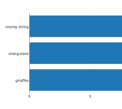
var data = [{
  type: 'bar',
  x: [20, 14, 23],
  y: ['giraffes', 'orangutans', 'a looooooooong string'],
  orientation: 'h'
}];

var layout = {
  title: 'Bar Chart'
};

Plotly.newPlot('plot', data, layout);
我不知道如何在y轴刻度设置API中实现此操作。
考虑到我的图表性质,我需要使用水平方向的刻度。所以,我不能使用垂直方向并将刻度旋转90度的解决方案。