我想出了一种使用SlidingPaneLayout实现小型导航抽屉的方法。
创建一个布局资源文件并将SlidingPaneLayout设置为父视图。SlidingPaneLayout需要两个子视图:主视图和详细视图。主视图将包含所有菜单选项的列表,详细视图将包含内容。
<?xml version="1.0" encoding="utf-8"?>
<android.support.v4.widget.SlidingPaneLayout
xmlns:android="http://schemas.android.com/apk/res/android"
android:layout_width="match_parent"
android:layout_height="match_parent">
<fragment
android:name="com.ng.anthony.mininavigationdrawer.MasterFragment"
android:layout_width="220dp"
android:layout_height="match_parent"
android:id="@+id/fragment_master">
</fragment>
<FrameLayout
android:layout_width="1000dp"
android:layout_height="match_parent"
android:layout_marginLeft="56dp">
</FrameLayout>
</android.support.v4.widget.SlidingPaneLayout>
创建一个主片段类。在您的主片段中,应该有一个包含所有菜单选项的列表视图。
public class MasterFragment extends ListFragment {

    public View onCreateView (LayoutInflater inflater, ViewGroup container, Bundle savedInstanceState) {
        View view = inflater.inflate(R.layout.fragment_master, container);

        setListAdapter(new MenuListAdapter(R.layout.row_menu_action_item, getActivity(), MenuActionItem.values()));
        return view;
    }
}
将主片段布局添加到您的布局资源文件夹中。
<?xml version="1.0" encoding="utf-8"?>
<LinearLayout xmlns:android="http://schemas.android.com/apk/res/android"
    android:orientation="vertical" android:layout_width="match_parent"
    android:layout_height="match_parent">

    <ListView
        android:id="@android:id/list"
        android:layout_width="match_parent"
        android:layout_height="match_parent"
        android:background="@android:color/darker_gray"
        android:divider="@null">
    </ListView>

</LinearLayout>
主片段包含一个列表视图,并使用菜单选项的枚举来填充列表。
public enum MenuActionItem {
    ITEM1,
    ITEM2,
    ITEM3,
    ITEM4,
    ITEM5
}
主碎片还包含自定义数组适配器,用于显示菜单选项列表。自定义数组适配器为每个菜单选项填充一行布局。
import android.app.Activity;
import android.view.MenuItem;
import android.view.View;
import android.view.ViewGroup;
import android.widget.ArrayAdapter;
import android.widget.ImageView;
import android.widget.TextView;
import java.util.ArrayList;
public class MenuListAdapter extends ArrayAdapter<MenuActionItem> {
int resource;
Activity activity;
public MenuListAdapter(int resource, Activity activity, MenuActionItem[] items) {
super(activity, resource, items);
this.resource = resource;
this.activity = activity;
}
public View getView (int position, View convertView, ViewGroup parent) {
View rowView = convertView;
if(rowView == null) {
rowView = activity.getLayoutInflater().inflate(resource, null);
MenuItemViewHolder viewHolder = new MenuItemViewHolder();
viewHolder.menuItemImageView = (ImageView)rowView.findViewById(R.id.menu_item_image_view);
viewHolder.menuItemTextView = (TextView)rowView.findViewById(R.id.menu_item_text_view);
rowView.setTag(viewHolder);
}
MenuItemViewHolder holder = (MenuItemViewHolder)rowView.getTag();
if(position == MenuActionItem.ITEM1.ordinal()) {
holder.menuItemImageView.setImageDrawable(activity.getDrawable(R.drawable.ic_payment_white_24dp));
holder.menuItemTextView.setText(activity.getResources().getString(R.string.item1));
}
else if(position == MenuActionItem.ITEM2.ordinal()) {
holder.menuItemImageView.setImageDrawable(activity.getDrawable(R.drawable.ic_pets_white_24dp));
holder.menuItemTextView.setText(activity.getResources().getString(R.string.item2));
}
else if(position == MenuActionItem.ITEM3.ordinal()) {
holder.menuItemImageView.setImageDrawable(activity.getDrawable(R.drawable.ic_receipt_white_24dp));
holder.menuItemTextView.setText(activity.getResources().getString(R.string.item3));
}
else if(position == MenuActionItem.ITEM4.ordinal()) {
holder.menuItemImageView.setImageDrawable(activity.getDrawable(R.drawable.ic_shopping_cart_white_24dp));
holder.menuItemTextView.setText(activity.getResources().getString(R.string.item4));
}
else if(position == MenuActionItem.ITEM5.ordinal()) {
holder.menuItemImageView.setImageDrawable(activity.getDrawable(R.drawable.ic_work_white_24dp));
holder.menuItemTextView.setText(activity.getResources().getString(R.string.item5));
}
return rowView;
}
private static class MenuItemViewHolder {
public ImageView menuItemImageView;
public TextView menuItemTextView;
}
}
添加行布局
<?xml version="1.0" encoding="utf-8"?>
<LinearLayout xmlns:android="http://schemas.android.com/apk/res/android"
    android:orientation="horizontal" android:layout_width="match_parent"
    android:layout_height="match_parent"
    android:padding="16dp"
    android:gravity="center_vertical">

    <ImageView
        android:id="@+id/menu_item_image_view"
        android:layout_width="24dp"
        android:layout_height="24dp"
        android:layout_marginRight="16dp"/>

    <TextView
        android:id="@+id/menu_item_text_view"
        android:layout_width="wrap_content"
        android:layout_height="wrap_content"
        android:textSize="16sp"
        android:textColor="@android:color/white"/>

</LinearLayout>
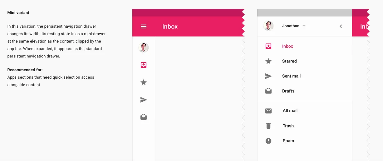
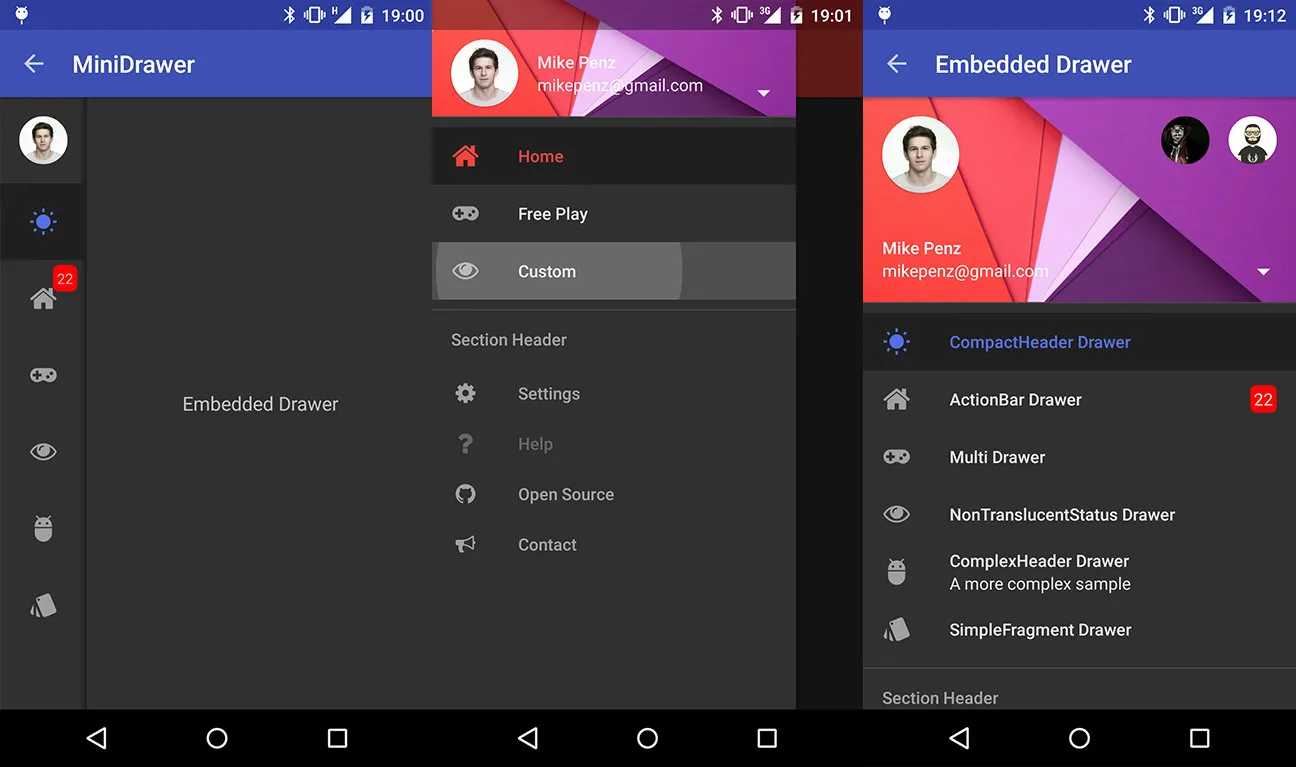
最终你应该看到类似这样的东西

你可以在这里下载示例项目:
https://github.com/nganthony/MiniNavigationDrawer
NavigationDrawer来实现这个?我怀疑这样做不会有用,至少如果你想与上面的图片相匹配的话。NavigationDrawer目前还没有实现迷你抽屉功能,至少据我所知。个人而言,我宁愿采用完全自定义的实现方式。 - Xaver KapellerRecyclerView或ListView,以及两个动画,可以折叠和展开RecyclerView或ListView,同时将其移动到Toolbar上方或下方。一点也不复杂。 - Xaver KapellerFrameLayout及其前景Drawable来绘制透明黑色覆盖其内容。 - Xaver Kapeller