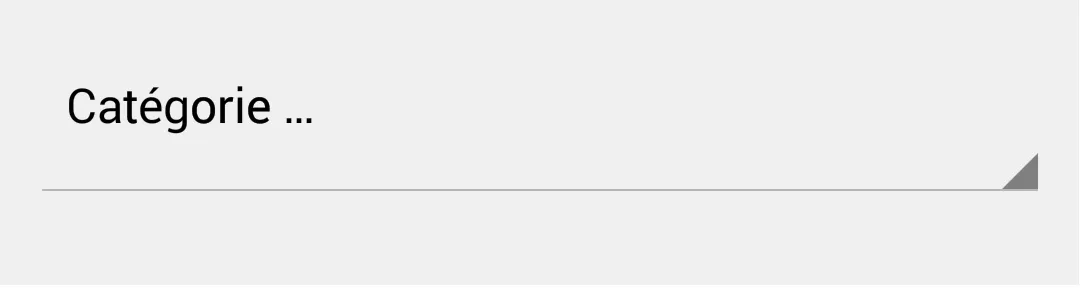
我读了很多关于它的东西,但找不到我需要的东西。我想保留灰色箭头,但是想要从默认样式中删除水平条,并拥有白色背景。你有任何想法如何做到这一点吗?
以下是我现在所拥有的(默认旋转器样式):
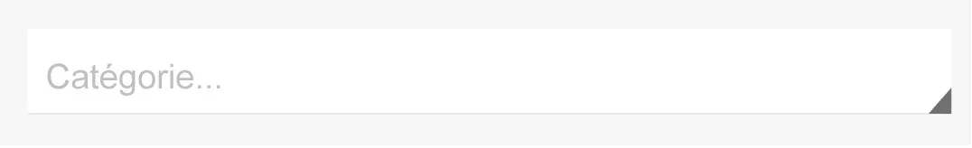
以下是我想要的:
我读了很多关于它的东西,但找不到我需要的东西。我想保留灰色箭头,但是想要从默认样式中删除水平条,并拥有白色背景。你有任何想法如何做到这一点吗?
以下是我现在所拥有的(默认旋转器样式):
以下是我想要的:
我根据 @Mansur Khan 的答案做了一点修改。
在这种情况下,我们不必添加一个 ImageView,因为 spinner 已经有一个三角形箭头。所以请查看下面的代码:
    <RelativeLayout
        android:layout_width="match_parent"
        android:layout_height="wrap_content"
        android:padding="8dp"
        android:background="#FFFFFF">
        <Spinner
            style="@style/Widget.AppCompat.DropDownItem.Spinner"
            android:layout_width="match_parent"
            android:layout_height="70dp"
            android:id="@+id/sign_up_country"
            />
    </RelativeLayout>
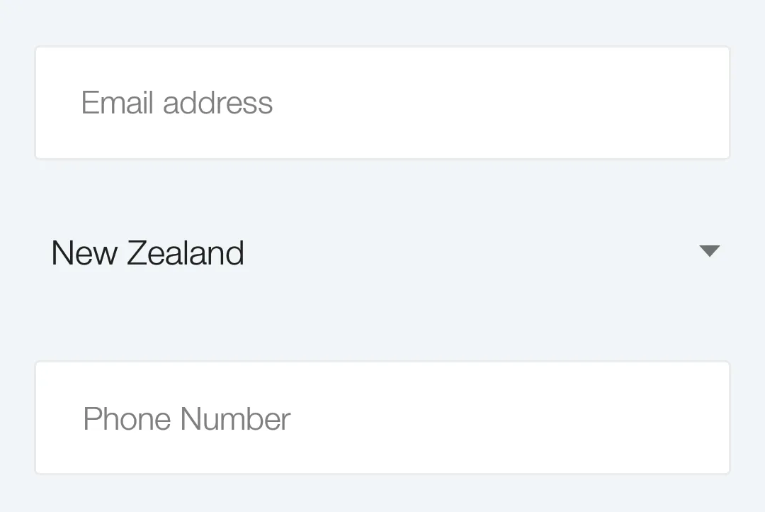
这是屏幕截图
之前:
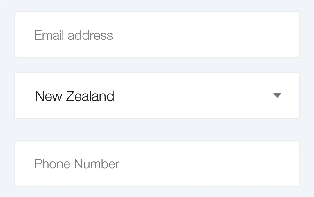
之后:
记录一下,我找到了一个简单的解决方法:将你的选项卡包装在一个相对布局中,并添加一张图片:
 <RelativeLayout
     android:layout_width="fill_parent"
     android:layout_height="wrap_content"
     android:background="@drawable/borderbottom_white"<!-- white background with bottom border -->
     android:layout_marginTop="15dp"  >
        <Spinner
        android:id="@+id/postfield_category"
        android:layout_width="fill_parent"
        android:layout_height="wrap_content"
        android:textSize="16sp"
        android:background="@null"
        android:minHeight="0dp" />
        <ImageView
         android:layout_width="wrap_content"
        android:layout_height="wrap_content"
        android:layout_alignParentBottom="true"
        android:layout_alignParentRight="true"
        android:src="@drawable/arrowspinner" />
    </RelativeLayout>
一个简单的解决方案是不需要创建自己的箭头drawable,而是将下拉框包装在一个RelativeLayout中,并在RelativeLayout中设置背景颜色,而不是在下拉框中设置:
<RelativeLayout
    android:layout_width="wrap_content"
    android:layout_height="wrap_content"
    android:background="#f00" >
    <Spinner
        android:id="@+id/spinner1"
        android:layout_width="wrap_content"
        android:layout_height="wrap_content" />
</RelativeLayout>
yourspinner.setOnItemSelectedListener(this);
@Override
public void onItemSelected(AdapterView<?> arg0, View arg1, int arg2,
        long arg3) {
    ((TextView) yourspinner.getSelectedView()).setBackgroundColor(getResources()
            .getColor(R.color.your_color));
}
你的类应该实现OnItemSelectedListener接口。
我认为在不进行复杂布局的情况下,最好的方法是:
使用此xml作为您的下拉框背景,您就可以开始了!!!
<item android:state_pressed="true">
    <shape>
        <solid android:color="@color/materialBlueGray600" />
        <corners android:radius="3dp" />
    </shape>
</item>
<item android:state_selected="true">
    <shape>
        <solid android:color="@color/materialGray50" />
        <corners android:radius="3dp" />
    </shape>
</item>
<item>
    <layer-list>
        <item>
            <shape>
                <solid android:color="@color/materialGray50" />
                <corners android:radius="3dp" />
            </shape>
        </item>

        <item android:gravity="right">
            <bitmap android:antialias="true"  android:gravity="right" android:src="@drawable/ic_expand_small" />
        </item>
    </layer-list>
</item>
您可以不必将Spinner组件包裹在LinearLayout、RelativeLayout等父布局中,从而增加布局解析次数。您只需在drawable文件夹下创建一个名为spinner_bg.xml的drawable即可。
<?xml version="1.0" encoding="utf-8"?>
<layer-list xmlns:android="http://schemas.android.com/apk/res/android" >
    <item>
        <bitmap
            android:layout_width="wrap_content"
            android:layout_height="wrap_content"
            android:gravity="right"
            android:src="@drawable/icn_dropdown_arw" />
    </item>
</layer-list>
将spinner_bg设置为您的spinner的背景,它会完美运作:
<Spinner
     android:layout_width="match_parent"
     android:layout_height="wrap_content"
     android:padding="5dp"
     android:background="@drawable/spinner_bg" />
以下是自定义下拉列表的代码,请查看并告诉我。我还没有测试过,所以请在检查后通知我是否解决了您的问题。
<Spinner
    android:layout_width="match_parent"
    android:layout_height="match_parent"
    android:background="@drawable/spinner_background"
    android:gravity="center"
    android:paddingRight="10dp"
    android:spinnerMode="dropdown"
    android:textColor="your text color"
    android:textSize="your text size" />
<?xml version="1.0" encoding="utf-8"?>
<layer-list xmlns:android="http://schemas.android.com/apk/res/android" >

    <item>
        <shape android:shape="rectangle" >
            <solid android:color="border color" />

            <corners android:radius="3dp" />
        </shape>
    </item>
    <item
        android:bottom="1dp"
        android:left="1dp"
        android:right="1dp"
        android:top="1dp">
        <shape android:shape="rectangle" >
            <solid android:color="@android:color/white" />

            <corners android:radius="3dp" />
        </shape>
    </item>

</layer-list>
编辑:
请查看此链接,了解如何进行操作。 自定义旋转器背景
或者您也可以尝试这样做。
<RelativeLayout
     android:layout_width="fill_parent"
     android:layout_height="wrap_content"
     android:background="spinner background image">

        <Spinner
        android:layout_width="match_parent"
        android:layout_height="match_parent"
        android:background="@null"/>

        <ImageView
         android:layout_width="wrap_content"
        android:layout_height="wrap_content"
        android:layout_alignParentBottom="true"
        android:layout_alignParentRight="true"
        android:src="arrow image" />

    </RelativeLayout>
  <LinearLayout
        android:layout_width="0dp"
        android:layout_height="match_parent"
        android:layout_weight=".6"
        android:background="@drawable/edit_text_rounded_shape"
        android:gravity="center|center_vertical">
    <Spinner
        android:id="@+id/spinerComanyName"
        android:layout_width="0dp"
        android:layout_height="wrap_content"
        android:padding="4dp"
        android:layout_weight=".6"
        android:layout_gravity="center"

        android:entries="@array/spinner_item"
        android:spinnerMode="dropdown"
        android:theme="@style/Spinner"

        />
   </LinearLayout>

   <style name="Spinner">
    <!-- Used for the bottom line when not selected / focused -->
    <item name="colorControlNormal">@color/black</item>
    <item name="colorControlActivated">@color/colorPrimary</item>
    <!-- colorControlActivated & colorControlHighlight use the colorAccent          color by default -->
   </style>
edit_text_rounded_shape提供背景颜色和圆角
   <?xml version="1.0" encoding="utf-8"?>

   <shape xmlns:android="http://schemas.android.com/apk/res/android"
         android:shape="rectangle" android:padding="10dp">
         <solid android:color="@color/white"/>
         <stroke android:color="@color/grey"/>
     <corners
     android:bottomRightRadius="15dp"
     android:bottomLeftRadius="15dp"
     android:topLeftRadius="15dp"
     android:topRightRadius="15dp"/>
  </shape>
       android:layout_alignParentRight="true"
        android:layout_width="@dimen/spinner_width"
        android:layout_height="wrap_content"
        android:id="@+id/spnLocation"
        android:entries="@array/labelFamily"
        android:layout_centerVertical="true"

        android:backgroundTint="@color/color_gray"
this work for me
如果您想了解更完整的过程,并查看一些示例XML文件,请参考我的相关答案:
getView()方法中填充.xml文件。 - Rustamimage并将该图像设置为该旋转器的background。 - Kaushik