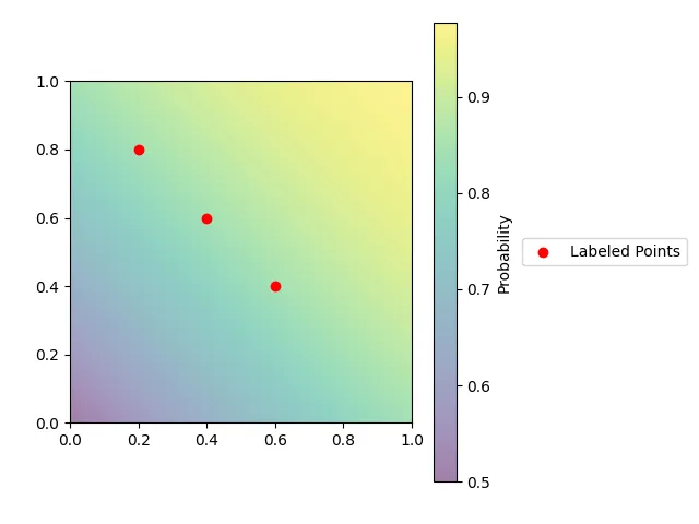
我有一个带有色条和图例的图表。我希望将图例放置在色条右侧的图表外面。为了实现这一目标,我使用了bbox_to_anchor参数,但是这会导致图例被裁剪:
import matplotlib.pyplot as plt
import numpy as np
from scipy.stats import norm

_, ax = plt.subplots()

extent = np.r_[0, 1, 0, 1]
space = np.linspace(0, 1)
probs = np.array([[norm.cdf(x + y) for x in space] for y in space])
colormap = ax.imshow(probs, aspect="auto", origin="lower", extent=extent, alpha=0.5)
colorbar = plt.colorbar(colormap, ax=ax)
colorbar.set_label(f"Probability")
ax.scatter(
    [0.2, 0.4, 0.6], [0.8, 0.6, 0.4], color="r", label="Labeled Points",
)
plt.legend(loc="center left", bbox_to_anchor=(1.3, 0.5))
plt.title
plt.show()
被裁剪的图例绘图
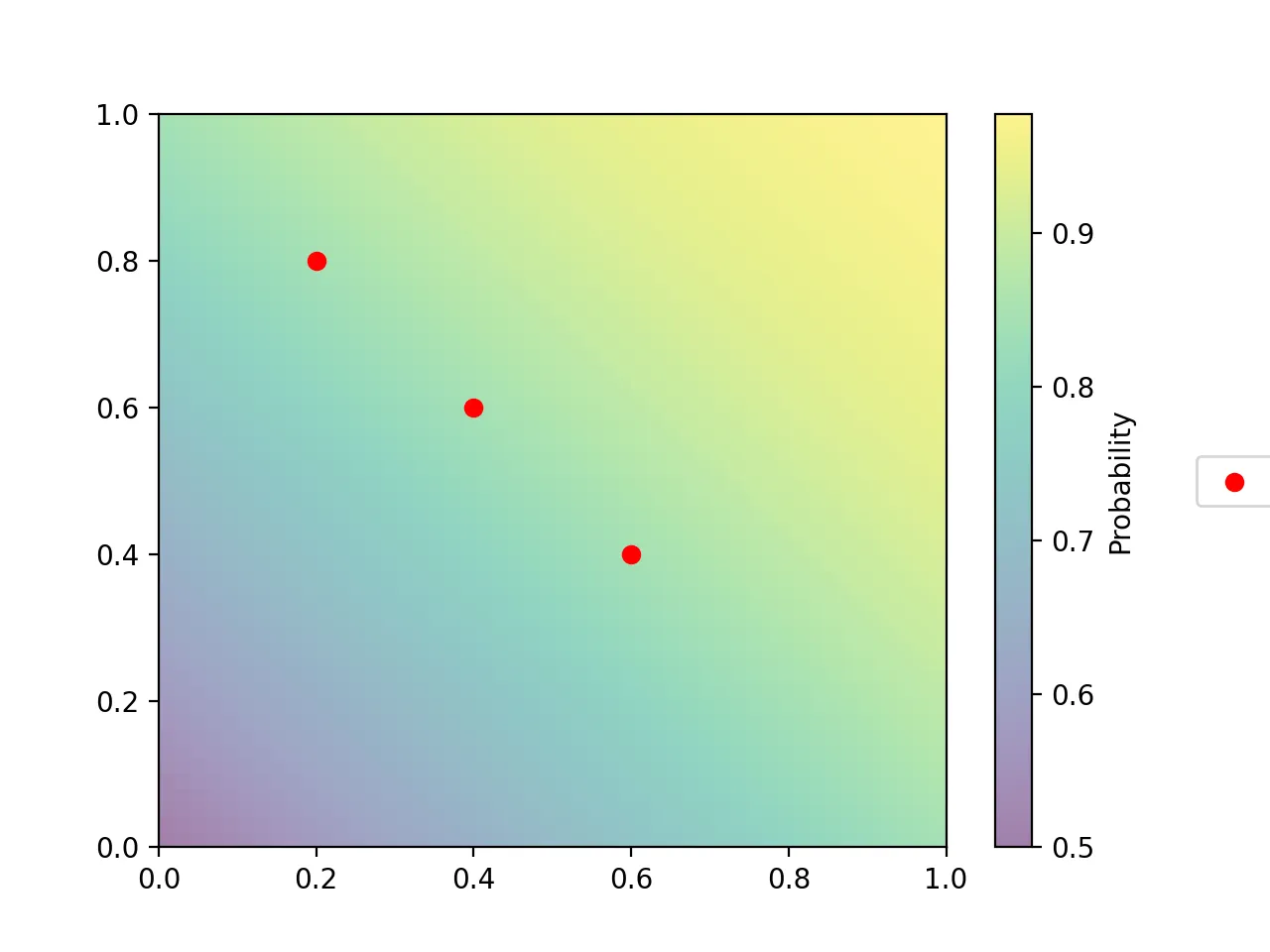
为了修复图例,可以在 plt.show() 之前插入一个调用 plt.tight_layout() 的代码,但这会导致宽高比被扭曲:
宽高比失真的绘图
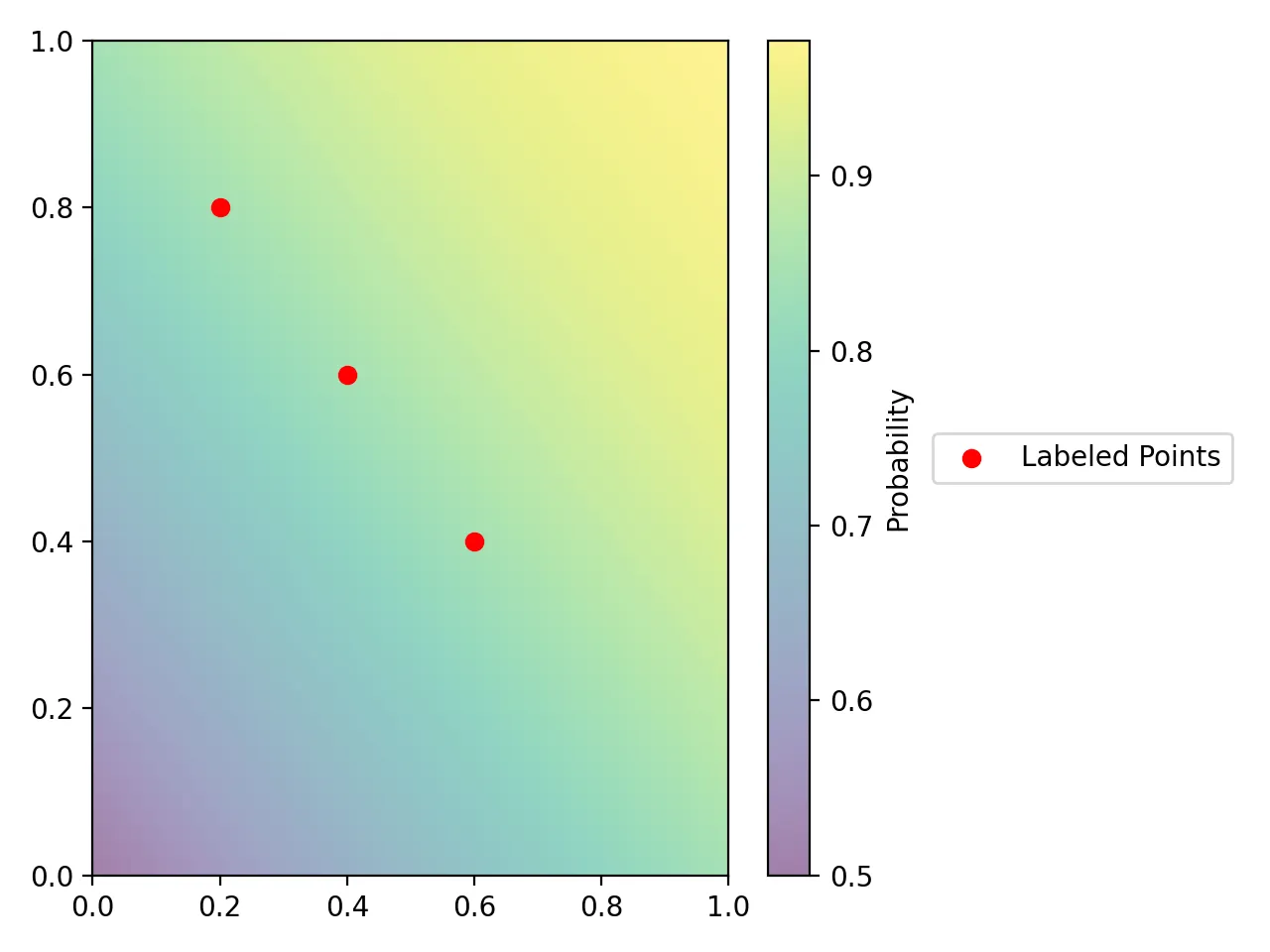
如何显示整个图例并保留坐标轴的宽高比?