现代浏览器可以包含 Emoji 字符,但如何将其设置为单色并选择颜色呢?
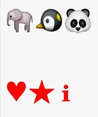
例如,这里有一些 Emoji 和一些常规(平面0)Unicode 符号。所有符号都应该是红色的,但只有普通符号呈现为红色。
相关HTML + CSS代码:
<p>

</p>
<p>
  ♥★ℹ
</div>

p {
  font-size: 3em;
  color: red
}
现代浏览器可以包含 Emoji 字符,但如何将其设置为单色并选择颜色呢?
例如,这里有一些 Emoji 和一些常规(平面0)Unicode 符号。所有符号都应该是红色的,但只有普通符号呈现为红色。
相关HTML + CSS代码:
<p>
</p>
<p>
♥★ℹ
</div>
p {
font-size: 3em;
color: red
}
是的,你可以给它们上色!
div {
  color: transparent;
  text-shadow: 0 0 0 red;
}<div></div>color: transparent样式不能起作用。所有普通文本都会变成透明的,但完整的彩色表情符号不受影响。 - Patrick Horn并非每个表情符号都能以相同的方式工作。一些是旧的文本符号,现在具有(可选或默认的)彩色表示,而其他一些则明确地仅作为表情符号。这意味着一些Unicode码点应该有两种可能的表示形式,即文本和表情符号。作者和用户应该能够表达他们更喜欢哪一个。目前,这通常使用否则不可见的变量选择器 U+FE0E(文本,VS-15)和U+FE0F(表情符号,VS-16)来完成,但已经提出了更高级别的解决方案(例如CSS)。
文本样式的表情符号是单色的,应该显示在前景色中,即在CSS中使用currentcolor,就像任何其他字形一样。Unicode联盟提供了一个按样式分类的表情符号概述(Beta版本)。您可以在HTML中附加︎,以选择带有“默认文本样式; 具有VSs”和“默认表情符号样式; 具有VSs”标签列中的任何内容的文本变体。但这并不包括示例表情符号和许多其他表情符号。
p {
  color: red; font-size: 3em; margin: 0;
  text-transform: text;           /* proposed */
  font-variant-emoji: text;       /* proposed */
  font-variant-color: monochrome; /* proposed */
  font-color: monochrome;         /* proposed */
  font-palette: dark;             /* drafted for CSS Fonts Level 4 */
}
p.hack {
  color: rgba(100%, 0%, 0%, 0);
  text-shadow: 0 0 0 red;
}
p.font {
  font-family: Emojione, Noto, Twemoji, Symbola;
}
@font-face { /* http://emojione.com/developers/ */
  font-family: Emojione;
  src: local("EmojiOne BW"), local("EmojiOne"), local("Emoji One"),
       /*   https://cdn.rawgit.com/Ranks/emojione/master/assets/fonts/emojione-bw.otf – monochrome only, deprecated, removed
            https://cdn.rawgit.com/Ranks/emojione/master/assets/fonts/emojione-android.ttf – with hack
            https://cdn.rawgit.com/Ranks/emojione/master/assets/fonts/emojione-apple.ttf – with hack */
       url("https://cdn.rawgit.com/Ranks/emojione/master/assets/fonts/emojione-svg.woff2") format("woff2"),
       url("https://cdn.rawgit.com/Ranks/emojione/master/assets/fonts/emojione-svg.woff") format("woff"),
       url("https://cdn.rawgit.com/Ranks/emojione/master/assets/fonts/emojione-svg.otf") format("truetype");
}
@font-face { /* https://www.google.com/get/noto/#noto-emoji-zsye */
  font-family: Noto;
  src: local("Noto Emoji"), local("Noto Color Emoji"), local("Noto"),
       url("https://cdn.rawgit.com/googlei18n/noto-emoji/master/fonts/NotoEmoji-Regular.ttf");
}
@font-face { /* https://github.com/eosrei/twemoji-color-font/releases */
  font-family: Twemoji;
  src: local("Twemoji");
}
@font-face { /* http://users.teilar.gr/~g1951d/ */
  font-family: Symbola;
  src: local("Symbola");
}<p title="♥★ℹ without variation selectors">🐘 🐧 🐼 ♥ ★ ℹ 💀 👌</p>
<p title="♥★ℹ with text variation selector 15">🐘︎ 🐧︎ 🐼︎ ♥︎ ★︎ ℹ︎ 💀︎ 👌︎</p>
<p title="♥★ℹ with emoji variation selector 16">🐘️ 🐧️ 🐼️ ♥️ ★️ ℹ️ 💀️ 👌️</p>
<p title="♥★ℹ with `text-shadow` hack" class="hack">🐘 🐧 🐼 ♥ ★ ℹ 💀 👌</p>
<p title="♥★ℹ with custom font" class="font">🐘 🐧 🐼 ♥ ★ ℹ 💀 👌</p>我添加了U+1F480 Skull和U+1F44C OK Hand Sign,因为它们的“眼睛”应该透过背景显示,并且我使用数字字符引用只是为了使代码更明显和更能抵御复制粘贴错误。
然而,有人提出可以将两个变量选择器应用于任何字符,这在大多数情况下没有影响。请注意,一些供应商,尤其是三星,已经为几个其他字符(默认)发布了表情符号字形(goo.gl/a4yK6p或goo.gl/DqtHcc)。
最近我自己想做这个,使用了一些新的CSS效果,在Firefox和Edge上也可以正常工作。
使用滤镜,首先使用sepia(1)来使颜色规范化,然后饱和度增加以获得纯红色。如果你想要摆脱黑线,在应用其他滤镜之前使用contrast(0)将表情符号的对比度降低。之后只需使用hue-rotate()将颜色从红色旋转到你想要的任何颜色即可。请注意,因为我使用了十进制而不是百分比,所以值为100意味着10000%。
Hue偏移量从红色定义开始。我们很幸运,sepia大部分都是红色,所以该轮从0度开始非常完美。您可以使用RGB to HSL转换器计算所需的偏移量。我在这里找到了一个不错的用JavaScript编写的工具:https://web.archive.org/web/20180808220922/http://axonflux.com/handy-rgb-to-hsl-and-rgb-to-hsv-color-model-c
必须将色调值乘以360才能从该函数中获取所需的结果。例如,rgbToHsl(0,100,100)[0]*360。将返回180。由于没有红色,这将是期望的结果,您将与红色相隔180度。
正如Litherium和Crissov所指出的,还有文本表情符号。它们更适合使用转换,并且通常看起来也更好。但是,在对文本表情符号应用上述方法之前,必须首先对其应用invert(.5),因为函数需要某种阴影进行操作。因此,只需在每个公式开头添加invert(.5)即可使它们在所有浏览器上对所有代码点进行操作。
.a { /* Normalize colour to a primary red */
    filter: sepia(1) saturate(100);
}
.b { /* Less saturation so more features, shifted colour 90-degrees */
    filter: sepia(1) saturate(5)  hue-rotate(90deg);
}
.c { /* Remove black outlines if desired by removing contrast */
    filter: contrast(0) sepia(1) saturate(100) hue-rotate(180deg);
}
.d { /* Other shades possible by lowering brightness */
    filter: contrast(0) sepia(1) saturate(100) brightness(.05) hue-rotate(180deg);
}
.e { /* Weird possibilities with no colour normalization */
    filter: contrast(100) hue-rotate(180deg);
}
.ma { /* Invert to provide a gray shade to apply sepia*/
    filter: invert(.5) sepia(1) saturate(100);
}
div {
    font-size: 25px;
}
.emo > div::after {
    content: "⛄";
}
.mono > div::after {
    content: "\1F30D\FE0E\26C4\FE0E\1F60D\FE0E\1F431\FE0E";
}<div class="emo">
<div>-:</div>
<div class="a">a:</div>
<div class="b">b:</div>
<div class="c">c:</div>
<div class="d">d:</div>
<div class="e">e:</div>
</div>
<span>Change the code point to text mode:</span>
<div class="mono">
<div class="a">a:</div>
<div class="ma">ma:</div>
</div>更新: 现在在npm上有更新的软件包可以计算色调等内容。你不需要使用我之前链接的网站上的代码片段。这里有一个例子:https://dev59.com/22865IYBdhLWcg3wnPya#56082323
text-shadow对它们进行着色了...所以如果你只支持最新的浏览器,我想你可以忽略我在这里做的所有这些巫术。 - ADJenks
p {
  font-size: 20px;
  color: transparent;
  text-shadow: 0 0 0 blue;
}<p></p>
<p></p>
<p></p>或者你可以勾勒它们:
body {
  background: #fff;
}

p {
  margin: 0;
  color: transparent;
  text-shadow: 0 0 3px blue;
  font-size: 20px;
  position: relative;
}

p::before {
  content: attr(title);
  position: absolute;
  text-shadow: 0 0 0 #fff;
}<p title=""></p>
<p title=""></p>
<p title=""></p>name来作为大纲,这样当用户有表情符号时,它就不会显示在工具提示中。好答案! - Zach Saucierfilter: url(svg),其中的 url() 将会带有一个 SVG 滤镜。
svg {
  display: none;
}

div {
  -webkit-filter: url(#red);
  filter: url(#red);
}<svg>
<filter id="red">
<feColorMatrix type="matrix" values="
1 0 0 0 0
0 0 0 0 0
0 0 0 0 0
0 0 0 1 0" />
</filter>
</svg>
<div></div>feColorMatrix 可能一开始看起来有些令人畏惧,但实际上定义自己的颜色是很简单的。以下是代表红色的示例:
1 0 0 0 0 0 0 0 0 0 0 0 0 0 0 0 0 0 1 0如果你从上面的粗体值中获取数据,我们可以看到它们与RGBA颜色模式的关系:
1 - 红色   (r)
0 - 绿色 (g)
0 - 蓝色  (b)
1 - Alpha通道 (a)
在这里,每个颜色都与0到255之间的值相关联,被分为255。因此,如果您有绿色的颜色,其RGBA值为:
 R   G   B  A
(0, 255, 0, 1)
那么您的值将如下:
0/255   -> 0 (r)
255/255 -> 1 (g)
0/255   -> 0 (b)
1       -> 1 (a) - 不要除以255
因此,使用这些值在矩阵中,我们得到:
0 0 0 0 0
0 1 0 0 0
0 0 0 0 0
0 0 0 1 0
现在,您可以将其作为其他过滤器的一个附加项(或删除旧过滤器),并为其指定一个
id,以便可以在css中引用它:filter: url(#filterID)。svg {
display: none;
}
.red {
-webkit-filter: url(#red);
filter: url(#red);
}
.green {
-webkit-filter: url(#green);
filter: url(#green);
}<svg>
<filter id="red">
<feColorMatrix type="matrix" values="
1 0 0 0 0
0 0 0 0 0
0 0 0 0 0
0 0 0 1 0" />
</filter>
<!-- \/ --- change id to be referenced within css -->
<filter id="green">
<feColorMatrix type="matrix" values="
0 0 0 0 0
0 1 0 0 0
0 0 0 0 0
0 0 0 1 0" />
</filter>
</svg>
<div class="red"></div>
<div class="green"></div><feColorMatrix /> 颜色矩阵生成器:为方便起见,我已经制作了一个feColorMatrix生成器,它允许您选择或输入颜色以及不透明度,并从该颜色生成一个feColorMatrix:
const colorPicker = document.getElementById("color-picker");
const alphaPicker = document.getElementById("alpha-picker");
const codeOutput = document.getElementById("code-output");
const alphaValue = document.getElementById("alpha-value");
const pickedFilter = document.getElementById("picked-filter");
let r=0, g=0, b=0, a=1;

const generateFeColorMatrix = () => `<feColorMatrix type="matrix" values="
  ${r} 0 0 0 0
  0 ${g} 0 0 0
  0 0 0 ${b} 0
  0 0 0 ${a} 0"
/>
`;

const update = () => {
  const feColorMatrixStr = generateFeColorMatrix();
  codeOutput.textContent = feColorMatrixStr;
  pickedFilter.innerHTML = feColorMatrixStr;
}

colorPicker.addEventListener("input", (e) => {
  const hexparts = e.target.value.match(/(\w{1,2})/g);
  ([r,g,b] = hexparts.map(hex => (parseInt(hex, 16) / 255).toFixed(2)));
  update();
});

alphaPicker.addEventListener("input", e => {
  a = e.target.value;
  alphaValue.textContent = a;
  update();
});
alphaValue.textContent = a;
svg {
display: none;
}
#color-picker {
float: right;
}
#code-output {
background-color: #f6f6f6;
}
#emojis {
-webkit-filter: url(#picked-filter);
filter: url(#picked-filter);
font-size: 30px;
}<input type="color" id="color-picker" />
<input type="range" id="alpha-picker" value="1" min="0" max="1" step="0.01"/><span id="alpha-value">1</span>
<pre id="code-output">
</pre>
<svg>
<filter id="picked-filter"></filter>
</svg>
<p id="emojis"></p>请注意,当前此解决方案的浏览器支持非常有限。要查看此功能支持的完整浏览器列表,请参见此处。
一些代码点可以以文本形式(非图片形式)或表情符形式(图片形式)绘制。Unicode 描述了可以使用两个变量选择器之一来选择这两种形式: U+FE0E(VARIATION SELECTOR-15) 或U+FE0F(VARIATION SELECTOR-16)。在以非图片形式绘制时,CSS 属性 color 应该适用。
例如:
U+2603 (雪人) 绘制方式如下:☃
代码点序列 U+2603 U+FE0E 绘制方式如下:☃︎
代码点序列 U+2603 U+FE0F 绘制方式如下:☃️
更多信息以及参与这些变化序列的代码点的完整列表可以在http://unicode.org/emoji/charts/emoji-variants.html找到。
(请注意,不同的操作系统可能在使用裸代码点时选择不同的默认值。例如,在 macOS 和 iOS 中查看此帖子 - 上面的裸代码点看起来不同!)
尼克·帕森斯(Nick Parsons)提供的SVG矩阵解决方案也可以使用data:方案转换为内联解决方案:
filter: url("data:image/svg+xml,<svg xmlns='http://www.w3.org/2000/svg'><filter id='f'><feColorMatrix color-interpolation-filters='sRGB' type='matrix' values='0 0 0 0 0 0 1 0 0 0 0 0 0 0 0 0 0 0 1 0'/></filter></svg>#f");
color-interpolation-filters='sRGB'自从一些浏览器使用了不同的默认颜色空间,因此出现了。
我还建议添加一个灰度过滤器,否则某些表情符号将失去对比度,如果使用纯色。
filter: grayscale(100%) url("data:image/svg+xml,<svg xmlns='http://www.w3.org/2000/svg'><filter id='f'><feColorMatrix color-interpolation-filters='sRGB' type='matrix' values='0 0 0 0 0 0 1 0 0 0 0 0 0 0 0 0 0 0 1 0'/></filter></svg>#f");
灰度滤镜也可以由矩阵表示,并且可以被纳入SVG数据中。下面是一个比CSS更符合人类感知的示例:
filter: url("data:image/svg+xml,<svg xmlns='http://www.w3.org/2000/svg'><filter id='f'><feColorMatrix color-interpolation-filters='linearRGB' type='matrix' values='0.2126 0.7152 0.0722 0 0 0.2126 0.7152 0.0722 0 0 0.2126 0.7152 0.0722 0 0 0 0 0 1 0'/><feColorMatrix color-interpolation-filters='sRGB' type='matrix' values='0 0 0 0 0 0 1 0 0 0 0 0 0 0 0 0 0 0 1 0'/></filter></svg>#f");
function matrixcolor($hex)
{
  list($r, $g, $b) = array_map(function($c) {return $c / 255 / 3;}, sscanf($hex, "#%02x%02x%02x"));
  return "$r $r $r 0 0  $g $g $g 0 0  $b $b $b 0 0";
}

function colormatrix($col)
{
  return "url(\"data:image/svg+xml,<svg xmlns='http://www.w3.org/2000/svg'><filter id='f'><feColorMatrix color-interpolation-filters='linearRGB' type='matrix' values='0.2126 0.7152 0.0722 0 0  0.2126 0.7152 0.0722 0 0  0.2126 0.7152 0.0722 0 0  0 0 0 1 0'/><feColorMatrix color-interpolation-filters='sRGB' type='matrix' values='".matrixcolor($col)."  0 0 0 1 0'/></filter></svg>#f\")";
}
如果你需要在CSS中使用伪元素before和after,你可以像这样进行操作
<span class="react-thumb-fly" title="Aimé">
   <button class="react-toggle-icon-thumb"></button>
</span>
然后为CSS编写这个
.react-toggle-icon-thumb {
  width: 20pt;
  height: 20pt;
  font-size: 30pt;
  position: relative;
  color: gray;
  cursor: pointer;
  border: none;
  background: transparent;
  margin-left: 0px;
  margin-right: 8px;
  top: -0px;
}
.react-toggle-icon-thumb:before, .react-toggle-icon-thumb:after {
  position: absolute;
  top: 0;
  left: 0;
  transition: all .3s ease-out;
  content: "";
  font-family: fontawesome;
  color: transparent;
 text-shadow: 0 0 0 #3498db;
}

.react-toggle-icon-thumb:hover:before {
  transform: scale(1.2);
  animation: thumbs-up 2s linear infinite;
}

@keyframes thumbs-up {
 25% {
  transform: rotate(20deg);
 }
 50%, 100% {
   transform: rotate(5deg);
 }
}