滚动页面时更改页眉

5
我希望将我的导航栏从透明背景改为白色背景,同时导航栏应该变小并且标志图案也应该消失。
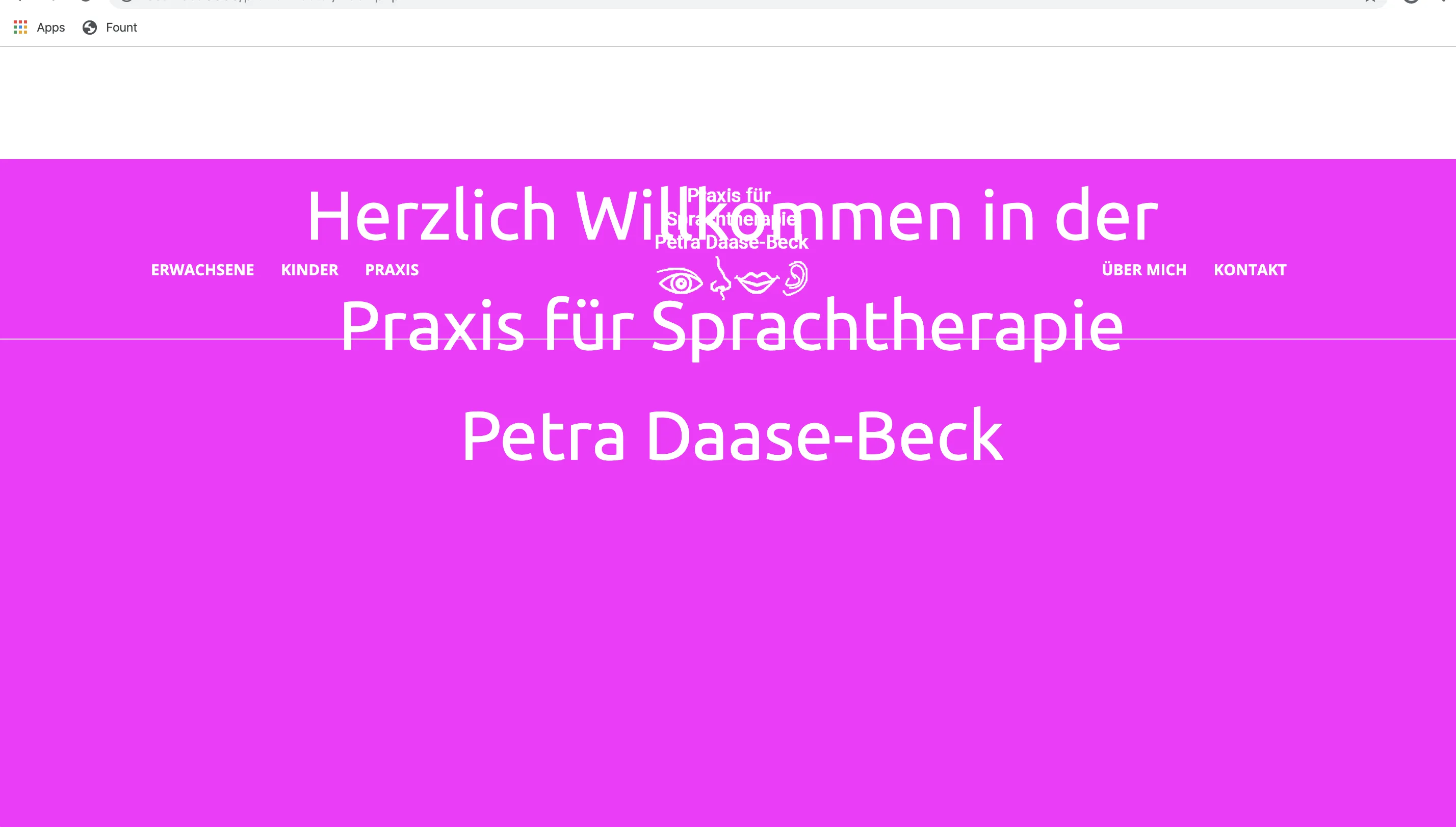
效果应该和这个网页完全一样:https://www.praxis-loeber.de 我已经写了jQuery代码,但是不幸的是它仍然不能正常工作。
如果有人能告诉我代码中的错误,我将非常高兴。
以下是我的代码:

$(window).scroll(function() {
  var scroll = $(window).scrollTop();
  if (scroll > 10) {
    $(".navigation").addClass("transparent");
    $(".hr").hide();
    $(".header-logo-container").hide();
    $("a").css("color", "black");
  } else {
    $(".navigation").removeClass("transparent");
    $(".hr").show();
    $(".header-logo-container").show();
    $("a").css("color", "white")
  }
});
.header {
  height: 820px;
  background-image: url("../img/beispiel.png");
  background-size: cover;
}

.header-unterseite {
  height: 500px;
  background-image: url("../img/beispiel.png");
  background-size: cover;
}

.navigation {
  position: sticky;
  top: 0px;
}

.navigation.transparent {
  background-color: white;
}

.header-logo-container {
  text-align: center;
  @media(max-width: 950px) {
    display: none;
  }
}

.header-logo {
  width: 11%;
  margin-top: 20px;
}

.header-navbar-links {
  float: left;
  font-family: 'Open Sans', bold;
  margin-top: -50px;
  font-size: 100%;
  margin-left: 150px;
  @media(max-width: 950px) {
    display: none;
  }
}

.header-navbar-links li {
  float: right;
  list-style-type: none;
  margin-right: 26px;
}

.header-navbar-links a {
  text-decoration: none;
  color: rgb(255, 255, 255);
}

.header-navbar-links a:hover {
  color: #88c602;
}

.header-navbar-rechts {
  color: white;
  float: right;
  margin-top: -50px;
  font-family: 'Open Sans', bold;
  font-size: 100%;
  margin-right: 150px;
  @media(max-width: 950px) {
    display: none;
  }
}

.header-navbar-rechts li {
  float: left;
  list-style-type: none;
  margin-right: 26px;
}

.header-navbar-rechts a {
  text-decoration: none;
  color: rgb(255, 255, 255);
}

.header-navbar-rechts a:hover {
  color: #88c602;
}

.footer-hr {
  color: rgb(255, 255, 255);
  width: 100%;
  height: 5px;
  @media(max-width: 950px) {
    display: none;
  }
}

.slogan {
  color: rgb(255, 255, 255);
  text-align: center;
  font-family: 'Ubuntu', regular;
  font-size: 450%;
  margin-top: 84px;
  -webkit-animation: fadein 2s;
  /* Safari, Chrome and Opera > 12.1 */
  -moz-animation: fadein 2s;
  /* Firefox < 16 */
  -ms-animation: fadein 2s;
  /* Internet Explorer */
  -o-animation: fadein 2s;
  /* Opera < 12.1 */
  animation: fadein 2s;
}

@keyframes fadein {
  from {
    opacity: 0;
  }
  to {
    opacity: 1;
  }
}

.description {
  background-color: #88c602;
  text-align: center;
  color: rgb(255, 255, 255);
  font-family: 'Ubuntu', regular italic;
  font-size: 200%;
  padding-top: 27px;
  padding-bottom: 27px;
}

.description-title {
  font-size: 180%;
  margin-top: -15px;
}

#side-menu-trigger {
  float: right;
  color: rgb(255, 255, 255);
  margin-top: 35px;
  padding-top: 5px;
  padding-bottom: 5px;
  padding-right: 25px;
  padding-left: 25px;
  font-size: 200%;
  height: inherit;
  @media(min-width: 950px) {
    display: none;
  }
}
<script src="https://cdnjs.cloudflare.com/ajax/libs/jquery/3.3.1/jquery.min.js"></script>
<div class="side-menu" style="display: none;">
  <h3>Navigation</h3>
  <ul class="side-menu-navigation">
    <?php require (__DIR__ . "/navigation-   links.php"); ?>
    <?php require (__DIR__ . "/navigation-rechts.php") ?>
  </ul>
</div>
<header class="header">
  <div class="navigation">
    <div class="header-logo-container">
      <a href="index.php"><img src="img/Logo_Petra.png" class="header-logo" alt="Logo"></a>
    </div>
    <nav class="header-navbar">
      <ul class="header-navbar-links">
        <?php require (__DIR__ . "/navigation-links.php"); ?>
      </ul>
      <ul class="header-navbar-rechts">
        <?php require (__DIR__ . "/navigation-rechts.php"); ?>
      </ul>
      <button id="side-menu-trigger">
        <i class="fa fa-bars" aria-hidden="true"></i>
      </button>
    </nav>
    <div class="hr">
      <hr class="footer-hr" />
    </div>
  </div>
  <div class="container" onload="document.getElementById(slogan).style.opacity='1'">
    <div class="slogan">
      Herzlich Willkommen in der<br> Praxis für Sprachtherapie<br> Petra Daase-Beck
    </div>
  </div>
</header>
<div class="description">
  <div class="description-title"><strong>Wortstark</strong></div>
  in Sprache und Schrift für Kinder - Jugendliche<br> und Erwachsene
</div>


好的。我马上会在几分钟内把代码发送给你。 - Revti Shah
这个回答解决了你的问题吗?滚动后更改导航栏颜色? - Tân
@Tân 他想要改变导航栏的大小。 - Revti Shah
3个回答

4
这里是代码。所有代码都能正常运行。只需对CSS进行一些修改。希望你需要这个标题。如果有任何更改,请告诉我。 https://jsfiddle.net/fovbwhx1/8/

$(window).scroll(function() {
  
  var scroll = $(window).scrollTop();

  if (scroll > 10)  {
    $(".navigation").addClass("transparent");
    $(".hr").hide();
    $(".header-logo-container").hide();
    $("a").css("color", "black");

  }

  else {
    $(".navigation").removeClass("transparent");
    $(".hr").show();
    $(".header-logo-container").show();
    $("a").css("color","white")
  }

});
*{
  padding:0;
  margin:0;
}
.container{
  margin-top:150px;
}
.header {
  height: 820px;
  background-image: url("https://dummyimage.com/800x800/ff00ff/fff.png");
  background-size: cover;
}
.header-unterseite {
  height: 500px;
  background-image: url("../img/beispiel.png");
  background-size: cover;
}
.navigation {
  position: fixed;
  top: 0px;
  width:100%;
}
.navigation.transparent {
  background-color: red;
}
.header-logo-container {
  text-align: center;

}
.header-logo {
  width: 11%;
  margin-top: 20px;
}
.header-navbar-links {
  float: left;
  font-family: 'Open Sans', bold;
  margin-top: -50px;
  font-size: 100%;
  margin-left: 150px;
}
.header-navbar-links li {
  float: right;
  list-style-type: none;
  margin-right: 26px;
}
.header-navbar-links a {
  text-decoration: none;
  color: rgb(255, 255, 255);
}
.header-navbar-links a:hover {
  color: #88c602;
}
.header-navbar-rechts {
  color: white;
  float: right;
  margin-top: -50px;
  font-family: 'Open Sans', bold;
  font-size: 100%;
  margin-right: 150px;

}
.header-navbar-rechts li {
  float: left;
  list-style-type: none;
  margin-right: 26px;
}
.header-navbar-rechts a {
  text-decoration: none;
  color: rgb(255, 255, 255);
}
.header-navbar-rechts a:hover {
  color: #88c602;
}
.footer-hr {
  color: rgb(255, 255, 255);
  width: 100%;
  height: 5px;
}
.slogan {
  color: rgb(255, 255, 255);
  text-align: center;
  font-family: 'Ubuntu', regular;
  font-size: 450%;
  margin-top: 110px;
  -webkit-animation: fadein 2s;
  /* Safari, Chrome and Opera > 12.1 */
  -moz-animation: fadein 2s;
  /* Firefox < 16 */
  -ms-animation: fadein 2s;
  /* Internet Explorer */
  -o-animation: fadein 2s;
  /* Opera < 12.1 */
  animation: fadein 2s;
}
@keyframes fadein {
  from {
    opacity: 0;
  }

  to {
    opacity: 1;
  }
}
.description {
  background-color: #88c602;
  text-align: center;
  color: rgb(255, 255, 255);
  font-family: 'Ubuntu', regular italic;
  font-size: 200%;
  padding-top: 27px;
  padding-bottom: 27px;
}
.description-title {
  font-size: 180%;
  margin-top: -15px;
}
#side-menu-trigger {
  float: right;
  color: rgb(255, 255, 255);
  margin-top: 35px;
  padding-top: 5px;
  padding-bottom: 5px;
  padding-right: 25px;
  padding-left: 25px;
  font-size: 200%;
  height: inherit;
}
<script src="https://cdnjs.cloudflare.com/ajax/libs/jquery/3.3.1/jquery.min.js"></script>
<div class="side-menu" style="display: none;">
  <h3>Navigation</h3>
  <ul class="side-menu-navigation">
    <?php require (__DIR__ . "/navigation-   links.php"); ?>
    <?php require (__DIR__ . "/navigation-rechts.php") ?>
  </ul>
</div>

<header class="header">
  <div class="navigation">
    <div class="header-logo-container">
      <a href="index.php"><img src="https://dummyimage.com/200x100/000/fff.png" class="header-logo" alt="Logo"></a>
    </div>
    <nav class="header-navbar">
      <ul class="header-navbar-links">
        <?php require (__DIR__ . "/navigation-links.php"); ?>
      </ul>
      <ul class="header-navbar-rechts">
        <?php require (__DIR__ . "/navigation-rechts.php"); ?>
      </ul>
      <button id="side-menu-trigger">
        <i class="fa fa-bars" aria-hidden="true"></i>
      </button>
    </nav>
    <div class="hr">
      <hr class="footer-hr" />
    </div>
  </div>
  <div class="container" onload="document.getElementById(slogan).style.opacity='1'">
    <div class="slogan">
      Herzlich Willkommen in der<br>
      Praxis für Sprachtherapie<br>
      Petra Daase-Beck
    </div>
  </div>
</header>
<div class="description">
  <div class="description-title"><strong>Wortstark</strong></div>
  in Sprache und Schrift für Kinder - Jugendliche<br>
  und Erwachsene
</div>


点赞。但是在CSS类中使用@media语法是正确的吗?这对我来说很新奇。 - Asfan Shaikh
1
谢谢您的快速回复!我将您的CSS代码一对一地复制了,但它仍然对我无效 :( 您有任何想法是什么原因吗? - Mr.Mo
@Mr.Mo,请再次复制CSS并将其放入您的代码中。 - Revti Shah
1
@AsfanShaikh,你可以在外部CSS类中使用媒体。如果你想在CSS类中使用媒体,则必须使用Sass。 - Revti Shah
@RevtiShah 是的,我知道,但我在你的CSS中看到了它(最初由@Mr.Mo发布)。所以,我认为这是CSS中的新东西。希望这是错误的语法:)。 - Asfan Shaikh
@Mr.Mo 无论你在哪里遇到困难,请告诉我。我会帮助你的。 - Revti Shah

1
编辑:我已经做出了你需要的东西;从透明头部到白色的过渡。

也许这会对你有所帮助,只需要一点css和简单的js。
<div id="header">Header</div>
<div style="margin-top:200px;padding:15px 15px 2500px;font-size:30px">
  <p><b>The Lorem Ipsum.</b></p>
  <p>Scroll down this frame to see the effect!</p>
  <p>Scroll to the top to remove the effect.</p>
  <p>What is Lorem Ipsum?
Lorem Ipsum is simply dummy text of the printing and typesetting industry. Lorem Ipsum has been the industry's standard dummy text ever since the 1500s, when an unknown printer took a galley of type and scrambled it to make a type specimen book. It has survived not only five centuries, but also the leap into electronic typesetting, remaining essentially unchanged. It was popularised in the 1960s with the release of Letraset sheets containing Lorem Ipsum passages, and more recently with desktop publishing software like Aldus PageMaker including versions of Lorem Ipsum.
</p>
</div>

这是 CSS:

    body{
  background-color: grey;
}
#header {
  background-color: transparent;
  padding: 50px 10px; /* Some padding */
  color: black;
  text-align: center; /* Centered text */
  font-size: 90px; /* Big font size */
  font-weight: bold;
  position: fixed; /* Fixed position - sit on top of the page */
  top: 0;
  width: 100%; /* Full width */
  transition: 0.2s; /* Add a transition effect (when scrolling - and font size is decreased) */
}

和js相关的内容

window.onscroll = function() {scrollFunction()};

function scrollFunction() {
  if (document.body.scrollTop > 50 || document.documentElement.scrollTop > 50) {
    document.getElementById("header").style.fontSize = "30px";
    document.getElementById("header").style.backgroundColor="white";
  } else {
    document.getElementById("header").style.fontSize = "90px";
    document.getElementById("header").style.backgroundColor="transparent";
  }
}

这是一个示例: https://jsfiddle.net/rick95/vpt173az/5/

谢谢你的回答。我的代码看起来几乎和你的建议一模一样。我在下面发布了我的代码,因为在我的项目中它不起作用。也许你有什么想法为什么它不起作用?! - Mr.Mo
我不太确定你想要它看起来是什么样子,但是乍一看,我发现字体颜色是白色,这就是它无法显示的主要原因。其次,如果你想让你的页眉位于页面顶部,你需要将其位置更改为固定位置。这并不是最好的建议,但我宁愿使用.style而不是addClass和removeClass,这样你可以根据你的div位置等直接在你的脚本中放置任何你想要的内容。 - RickJo

0

@RevtiShah

我的代码看起来像这样:

*{
    padding:0;
    margin:0;
  }
  
  .header {
    height: 820px;
    background-image: url("https://dummyimage.com/800x800/ff00ff/fff.png");
    background-size: cover;
  }
  
  .header-unterseite {
    height: 500px;
    background-image: url("../img/beispiel.png");
    background-size: cover;
  }
  
  .navigation {
    position: fixed;
    top: 0px;
    width:100%;
  }
  
  .navigation.transparent {
    background-color: red;
  }
  
  .header-logo-container {
    text-align: center;
  
    @media(max-width: 950px) {
      display: none;
    }
  }
  
  .header-logo {
    width: 11%;
    margin-top: 20px;
  }
  
  .header-navbar-links {
    float: left;
    font-family: 'Open Sans', bold;
    margin-top: -50px;
    font-size: 100%;
    margin-left: 150px;
  
    @media(max-width: 950px) {
      display: none;
    }
  }
  
  .header-navbar-links li {
    float: right;
    list-style-type: none;
    margin-right: 26px;
  }
  
  .header-navbar-links a {
    text-decoration: none;
    color: rgb(255, 255, 255);
  }
  
  .header-navbar-links a:hover {
    color: #88c602;
  }
  
  .header-navbar-rechts {
    color: white;
    float: right;
    margin-top: -50px;
    font-family: 'Open Sans', bold;
    font-size: 100%;
    margin-right: 150px;
  
    @media(max-width: 950px) {
      display: none;
    }
  }
  
  .header-navbar-rechts li {
    float: left;
    list-style-type: none;
    margin-right: 26px;
  }
  
  .header-navbar-rechts a {
    text-decoration: none;
    color: rgb(255, 255, 255);
  }
  
  .header-navbar-rechts a:hover {
    color: #88c602;
  }
  
  .footer-hr {
    color: rgb(255, 255, 255);
    width: 100%;
    height: 5px;
  
    @media(max-width: 950px) {
      display: none;
    }
  }
  
  .slogan {
    color: rgb(255, 255, 255);
    text-align: center;
    font-family: 'Ubuntu', regular;
    font-size: 450%;
    margin-top: 110px;
  
    -webkit-animation: fadein 2s;
    /* Safari, Chrome and Opera > 12.1 */
    -moz-animation: fadein 2s;
    /* Firefox < 16 */
    -ms-animation: fadein 2s;
    /* Internet Explorer */
    -o-animation: fadein 2s;
    /* Opera < 12.1 */
    animation: fadein 2s;
  }
  
  @keyframes fadein {
    from {
      opacity: 0;
    }
  
    to {
      opacity: 1;
    }
  }
  
  .description {
    background-color: #88c602;
    text-align: center;
    color: rgb(255, 255, 255);
    font-family: 'Ubuntu', regular italic;
    font-size: 200%;
    padding-top: 27px;
    padding-bottom: 27px;
  }
  
  .description-title {
    font-size: 180%;
    margin-top: -15px;
  }
  
  #side-menu-trigger {
    float: right;
    color: rgb(255, 255, 255);
    margin-top: 35px;
    padding-top: 5px;
    padding-bottom: 5px;
    padding-right: 25px;
    padding-left: 25px;
    font-size: 200%;
    height: inherit;
  
    @media(min-width: 950px) {
      display: none;
    }
  }
    
<script src="https://cdnjs.cloudflare.com/ajax/libs/jquery/3.3.1/jquery.min.js"></script>
<div class="side-menu" style="display: none;">
            <h3>Navigation</h3>
            <ul class="side-menu-navigation">
                    <?php require (__DIR__ . "/navigation-links.php"); ?>
                    <?php require (__DIR__ . "/navigation-rechts.php") ?>
                </ul>
            </div>

<header class="header">
   <div class="navigation">
           <div class="header-logo-container">
           <a href="index.php"><img src="img/Logo_Petra.png" class="header-logo" alt="Logo"></a>
          </div>
        <nav class="header-navbar">
             <ul class="header-navbar-links">
              <?php require (__DIR__ . "/navigation-links.php"); ?>
             </ul>
             <ul class="header-navbar-rechts">
             <?php require (__DIR__ . "/navigation-rechts.php"); ?>
            </ul>
            <button id="side-menu-trigger">
                <i class="fa fa-bars" aria-hidden="true"></i>
            </button>
        </nav>
   <div class="hr">
      <hr class="footer-hr" />
   </div>
</div>
<div class="container" onload="document.getElementById(slogan).style.opacity='1'">
   <div class="slogan">
       Herzlich Willkommen in der<br>
       Praxis für Sprachtherapie<br>
       Petra Daase-Beck
    </div> 
</div>
</header>
    <div class="description">
       <div class="description-title"><strong>Wortstark</strong></div>
       in Sprache und Schrift für Kinder - Jugendliche<br>
       und Erwachsene
     </div>


<script type="text/javascript">

$(window).scroll(function() {
    var scroll = $(window).scrollTop();

       if (scroll > 10)  {
            $(".navigation").addClass("transparent");
            $(".hr").hide();
            $(".header-logo-container").hide();
            $("a").css("color", "black");
        
        } else {
            $(".navigation").removeClass("transparent");
            $(".hr").show();
            $(".header-logo-container").show();
            $("a").css("color","white")
        }
});

</script>

当我打开页面时,它看起来像这样:

我不确定是否是这个问题,但我仍然使用骨架作为框架和scss。 也许这里有一个默认值会破坏导航。


网页内容由stack overflow 提供, 点击上面的
可以查看英文原文,
原文链接