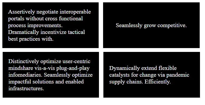
我们正在使用flexbox并尝试以下操作。目标是在移动断点上每个项目有一列,在平板断点上有两列,在桌面断点上有四列。
该示例仅使用了四个项目,但假设我有5或6个项目,那么我只希望这些项目具有响应性。如果行仅有足够的空间来显示每行2个项目,那么我希望每个项目继续向下移动到上面的行下面。
如何实现这一点?
该示例仅使用了四个项目,但假设我有5或6个项目,那么我只希望这些项目具有响应性。如果行仅有足够的空间来显示每行2个项目,那么我希望每个项目继续向下移动到上面的行下面。
如何实现这一点?
.flex-row {
  display: flex;
  @media screen and (min-width: 768px) {
    flex: 1;
    flex-direction: row;
    justify-content: space-between;
  }
}

.flex-col {
  margin: 6px;
  padding: 16px;
  background-color: black;
  display: flex;
  justify-content: center;
  align-items: center;
  flex: 1;
  flex-direction: column;
  color: white;
} <div class="flex-row">
<div class="flex-col">Assertively negotiate interoperable portals without cross functional process improvements. Dramatically incentivize tactical best practices with.</div>
<div class="flex-col">Seamlessly grow competitive.</div>
<div class="flex-col">Distinctively optimize user-centric mindshare vis-a-vis plug-and-play infomediaries. Seamlessly optimize impactful solutions and enabled infrastructures.</div>
<div class="flex-col">Dynamically extend flexible catalysts for change via pandemic supply chains. Efficiently.</div>
</div>当前结果
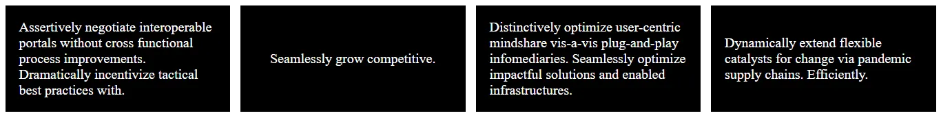
平板电脑上的期望结果