我已成功使用flexbox创建了一个分屏布局。
在我的左侧,我设置了一个内部容器来容纳内容。第一段内容是另一个容器,其中包含一个高大的SVG图像。
我已经用轮廓线勾勒出了这两个容器,以便更容易地查看它们在下面的实时示例中的位置。
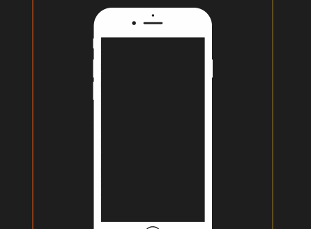
这两个容器用红色(外部)和绿色(内部)轮廓线标出。 我想要实现的是当红色容器的底部碰到绿色容器时,绿色容器在红色容器内缩小,从而缩小SVG的大小。不确定这是否依赖于内部容器、SVG或两者属性。 HTML
在我的左侧,我设置了一个内部容器来容纳内容。第一段内容是另一个容器,其中包含一个高大的SVG图像。
我已经用轮廓线勾勒出了这两个容器,以便更容易地查看它们在下面的实时示例中的位置。
这两个容器用红色(外部)和绿色(内部)轮廓线标出。 我想要实现的是当红色容器的底部碰到绿色容器时,绿色容器在红色容器内缩小,从而缩小SVG的大小。不确定这是否依赖于内部容器、SVG或两者属性。 HTML
<main class="row space-between">
  <section class="column w50 vh100 center" style="background: #1e1e1e">
    <div class="column w75 h75 top-center" style="border: 1px solid red">
      <div class="w100 center pt1 pb1" style="border: 1px solid green">
        <div class="phoneContainer center w100 depth-1" style="position: relative; height: 500px">

          <svg class="absolute depth-1" preserveAspectRatio="xMidYMidmeet" width="100%" viewbox="0 0 497 1014" version="1.1" xmlns="http://www.w3.org/2000/svg" xmlns:xlink="http://www.w3.org/1999/xlink">
            <title>Apple iPhone 6</title>
            <defs></defs>
            <g id="Page-1" stroke="none" stroke-width="1" fill="none" fill-rule="evenodd">
              <path id="Apple-iPhone-6" d="M494,290 L495.501424,290 C496.329065,290 497,289.328711 497,288.501847 L497,216.498153 C497,215.670746 496.33497,215 495.501424,215 L494,215 L494,74.9994014 C494,33.5783758 460.420697,0 418.993513,0 L78.0064869,0 C36.5815481,0 3,33.5749963 3,74.9994014 L3,128 L1.49857602,128 C0.670935336,128 0,128.677424 0,129.507836 L0,167.492164 C0,168.324919 0.665029764,169 1.49857602,169 L3,169 L3,215 L1.49857602,215 C0.670935336,215 0,215.671289 0,216.498153 L0,288.501847 C0,289.329254 0.665029764,290 1.49857602,290 L3,290 L3,307 L1.49857602,307 C0.670935336,307 0,307.671289 0,308.498153 L0,380.501847 C0,381.329254 0.665029764,382 1.49857602,382 L3,382 L3,939.000599 C3,980.421624 36.5793027,1014 78.0064869,1014 L418.993513,1014 C460.418452,1014 494,980.425004 494,939.000599 L494,290 Z M33,123 L33,889 L464,889 L464,123 L33,123 Z M248,983 C268.98682,983 286,965.98682 286,945 C286,924.01318 268.98682,907 248,907 C227.01318,907 210,924.01318 210,945 C210,965.98682 227.01318,983 248,983 Z M248,979 C266.777681,979 282,963.777681 282,945 C282,926.222319 266.777681,911 248,911 C229.222319,911 214,926.222319 214,945 C214,963.777681 229.222319,979 248,979 Z M170,72 C174.418278,72 178,68.418278 178,64 C178,59.581722 174.418278,56 170,56 C165.581722,56 162,59.581722 162,64 C162,68.418278 165.581722,72 170,72 Z M249,37 C251.761424,37 254,34.7614237 254,32 C254,29.2385763 251.761424,27 249,27 C246.238576,27 244,29.2385763 244,32 C244,34.7614237 246.238576,37 249,37 Z M212.994583,60 C210.788436,60 209,61.7953562 209,64 C209,66.209139 210.78308,68 212.994583,68 L285.005417,68 C287.211564,68 289,66.2046438 289,64 C289,61.790861 287.21692,60 285.005417,60 L212.994583,60 Z"
              fill="#FFFFFF"></path>
            </g>
          </svg>

        </div>
      </div>
    </div>

  </section>
  <section class="column w50 vh100 center bg-white">
    <div class="column w75 h75 center" style="border: 1px solid red">
      <div class="h100" style="border: 1px solid blue">
        <h2>Title Text Box</h2></div>
    </div>
  </section>
</main>
CSS
svg {
  max-height: 100%;
  max-width: 100%;
}

.pt1 {
  padding-top: 1rem;
}

.pb1 {
  padding-bottom: 1rem;
}

.column {
  display: -webkit-box;
  display: -ms-flexbox;
  display: flex;
  -webkit-box-orient: vertical;
  -webkit-box-direction: normal;
  -ms-flex-direction: column;
  flex-direction: column;
  -webkit-box-flex: 1;
  -ms-flex: 1 1 auto;
  flex: 1 1 auto;
  height: auto;
  -ms-flex-wrap: nowrap;
  flex-wrap: nowrap;
}

@media screen and (max-width:480px) {
  .column {
    min-width: 100%;
  }
}

.row {
  display: -webkit-box;
  display: -ms-flexbox;
  display: flex;
  -webkit-box-flex: 1;
  -ms-flex: 1 1 auto;
  flex: 1 1 auto;
  height: auto;
  -webkit-box-orient: horizontal;
  -webkit-box-direction: normal;
  -ms-flex-direction: row;
  flex-direction: row;
  -ms-flex-wrap: wrap;
  flex-wrap: wrap;
}

@media screen and (max-width:480px) {
  .row>.column {
    width: 100%!important;
  }
}

.w50 {
  width: 50%;
}

.w75 {
  width: 75%;
}

.w100 {
  width: 100%;
}

.vh100 {
  height: 100vh;
}

.h75 {
  height: 75%;
}

.h100 {
  height: 100%;
}

.bg-white {
  background-color: #fff;
}

.absolute {
  position: absolute;
}

.center {
  -webkit-box-align: center;
  -ms-flex-align: center;
  -ms-grid-row-align: center;
  align-items: center;
  -webkit-box-pack: center;
  -ms-flex-pack: center;
  justify-content: center;
}

.column.top-center {
  -webkit-box-align: center;
  -ms-flex-align: center;
  -ms-grid-row-align: center;
  align-items: center;
}

.column.top-center {
  -webkit-box-pack: start;
  -ms-flex-pack: start;
  justify-content: flex-start;
}

.space-between {
  -webkit-box-pack: justify;
  -ms-flex-pack: justify;
  justify-content: space-between;
}

.depth-1 {
  z-index: 100;
}

@font-face {
  font-family: Office Code Pro;
  src: url(../fonts/OfficeCodePro-Regular.woff);
}

::-moz-selection {
  background: #222;
  color: #2c6284;
}

::selection {
  background: #222;
  color: #2c6284;
}

h2 {
  font-weight: 400;
  margin-bottom: 1rem;
}

h2 {
  font-size: 1.75rem;
  line-height: 1.3;
}

body {
  font-size: 1rem;
}

body {
  background-color: #fff;
  color: #222;
  font-family: Open Sans, Helvetica, sans-serif;
  line-height: 1.6;
}

ul {
  list-style-type: disc;
}
max-width: 100%; height: auto;? - privateer35