如何使用CSS将SVG图像动画化,使其像进度条一样运行

3

我对SVG还不熟悉,想要使用CSS来为这些对象添加动画。

我阅读了一些文档,但是没有实现任何效果。

我有另一个想法:“将对象分成更小的部分,在SVG中导出所有这些部分,然后使用CSS逐步显示对象的各个部分,直至完成”

但在尝试这之前,我想寻求帮助。

以下是我尝试要做的内容(显然这必须是流体动画):

enter image description here

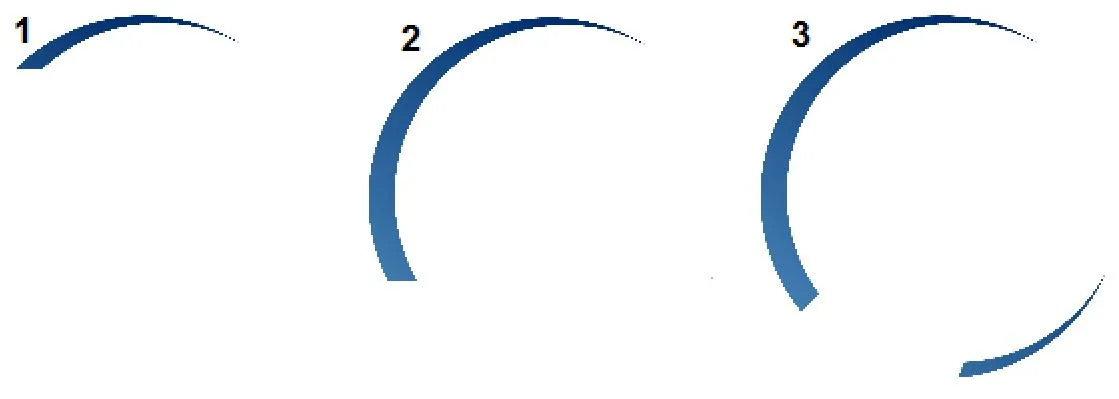
这里有两个我尝试添加动画的示例。我认为左侧的那个比较复杂。

<div class="demo">
  <svg class="progress"
    xmlns="http://www.w3.org/2000/svg"
    xmlns:xlink="http://www.w3.org/1999/xlink" viewBox="0 0 209.29 106.77">
    <defs>
        <style>.cls-1{fill:url(#linear-gradient);}.cls-2{fill-rule:evenodd;fill:url(#linear-gradient-2);}</style>
        <linearGradient id="linear-gradient" x1="208.06" y1="15.09" x2="148.49" y2="88.62" gradientUnits="userSpaceOnUse">
            <stop offset="0" stop-color="#bababa"/>
            <stop offset="0.28" stop-color="#979797"/>
            <stop offset="1" stop-color="#424242"/>
        </linearGradient>
        <linearGradient id="linear-gradient-2" x1="12.55" y1="97.95" x2="78.02" y2="26.75" gradientUnits="userSpaceOnUse">
            <stop offset="0" stop-color="#4682b4"/>
            <stop offset="1" stop-color="#002e6e"/>
        </linearGradient>
    </defs>
    <g id="c2" data-name="c2">
        <g id="Layer_1" data-name="Layer 1">
            <path class="cls-1" d="M135.21,71.21,130,76.3a52.67,52.67,0,0,0,9.56,8.58l1.43-1.76L208.64,0ZM160.15,89.3,158,93a52.93,52.93,0,0,0,14.44,1.23l.55-1.38L209.29,3.59Z"/>
            <path class="cls-2" d="M24.42,9.83A52.69,52.69,0,0,0,8.24,82.57a51.86,51.86,0,0,0,3.65,5l5.16-5,.15-.15c-.68-.92-1.35-1.87-2-2.85a49.58,49.58,0,0,1,65.44-70A52.71,52.71,0,0,0,24.42,9.83Zm59,84.7a49.52,49.52,0,0,1-24.12,7.71l-1.61,4-.24.58A52.67,52.67,0,0,0,101.3,74.63,49.52,49.52,0,0,1,83.4,94.53Z"/>
        </g>
    </g>
  </svg>
</div>

1个回答

2

您可以通过动画color-stop和/或offset来使渐变动起来。然后通过调整不同的值,您可以创建所需的效果。

这里有一个简单的例子,我在左侧的颜色和右侧的偏移量上进行了动画处理。

<div class="demo">
  <svg class="progress"
    xmlns="http://www.w3.org/2000/svg"
    xmlns:xlink="http://www.w3.org/1999/xlink" viewBox="0 0 209.29 106.77">
    <defs>
        <style>.cls-1{fill:url(#linear-gradient);}.cls-2{fill-rule:evenodd;fill:url(#linear-gradient-2);}</style>
        <linearGradient id="linear-gradient" x1="208.06" y1="15.09" x2="148.49" y2="88.62" gradientUnits="userSpaceOnUse">
            <stop offset="0" stop-color="#bababa"/>
            <stop offset="0.28" stop-color="#979797">
              <animate  attributeName="offset" values=".0;.28" dur="8s" fill="freeze"  /> 
            </stop>
            <stop offset="1" stop-color="#424242">
                <animate attributeName="offset" values="0;1" dur="8s" fill="freeze"  /> 
            </stop>
            <stop offset="1" stop-color="rgba(0,0,0,0)">
                <animate attributeName="offset" values="0;1" dur="8s" fill="freeze"  /> 
            </stop>
        </linearGradient>
        <linearGradient id="linear-gradient-2" x1="12.55" y1="97.95" x2="78.02" y2="26.75" gradientUnits="userSpaceOnUse">
            <stop offset="0" stop-color="rgba(0,0,0,0)">            
                <animate attributeName="stop-color" values="rgba(0,0,0,0); #4682b4" dur="8s" fill="freeze"  /> 
            </stop>
            <stop offset="1" stop-color="rgba(0,0,0,0)">  
                <animate attributeName="stop-color" values="rgba(0,0,0,0); #002e6e" dur="8s" fill="freeze"  />    
            </stop>  
        </linearGradient>
    </defs>
    <g id="c2" data-name="c2">
        <g id="Layer_1" data-name="Layer 1">
            <path class="cls-1" d="M135.21,71.21,130,76.3a52.67,52.67,0,0,0,9.56,8.58l1.43-1.76L208.64,0ZM160.15,89.3,158,93a52.93,52.93,0,0,0,14.44,1.23l.55-1.38L209.29,3.59Z"/>
            <path class="cls-2" d="M24.42,9.83A52.69,52.69,0,0,0,8.24,82.57a51.86,51.86,0,0,0,3.65,5l5.16-5,.15-.15c-.68-.92-1.35-1.87-2-2.85a49.58,49.58,0,0,1,65.44-70A52.71,52.71,0,0,0,24.42,9.83Zm59,84.7a49.52,49.52,0,0,1-24.12,7.71l-1.61,4-.24.58A52.67,52.67,0,0,0,101.3,74.63,49.52,49.52,0,0,1,83.4,94.53Z"/>
        </g>
    </g>
  </svg>
</div>

一些有用的链接:

https://css-tricks.com/guide-svg-animations-smil/

https://designmodo.com/animate-svg-gradients/

https://css-tricks.com/smil-is-dead-long-live-smil-a-guide-to-alternatives-to-smil-features/


谢谢,右边的动画正是我想要的,但是左边的对象能否实现同样的效果呢?我会去了解一下。 - Jonatan Lavado
@L.Flor 当然可以 :) 只需动画化左侧的偏移量即可 ;) 我试图展示两种类型,颜色和偏移量..你也可以将它们结合起来等等...我让你自己玩,如果你还有问题就告诉我吧 ;) - Temani Afif
@vals 是的,没错 ;) 我会添加另一个链接,以便提供一些替代方案。 - Temani Afif
1
@L.Flor,SVG动画元素中有两个属性称为beginend。您可能对begin感兴趣,可以指定动画何时开始,并且可以与另一个动画链接。这是一个例子:https://dev59.com/TFwZ5IYBdhLWcg3wPONM,您可以搜索这些属性,会发现还有很多其他的用法;) - Temani Afif
我已经明白了,我不知道我也可以将动画应用于“路径”,再次感谢! - Jonatan Lavado
显示剩余3条评论

网页内容由stack overflow 提供, 点击上面的
可以查看英文原文,
原文链接