我有一个使用CSS创建居中盒子的问题。目前我有这个代码:http://jsfiddle.net/LW7mN/2/
.trex-clear-all{
    display: inline-block;
    width: 99%;
    height: 17px;
    font-size: 12px !important;
    text-align: -webkit-right !important;
    text-align: right;
}
#trex_showonhover{
    visibility:hidden;
    background-color:#FFFFFF;
    border:1px solid #999999;
    cursor:default;
    position:absolute;
    text-align:center;
    width: 280px;
    z-index:100;
    -moz-border-radius: 15px;
    border-radius: 15px;
    padding: 10px 10px 10px;
}
#trex_close_div{
    top:6px;
    right:6px;
    position:absolute;
}
.trex_showdiv{
    width:310px;
    float: right;
}

.trex-text-title{
    font-family: 'Segoe UI_', 'Open Sans', Verdana, Arial, Helvetica, sans-serif !important;
    font-size: 11px !important;
    font-weight:700 !important;
    padding: 2px !important;
}


.trex-new-widget-container {
    font: 10pt normal Arial, sans-serif;
    height: auto;
    margin: 10px auto 0 auto;
    text-align: center;
    width: 100%;
}


.trex-new-widget-container .trex-box {
    border: 1px solid #000;
    cursor: pointer;
    height: 180px;
    width: 240px;
    float: left;
    margin: 3px;
    position: relative;
    overflow: hidden;
    -webkit-box-shadow: 2px 1px 1px 1px #ccc;
    -moz-box-shadow: 2px 1px 1px 1px #ccc;
    box-shadow: 2px 1px 1px 1px #ccc;
}


.trex-new-widget-container .trex-box img {
    position: absolute;
    left: 0;
    width:100%;
    height: 100%;
    -webkit-transition: all 300ms ease-out;
    -moz-transition: all 300ms ease-out;
    -o-transition: all 300ms ease-out;
    -ms-transition: all 300ms ease-out;
    transition: all 300ms ease-out;
}


.trex-new-widget-container .trex-box .trex-caption {
    background-color: rgba(240,240,240,0.6);
    position: absolute;
    color: #000 !important;
    z-index: 1000;
    -webkit-transition: all 400ms ease-out;
    -moz-transition: all 400ms ease-out;
    -o-transition: all 400ms ease-out;
    -ms-transition: all 400ms ease-out;
    transition: all 400ms ease-in;
    left: 0;
}


.trex-new-widget-container .trex-box .trex-full-caption {
    width: 240px;
    height: 50px;
    top: 130px;
    text-align: center;
    padding-top: 0px;
}


.trex-new-widget-container .trex-box:hover .trex-full-caption {
    -moz-transform: translateY(-60px);
    -o-transform: translateY(-60px);
    -webkit-transform: translateY(-60px);
    transform: translateY(-60px);
    opacity: 1;
    background-color: rgba(0,0,0,0.9);
    color: #fff !important;
}
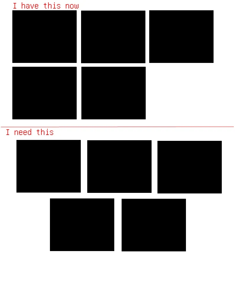
如您所见,当您改变页面宽度(调整浏览器大小或更改分辨率)时,每行的盒子数量会发生变化。这很好,但是盒子应该居中对齐,而不是像现在这样靠左。
我希望您能理解问题所在。这里有一个简单的示意图,以便您可以形象地理解。
谢谢。
div,而你可以只使用ul和li来简化它。 - Kheema Pandey