renderBorder: false
fillColor: Colors.white,
ToggleButtons(
renderBorder: false,
fillColor: Colors.white,
onPressed: (val) {
setState(() {
itemStatus = List.generate(3, (index) => false);
itemStatus[val]=!itemStatus[val];
});
},
children: List<Widget>.generate(
3,
(index) => Padding(
padding: const EdgeInsets.all(8.0),
child: Container(
decoration: BoxDecoration(
**color:itemStatus[index]? Colors.amber:Colors.white,**
border: Border.all(),
borderRadius: BorderRadius.circular(10),),
padding: const EdgeInsets.all(5),
width: 160,
height: 70,
alignment: Alignment.center,
child: Text(itemTypes[index],style:const **TextStyle(color:
Colors.black)**,),
isSelected: itemStatus
),
我有点晚来参加这个派对,但是如果有人遇到这个问题,我有一个自定义的解决方案可以添加一些框在按钮之间。就像之前我的输出看起来像:
代码:
ToggleButtons(
constraints: BoxConstraints.loose(Size.infinite),
direction: Axis.horizontal,
children: <Widget>[
Text('Pre-KG',
style: GoogleFonts.roboto(
fontWeight: FontWeight.bold, fontSize: 20.0)),
Box(
color: Colors.white,
width: 8,
),
Text('Junior-KG',
style: GoogleFonts.roboto(
fontWeight: FontWeight.bold, fontSize: 20.0)),
Box(
color: Colors.white,
width: 8,
),
Text('Senior-KG',
style: GoogleFonts.roboto(
fontWeight: FontWeight.bold, fontSize: 20.0)),
],
color: Colors.grey,
borderColor: Colors.white,
selectedColor: Colors.blue,
需要注意的一些事情:
添加盒子后,需要进行热重启或重启,否则会出现错误。
如果要使用isSelected属性,则列表需要有值来表示切换按钮中项目的数量,例如我不得不更新为5个值:
List isSelected = [false, false, false, false, false];
嘿,一个简单的方法是将每个图标包装在容器中,然后为每个容器提供边距。像这样:
ToggleButtons(
children: <Widget>[
color: Colors.grey,
fillColor: Colors.white,
renderBorder: false,
selectedColor: Colors.black,
children: <Widget>[
Container(
margin: const EdgeInsets.symmetric(horizontal: 40.0),
child: Column(
children: const [Icon(Icons.circle), Text('Cash')],
),
),
Container(
margin: const EdgeInsets.symmetric(horizontal: 40.0),
child: Column(
children: const [Icon(Icons.circle), Text('Upi')],
),
),
Container(
margin: const EdgeInsets.symmetric(horizontal: 40.0),
child: Column(
children: const [Icon(Icons.circle), Text('Credit')],
),
)
],
onPressed: (int index) {
setState(() {
isSelected[index] = !isSelected[index];
});
},
isSelected: isSelected,
),
切换按钮在图像中看起来是这样的
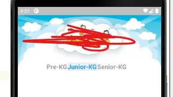
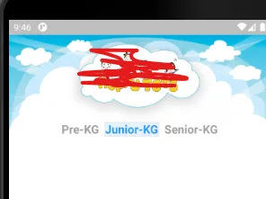
我认为borderWidth可以填充按钮,使它们之间看起来像有空间。就像这样:
ToggleButtons(
isSelected: isSelected,
selectedColor: Color.fromARGB(255, 250, 244, 218),
color: Color.fromARGB(255, 195, 162, 65),
fillColor: Colors.transparent,
textStyle: TextStyle(fontSize: 28),
borderWidth: 20,
borderColor: Colors.white,
selectedBorderColor: Colors.white,
splashColor: Colors.transparent,
children: <Widget>[
Container(
padding: const EdgeInsets.symmetric(
horizontal: 30, vertical: 30),
decoration: BoxDecoration(
color: isSelected[0]
? const Color.fromARGB(255, 232, 182, 43)
: const Color.fromARGB(255, 250, 244, 218),
border: Border.all(
color: const Color.fromARGB(255, 232, 182, 43),
),
borderRadius: const BorderRadius.all(
Radius.circular(20),
),
),
child: Icon(Icons.add_circle_outline_outlined),
),
Container(
padding: const EdgeInsets.symmetric(
horizontal: 30, vertical: 30),
decoration: BoxDecoration(
color: isSelected[1]
? const Color.fromARGB(255, 232, 182, 43)
: const Color.fromARGB(255, 250, 244, 218),
border: Border.all(
color: const Color.fromARGB(255, 232, 182, 43),
),
borderRadius: const BorderRadius.all(
Radius.circular(20),
),
),
child: Icon(Icons.add_circle_outline_outlined),
),
Container(
padding: const EdgeInsets.symmetric(
horizontal: 30, vertical: 30),
decoration: BoxDecoration(
color: isSelected[2]
? const Color.fromARGB(255, 232, 182, 43)
: const Color.fromARGB(255, 250, 244, 218),
border: Border.all(
color: const Color.fromARGB(255, 232, 182, 43),
),
borderRadius: const BorderRadius.all(
Radius.circular(20),
),
),
child: Icon(Icons.add_circle_outline_outlined),
),
],
onPressed: (int newIndex) {
setState(() {
for (int index = 0; index < isSelected.length; index++) {
if (index == newIndex) {
isSelected[index] = true;
} else {
isSelected[index] = false;
}
}
});
},
),
只需在行中放置两个或更多的ToggleButton。 创建单独的bool列表。
就像下面的代码一样:
List<bool> isSelected1 = [false];
List<bool> isSelected2 = [false];
Row(
mainAxisAlignment: MainAxisAlignment.spaceEvenly,
children: [
ToggleButtons(
isSelected: isSelected1,
onPressed: (int index) {
setState(() {
isSelected1[index] = !isSelected1[index];
});
},
children: [
Icon(Icons.credit_card),
],
),
SizedBox(width: 10),
ToggleButtons(
isSelected: isSelected2,
onPressed: (int index) {
setState(() {
isSelected2[index] = !isSelected2[index];
});
},
children: [
Icon(Icons.money),
],
),
],
),
嗯,这不是最优雅的方式,但它可以实现你想要的功能。