我正在定制Slick Slider的外观。
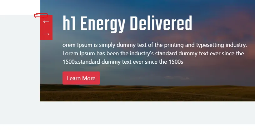
我在.media-slider上创建了一个灰色背景,具有特定的高度,并将箭头定位到与灰色背景顶部对齐:
这是灰色背景:
.media-slider-wrap .media-slider {
  position: relative;
  overflow: hidden;
  padding-bottom: 4rem;
}
.media-slider-wrap .media-slider:before {
  content: "";
  position: absolute;
  bottom: 0;
  left: 0;
  right: 0;
  background-color: #eff3f5;
  display: block;
  height: 55.1%;
  z-index: -1;
}
我将箭头放置在这样的位置:
.media-slider-wrap .media-slider-text-slider .slick-prev, .media-slider-wrap .media-slider-text-slider .slick-next {
    background-color: #d4272e;
    height: 40px;
    width: 40px;
    z-index: 1;
    left: 0;
    top: 54%;
}
这是我做的对齐方式,灰色背景顶部与箭头顶部对齐:
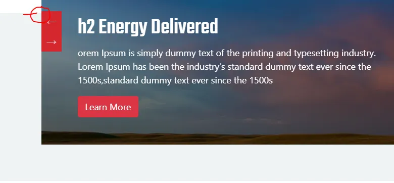
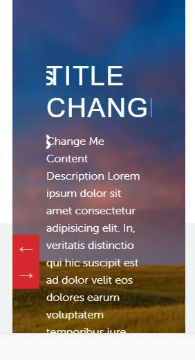
此外,在非常小的屏幕上(iPhone 5屏幕尺寸),我发现另一个幻灯片会推动当前幻灯片,不确定是否由同样的问题引起。
这是我的完整代码:
$(document).ready(function() {

  $(".media-slider-bg-slide").slick({
    slidesToShow: 1,
    slidesToScroll: 1,
    arrows: false,
    fade: true,
    asNavFor: '.media-slider-text-slider',
  });


  $(".media-slider-text-slider").slick({
    slidesToShow: 1,
    slidesToScroll: 1,
    centerPadding: '0px',
    asNavFor: '.media-slider-bg-slide',
    centerMode: false,
    focusOnSelect: true,
    speed: 1000,
    arrows: true,
  });


});

jQuery(window).on('load', function() {
  function getImage() {
    jQuery(".media-slider-wrap .media-slider-img-wrap").each(function() {
      var imgSrc = $(this).find("img").attr("src");
      $(this).css('background-image', 'url(' + imgSrc + ')');
    });
  }
  getImage();
});h1,
h2,
h3,
h4,
h5,
h6 {
font-family: 'Teko', sans-serif;
}
html {
font-size: 18px;
}
@media (min-width: 576px) {
.container {
max-width: 540px;
}
}
@media (min-width: 768px) {
.container {
max-width: 720px;
}
}
@media (min-width: 992px) {
.container {
max-width: 960px;
}
}
@media (min-width: 1200px) {
.container {
max-width: 1400px;
}
}
h1,
.h1 {
font-size: 3.815rem;
}
h2,
.h2 {
font-size: 2.441rem;
}
h3,
.h3 {
font-size: 1.563rem;
}
h4,
.h4 {
font-size: 1.25rem;
}
h1,
h2,
h3,
h4,
h5,
h6 {
font-family: 'Teko', sans-serif;
}
.media-slider-wrap .media-slider-text-wrap {
padding-top: 16%;
padding-left: 1rem;
}
.media-slider-wrap .media-slider-text-wrap h1 {
color: #fff;
font-weight: normal;
letter-spacing: 1.5px;
}
.media-slider-wrap .media-slider-text-slider {
color: #fff;
padding: 2%;
}
.media-slider-wrap .media-slider-text-slider .slick-prev,
.media-slider-wrap .media-slider-text-slider .slick-next {
background-color: #d4272e;
height: 40px;
width: 40px;
z-index: 1;
left: 0;
top: 54%;
}
.media-slider-wrap .media-slider-text-slider .slick-list {
padding-top: 1rem;
}
.media-slider-wrap .media-slider-text-slider .slick-next {
margin-top: 40px;
}
.media-slider-wrap .media-slider-text-slider .slick-arrow:hover {
background-color: #721722;
}
.media-slider-wrap .media-slider {
position: relative;
overflow: hidden;
padding-bottom: 4rem;
}
.media-slider-wrap .media-slider:before {
content: "";
position: absolute;
bottom: 0;
left: 0;
right: 0;
background-color: #eff3f5;
display: block;
height: 55.1%;
z-index: -1;
}
.media-slider-wrap .slick-prev:before,
.media-slider-wrap .slick-next:before {
font-family: 'Ionicons';
}
.media-slider-wrap .media-slider-img-wrap {
background-size: cover;
background-position: top-center;
}
.media-slider-wrap .media-slider-img-wrap img {
opacity: 0;
visibility: hidden;
}
.media-slider-wrap .media-slider-bg-slide {
position: absolute;
left: 0;
right: 0;
z-index: -1;
top: 0;
bottom: 0;
-webkit-transition: all 0.5s ease;
-moz-transition: all 0.5s ease;
-ms-transition: all 0.5s ease;
-o-transition: all 0.5s ease;
transition: all 0.5s ease;
}
.media-slider-wrap .media-slider-bg-slide div {
height: 100%;
}
.media-slider-wrap .media-slider-bg-slide .slick-slide {
margin: 0px;
}
.media-slider-wrap .media-slider-gradient-wrap {
position: relative;
overflow: hidden;
}
.media-slider-wrap .media-slider-gradient-wrap:before {
content: "";
position: absolute;
top: 0;
bottom: 0;
right: 0;
left: 0;
/* background-color: #000;
*/
background: -moz-linear-gradient(top, rgba(0, 0, 0, 0) 0%, rgba(0, 0, 0, 0.7) 100%);
background: -webkit-linear-gradient(top, rgba(0, 0, 0, 0) 0%, rgba(0, 0, 0, 0.7) 100%);
background: linear-gradient(to bottom, rgba(0, 0, 0, 0) 0%, rgba(0, 0, 0, 0.7) 100%);
filter: progid:DXImageTransform.Microsoft.gradient(startColorstr='#33000000', endColorstr='#b3000000', GradientType=0);
}
.media-slider-wrap .pagingInfo {
position: relative;
left: 8rem;
top: -10px;
color: #fff;
}
.media-slider-wrap .media-slider-bg-slide img {
height: 100vh;
width: auto;
}
@media (max-width: 768px) {
.media-slider-wrap .media-slider-text-wrap br {
display: none;
}
}<link rel="stylesheet" href="https://stackpath.bootstrapcdn.com/bootstrap/4.1.3/css/bootstrap.min.css" integrity="sha384-MCw98/SFnGE8fJT3GXwEOngsV7Zt27NXFoaoApmYm81iuXoPkFOJwJ8ERdknLPMO" crossorigin="anonymous">
<link href="https://unpkg.com/ionicons@4.4.8/dist/css/ionicons.min.css" rel="stylesheet">
<link rel="stylesheet" href="https://cdnjs.cloudflare.com/ajax/libs/slick-carousel/1.9.0/slick.css" />
<link rel="stylesheet" href=" https://cdnjs.cloudflare.com/ajax/libs/slick-carousel/1.9.0/slick.min.css" />
<link rel="stylesheet" href="https://cdnjs.cloudflare.com/ajax/libs/slick-carousel/1.9.0/slick-theme.css" />
<link href="https://fonts.googleapis.com/css?family=Teko:400,500,600,700" rel="stylesheet">
<div class="mt-5"></div>
<section class="media-slider-wrap">
<div class="media-slider">
<div class="container">
<div class="media-slider-gradient-wrap">
<div class="media-slider-bg-slide ">
<div class="media-slider-img-wrap"><img src="https://www.dropbox.com/s/9fvw247x7ml90mf/canadaN.jpg?dl=1"></div>
<div class="media-slider-img-wrap"><img src="https://www.dropbox.com/s/5x8p2z5cvip5u38/chicago.jpg?dl=1"></div>
<div class="media-slider-img-wrap"><img src="https://www.dropbox.com/s/9fvw247x7ml90mf/canadaN.jpg?dl=1"></div>
<div class="media-slider-img-wrap"><img src="https://www.dropbox.com/s/5x8p2z5cvip5u38/chicago.jpg?dl=1"></div>
<div class="media-slider-img-wrap"><img src="https://www.dropbox.com/s/9fvw247x7ml90mf/canadaN.jpg?dl=1"></div>
<div class="media-slider-img-wrap"><img src="https://www.dropbox.com/s/5x8p2z5cvip5u38/chicago.jpg?dl=1"></div>
</div>
<div class="row">
<div class="col-md-12">
<div class="media-slider-text-slider d-flex flex-wrap align-content-end p-5">
<div class="media-slider-text-wrap">
<h4> h4 Energy Delivered</h4>
<p class="col-lg-6 pl-0">orem Ipsum is simply dummy text of the printing and typesetting industry. Lorem Ipsum has been the industry's standard dummy text ever since the 1500s,standard dummy text ever since the 1500sum is simply dummy text of the printing and
typesetting industry. Lorem Ipsum has been the industry's standard dummy text ever since the 1500s,standard dummy text ever since the 1500s</p>
<a href="#" class="btn btn-danger" tabindex="0">Learn More</a>
</div>
<div class="media-slider-text-wrap">
<h4> h2 Energy Delivered</h4>
<p class="col-lg-6 pl-0">orem Ipsum is simply dummy text of the printing and typesetting industry. Lorem Ipsum has been the industry's standard dummy text ever since the 1500s,standard dummy text ever since the 1500s</p>
<a href="#" class="btn btn-danger" tabindex="0">Learn More</a>
</div>
<div class="media-slider-text-wrap">
<h4> h3 Energy Delivered</h4>
<p class="col-lg-6 pl-0">orem Ipsum is simply dummy text of the printing and typesetting industry. Lorem Ipsum has been the industry's standard dummy text ever since the 1500s,standard dummy text ever since the 1500s</p>
<a href="#" class="btn btn-danger" tabindex="0">Learn More</a>
</div>
<div class="media-slider-text-wrap">
<h4> h4 Energy Delivered</h4>
<p class="col-lg-6 pl-0">orem Ipsum is simply dummy text of the printing and typesetting industry. Lorem Ipsum has been the industry's standard dummy text ever since the 1500s,standard dummy text ever since the 1500s</p>
<a href="#" class="btn btn-danger" tabindex="0">Learn More</a>
</div>
<div class="media-slider-text-wrap">
<h4> h5 Energy Delivered</h4>
<p class="col-lg-6 pl-0">orem Ipsum is simply dummy text of the printing and typesetting industry. Lorem Ipsum has been the industry's standard dummy text ever since the 1500s,standard dummy text ever since the 1500s</p>
<a href="#" class="btn btn-danger" tabindex="0">Learn More</a>
</div>
<div class="media-slider-text-wrap">
<h4> h4 Energy Delivered</h4>
<p class="col-lg-6 pl-0">orem Ipsum is simply dummy text of the printing and typesetting industry. Lorem Ipsum has been the industry's standard dummy text ever since the 1500s,standard dummy text ever since the 1500s</p>
<a href="#" class="btn btn-danger" tabindex="0">Learn More</a>
</div>
</div>
</div>
</div>
</div>
</div>
</div>
</section>
<script src="https://code.jquery.com/jquery-3.3.1.js" integrity="sha256-2Kok7MbOyxpgUVvAk/HJ2jigOSYS2auK4Pfzbm7uH60=" crossorigin="anonymous"></script>
<script src="https://stackpath.bootstrapcdn.com/bootstrap/4.1.3/js/bootstrap.min.js" integrity="sha384-ChfqqxuZUCnJSK3+MXmPNIyE6ZbWh2IMqE241rYiqJxyMiZ6OW/JmZQ5stwEULTy" crossorigin="anonymous"></script>
<script src="https://cdnjs.cloudflare.com/ajax/libs/popper.js/1.14.3/umd/popper.min.js" integrity="sha384-ZMP7rVo3mIykV+2+9J3UJ46jBk0WLaUAdn689aCwoqbBJiSnjAK/l8WvCWPIPm49" crossorigin="anonymous"></script>
<script src="https://cdnjs.cloudflare.com/ajax/libs/slick-carousel/1.9.0/slick.min.js"></script>