我只有基本的CSS知识。根据以下指南,我正在尝试为我的一个项目提供渐变色,并且应该是垂直方向的。
我尝试了下面的代码,但只有第一种颜色显示在整个区域中。我不理解30%和50%的含义。如何实现这个效果?
 .myheader {
  background: linear-gradient(to bottom, #mycolor1 85%, #mycolor2 45%, #mycolor3 10%);
  }
我只有基本的CSS知识。根据以下指南,我正在尝试为我的一个项目提供渐变色,并且应该是垂直方向的。
我尝试了下面的代码,但只有第一种颜色显示在整个区域中。我不理解30%和50%的含义。如何实现这个效果?
.myheader {
background: linear-gradient(to bottom, #mycolor1 85%, #mycolor2 45%, #mycolor3 10%);
}
body {
  height: 100vh;
  overflow: hidden;
  background: linear-gradient(to bottom, blue 15%, red 90%) center/cover no-repeat;
}linear-gradient(to top, #mycolor3 10%, #mycolor2 45%, #mycolor1 85%);
例子:
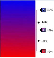
最初的回答body {
background: linear-gradient(to top, red 10%, purple 45%, blue 85%);
margin: 0;
height: 100vh;
}例子:在两个颜色停止点之间可以有一个颜色插值提示,它指定了两侧颜色停止点之间的空间中颜色应如何插值(默认情况下,它们进行线性插值)。在任何给定的两个颜色停止点之间最多只能有一个颜色插值提示;使用多个会使函数无效。
body {
  background:
   /* First gradient with hints*/
   linear-gradient(to top, red 10%, purple 45%, blue 85%) left /45% 100%,
   /* Second gradient with hints*/
   linear-gradient(to top, red 10%,27.5% ,purple 45%, 57% ,blue 85%) right/45% 100%;


  background-repeat:no-repeat;
  margin: 0;
  height: 100vh;
} .myheader {
width: 100px;
height: 100px;
background: linear-gradient(to bottom, blue 15%, purple 45%, red 90%);
}<div class="myheader"></div>这是一个例子,使用您的rgba颜色。
.myheader {
  background: linear-gradient(to bottom, rgba(248,80,50,1) 0%, rgba(241,111,92,1) 50%, rgba(246,41,12,1) 51%, rgba(240,47,23,1) 71%, rgba(231,56,39,1) 100%
  }
$mycolor1: blue;
$mycolor2: purple;
$mycolor3: red;

.myheader {
background: linear-gradient(to bottom, $mycolor1 0%, $mycolor2 50%, $mycolor3 90%);
height: 200px;
width: 100px;
}
https://jsfiddle.net/qa1kLmfc/3/
对于你的梯度,你可能只需要使用蓝色和红色。
background: linear-gradient(to bottom, blue, red);应该可以实现。 - Paulie_D