我有一堆响应式的img元素(它们根据图片和视口大小进行调整大小)在垂直列表上。
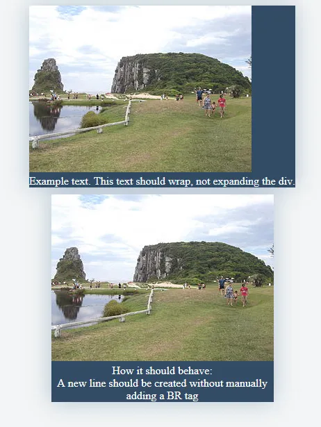
每个图像需要底部的描述,但不应水平扩展容器。(我目前无法将文本换行)
在第一个示例中,文本扩展了容器的宽度。使用第二个示例,我不得不添加<br>标签来模拟我想要的效果。
是否有办法通过CSS控制文本元素的换行?
我有一堆响应式的img元素(它们根据图片和视口大小进行调整大小)在垂直列表上。
每个图像需要底部的描述,但不应水平扩展容器。(我目前无法将文本换行)
在第一个示例中,文本扩展了容器的宽度。使用第二个示例,我不得不添加<br>标签来模拟我想要的效果。
是否有办法通过CSS控制文本元素的换行?
您可以使用 width: min-content 来设置 .box 的宽度,例如:
.box {
  width: min-content;
}
.box {
  width: min-content;
  display: table;
  position: relative;
  background: #334b64;
  margin: 0px auto 20px auto;
  box-shadow: 0px 0px 50px rgba(29, 80, 123, 0.3);
}

.text {
  color: white;
  font-size: 14;
  text-align: center;
  position: relative;
  width: 100%;
  height: auto;
  word-wrap: break-word;
  white-space: pre-wrap
}<div class="container-fluid container-screenshot">
<div class="img-responsive-parent">
<div class="box">
<img class="img-responsive" src="https://upload.wikimedia.org/wikipedia/commons/thumb/a/a9/Guarita_-_Torres_-_Brasil_.JPG/320px-Guarita_-_Torres_-_Brasil_.JPG" />
<h4 class="text">Example text. This text should wrap, not expanding the div.</h4>
</div>
<div style="display:table; position: relative; background: #334b64; margin: 0px auto 30px auto; box-shadow: 0px 0px 50px rgba(29, 80, 123, 0.3);">
<img class="img-responsive" src="https://upload.wikimedia.org/wikipedia/commons/thumb/a/a9/Guarita_-_Torres_-_Brasil_.JPG/320px-Guarita_-_Torres_-_Brasil_.JPG" />
<h4 class="text">How it should behave:<br>A new line should be created without manually<br>adding a BR tag</h4>
</div>
</div>
</div>
min-content之前考虑 http://caniuse.com/#search=min-content,因为它在某些浏览器上存在限制。 - Robertmin-content。我最终使用了一个表格。无论如何,谢谢。 :) - Nicke Manarin