如何使用inline-block让两个div并排显示?

21

如何使 div 并排显示,并且其中一个 div('contentwrapper')可以响应浏览器窗口大小变化。

HTML:

<div id="maincontainer">
<div id="leftcolumn">&nbsp;</div>

<div id="contentwrapper">&nbsp;</div>
</div>

CSS(层叠样式表)
#maincontainer {
    width:100%;
    height: 100%;
}

#leftcolumn {
    display:inline-block;
    width: 100px;
    height: 100%;
    background: blue;
}

#contentwrapper {
    display:inline-block;
    width:100%;
    height: 100%;
    background-color: red;
}

JSFIDDLE http://jsfiddle.net/A5HM7/


@BuddhistBeast 与浏览器在同一行 - user2133606
5个回答

22
<style>
  #maincontainer {
    width:100%;
    height: 100%;
  }

  #leftcolumn {
    float:left;
    display:inline-block;
    width: 100px;
    height: 100%;
    background: blue;
  }

  #contentwrapper {
    float:left;
    display:inline-block;
    width: -moz-calc(100% - 100px);
    width: -webkit-calc(100% - 100px);
    width: calc(100% - 100px);
    height: 100%;
    background-color: red;
  }
</style>

图片描述

图片描述


6

好的,我认为这将是您最快的解决方案。您已经拥有了很好的HTML结构,但我将进一步缩小范围。这里是JsFiddle

使用您的代码:

#maincontainer {
    width:100%;
    height: 100%;
}

我进行了一些小的调整,如下所示:
#maincontainer {
    width:100%;
    height: 100%;
    display:inline-block;//added this
}

接着,我也对另外两个东西进行了重构,方法如下:

#leftcolumn {
    float:left;//added this
    width: 100px;
    height:100%;
    background: blue;
}
#contentwrapper {
    float:right;//added this
    width:100%;
    height: 100%;
    background-color: red;
}

现在在这个JsFiddle中,我已经创建了一个特定的宽度,因此您可以随时更改它。请记住,如果您将100%用作宽度,并尝试在同一行中添加其他内容,则会自动创建两行,如下所示:
#leftcolumn {
    display:inline-block;<-- changed this above.
    width: 100px;<----This won't work with the below
    height: 100%;
    background: blue;
}

#contentwrapper {
    display:inline-block;<---- changed this above.
    width:100%;<---- This won't work with the above
    height: 100%;
    background-color: red;
}

但如果您将其重构为以下形式:
#leftcolumn {
    display:inline-block;
    width: 10%;<---This will work with the below
    height: 100%;
    background: blue;
}

#contentwrapper {
    display:inline-block;
    width:90%;<---This will work with the above.
    height: 100%;
    background-color: red;
}

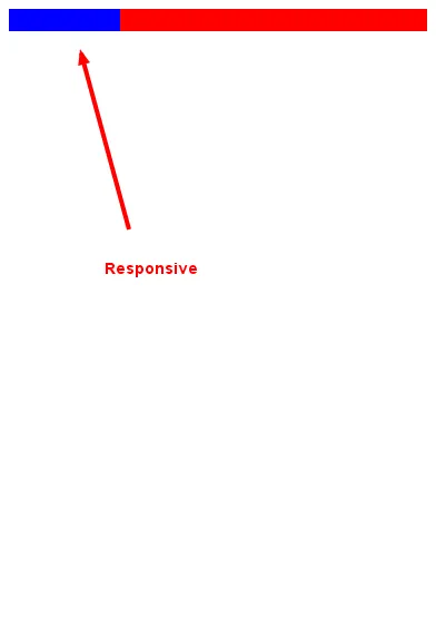
需要注意几点,我在JsFiddle中添加了高度以便查看实际尺寸,并且也添加了宽度以确保精确。一个非常有用的提示可以帮助你进行实现和基本的"为什么会生效"是这个

如果某些内容对您无效,请在下面评论。


4

不使用浮动或绝对定位也可以将2个div并排放置。我使用的是calc函数,该函数在IE9及以上版本中支持。 MDN calc规范 同时别忘了使用空格隔开块元素Stackoverflow: 50% wont fit because hidden space between divs

<!-- HMTL -->
<div id="maincontainer">
<div id="leftcolumn">&nbsp;</div><!-- space blocker
--><div id="contentwrapper">&nbsp;</div>
</div>

CSS

#maincontainer {
  width:100%;
  height: 100%;
}

#leftcolumn {
  display:inline-block;
  width: 100px;
  height: 100%;
  background: blue;
}

#contentwrapper {
  display:inline-block;
  width: calc(100% - 100px);
  height: 100%;
  background-color: red;
}

0
#maincontainer {
    width:100%;
    height: 100%;
}

#leftcolumn {
    display:inline-block;
    position: absolute;
    width: 340px;
    float: left;
    height: 100%;
    background: blue;
}

#contentwrapper {
    display:inline-block;
    margin-left: 340px;  // see how this is equal to the width of #left-column
    position: absolute; // might want to try with this or position relative
    max-width: 100%;
    width: 100%; // might want to try with or without this line
    height: 100%;
    background-color: red;
}

0

有多种可能性,但最简单的方法是使用flexbox。查看弹性盒子布局模块的文档以获取更多信息。请注意,它仍然是一个候选推荐,因此一些浏览器可能会遇到问题。


网页内容由stack overflow 提供, 点击上面的
可以查看英文原文,
原文链接