区分Google Pixel 1/2与Google Pixel XL以及Google Pixel 2 XL的媒体查询

3
我正在编写一个Cordova应用程序,需要将这些Google手机隔离以进行样式调整。
考虑到这一点:enter image description here 
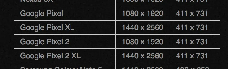
我很难区分任何一个Google Pixel手机。
@media only screen and (min-width: 411px) and (max-width: 731px) {
    .myDiv{ background-color: blue; }
}

这会触发所有像素 - 包括模拟器和实际设备

@media only screen and (min-width: 411px) and (-webkit-device-pixel-ratio: 3) {
    .myDiv{ background-color: blue; }
}

任何像素手机都无法触发此功能 - 无论是3还是4的像素比例。

@media screen and (device-width: 411px) and (device-height: 731px) and (orientation: portrait) and (-webkit-device-pixel-ratio: 2.6){
   .myDiv{ background-color: blue;
}

这也不会在任何一款Pixel手机上触发。

我正在努力寻找一个可以隔离Google Pixel 2 XL的媒体查询,但似乎没有任何相关的信息发布,而这款手机已经发布了一段时间了?

有人尝试过吗?


你在这方面有什么运气吗?我也遇到了同样的问题。 - alex
很遗憾我没有 :( - 看起来现在Stack Overflow的问题很快就会被淹没 - 不知道是不是有什么变化。 - Dan
我最终做的是使用JS计算设备高度,并将变量附加到CSS类上,以根据高度推拉div元素...虽然不太美观,但可以工作。 - Dan
2个回答

6

使用Javascript可以获取设备的宽度、高度和像素宽高比

输出设备信息函数

function OutputDeviceInformation() {
  let deviceWidth = window.screen.width;
  let deviceHeight = window.screen.height;
  let devicePixelAspectRation = window.devicePixelRatio;

  console.log('Width: ' + deviceWidth);
  console.log('Height: ' + deviceHeight);
  console.log('Pixel Aspect Ratio: ' + devicePixelAspectRatio);
}

Google Pixel 2 XL 输出:

宽度: 412 像素

高度: 823 像素

像素宽高比: 3.5

媒体查询以针对 Google Pixel 2 XL

/* Portrait */
@media screen 
  and (device-width: 412px) 
  and (device-height: 823px) 
  and (-webkit-device-pixel-ratio: 3.5) 
  and (orientation: portrait) {

}

/* Landscape */
@media screen 
  and (device-width: 412px) 
  and (device-height: 823px) 
  and (-webkit-device-pixel-ratio: 3.5) 
  and (orientation: landscape) {

}

/* Target Portrait and Landscape */
@media screen 
  and (device-width: 412px) 
  and (device-height: 823px) 
  and (-webkit-device-pixel-ratio: 3.5) 
  and (orientation: landscape) {

}

-4
尝试适用于Google Pixel XL的以下代码:
/* Google Pixel XL */ '@media screen and (device-width: 411px) and (device-height: 823px) { }'

网页内容由stack overflow 提供, 点击上面的
可以查看英文原文,
原文链接