均匀分布固定大小的div

7
我看了几个类似的问题,但是答案对我没有用。
我有几个 div,每个 div 的宽度都是 210 像素。
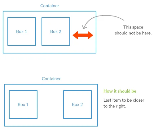
他们所在的容器可以根据用户屏幕大小调整大小。这些 div 必须始终水平均匀分布,并且如果没有空间,它们还应该断开 div 行。
为了更清楚地说明,请参见下面的图。 enter image description here 
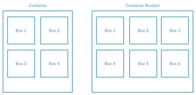
这个 JS fiddle 已经实现了我想要的结果。但是我不知道它如何适用于必须具有固定宽度的我的 div。
width: calc(100% / 6);

编辑:

JS Fiddle的问题在于当屏幕大小有空间,但不足以容纳另一个div时。此时,最后一个div应该更靠近右边。

enter image description here


Flexbox来拯救。 - Praveen Kumar Purushothaman
Flexbox可以通过为子元素设置最小宽度来填充整行,但不要太靠近问题,我相信:http://jsfiddle.net/bvgn46hu/108/有趣的回退到最初希望的方式。 - G-Cyrillus
在您提供的 jsfiddle 中,将 div 的宽度更改为固定大小怎么样?http://jsfiddle.net/0tc8e0kf/ - sc3w
@sc3w 你好。我编辑了问题并添加了JS fiddle无法工作的部分。 - user3607282
@user3607282,你能改变HTML结构吗? - Nenad Vracar
显示剩余4条评论
3个回答

2
使用Flexbox技术,可以通过设置justify-content属性为space-around(或者根据你的需求设置为space-between)来实现你想要的效果。以下是一个快速示例:

Flexbox

body{
  display:flex;
  flex-wrap:wrap;
  justify-content:space-around;
  margin:0;
  padding:5px;
}
div{
  background:#000;
  flex:0 0 210px;
  height:210px;
  margin:5px;
  width:210px;
}
<div></div><div></div><div></div><div></div><div></div><div></div><div></div><div></div><div></div><div></div><div></div><div></div><div></div><div></div><div></div>

请查看caniuse.com,以获取有关浏览器支持和前缀的详细信息。


一般情况下是正确的,取决于发帖者希望在最后一行中显示的框的方式。 - Paulie_D
天啊,我真的需要花时间来熟悉使用 flex-box。看起来它可以为常见的设计模式节省大量的额外代码。 - Korgrue
这是一个非常好的关于flexbox及其属性的初学者教程:https://css-tricks.com/snippets/css/a-guide-to-flexbox/ - Shaggy
同意,@Paulie_D,但是SO上还有其他处理该问题的问题。 - Shaggy

0

如果我参考屏幕截图和大家的想法,flexbox可以帮助你(实际上我期望从我的评论中得到反馈,关于http://jsfiddle.net/bvgn46hu/108/http://jsfiddle.net/bvgn46hu/114/

#container {
  margin:1em;
  color:turquoise;
  display:flex;
  flex-wrap:wrap;
  border: solid;
  padding:2vh;
  align-items:center;
  justify-content:space-between;
}
#container > div:before {
  content:'boxe ';
  padding-right:0.25em;;
}
#container > div {
  display:flex;
  
  align-items:center;
  justify-content:center;
  min-height:25vh;
  border: solid;
  margin:1vh 0;
  width:400px;
  min-width:calc(100vw  / 4);
  max-width: 45%;
  
}
<div id="container">
    <div>1</div>
    <div>2</div>
    <div>3</div>
    <div>4</div>
    <div>5</div>
    <div>6</div>
</div>

CodePen 可供使用


0

http://kyusuf.com/post/almost-complete-guide-to-flexbox-without-flexbox

这是一篇关于如何在不使用 Flexbox 的情况下实现可视化布局的文章(Flexbox 存在很多 bug,你需要深入了解才能使它在各个浏览器中稳定运行——当你不在其基础上进行语法调整时,浏览器支持会变得更糟糕,所以假设:“没有 Flexbox!”)。
解决你手头问题的方法非常简单,不需要用到 Flexbox:
.container {
  padding: y%; /* by giving the container a percentage based padding, you will create a slowly upscaling container as screen-width increases */
}

.box {
  width: 210px; /* whyever they need a fixed width but ok, who knows */
  margin-right: x%; /* x should be replaced with a value that distributes your containers evenly across the screen and makes them wrap when needed. Fiddle with the value until it makes sense to you. */
}

那解决了这个问题吗?


网页内容由stack overflow 提供, 点击上面的
可以查看英文原文,
原文链接