我在创建Android中的圆形复选框时遇到了问题。我尝试了许多方法,但我的问题没有解决。我创建了形状并应用于复选框,但问题仍未解决。请帮助我如何创建圆形复选框。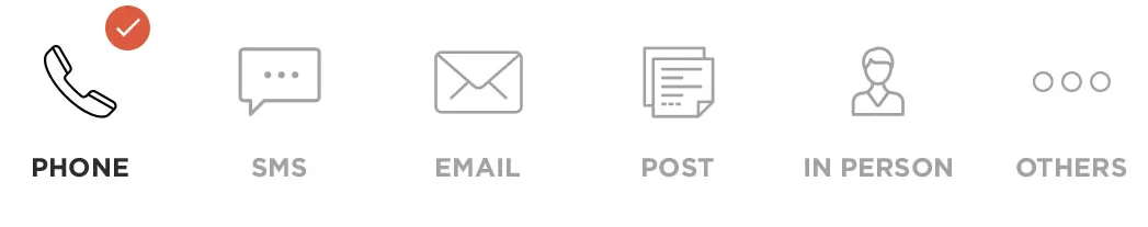
如何创建如图所示的圆形复选框。
我在创建Android中的圆形复选框时遇到了问题。我尝试了许多方法,但我的问题没有解决。我创建了形状并应用于复选框,但问题仍未解决。请帮助我如何创建圆形复选框。
如何创建如图所示的圆形复选框。
经过一段时间的努力,我已经创建了这个模板,你可以使用它。根据需要,您可能需要进行修改。
在activity.xml中
<CheckBox
    android:id="@+id/checkb"
    android:layout_width="115dp"
    android:layout_height="50dp"
    android:button="@drawable/custom_checkbox"
    android:scaleX="3"
    android:scaleY="3"
    android:layout_centerVertical="true"
    android:layout_alignParentRight="true"
    android:layout_alignParentEnd="true"
    android:layout_marginRight="15dp"
    android:layout_marginEnd="15dp" />
在drawable文件夹中创建一个名为custom_checkbox.xml的新XML文件
<?xml version="1.0" encoding="utf-8"?>
<selector xmlns:android="http://schemas.android.com/apk/res/android" >
    <item android:state_checked="true"
        android:drawable="@drawable/checked" />
    <item android:state_pressed="true"
        android:drawable="@drawable/checked" />
    <item android:state_pressed="false"
        android:drawable="@drawable/unchecked" />
</selector>
在drawable文件夹中创建一个名为checked.xml的新XML文件。
<?xml version="1.0" encoding="utf-8"?>
<selector xmlns:android="http://schemas.android.com/apk/res/android">
    <item android:state_checked="true">
        <layer-list>
            <item>
                <shape android:shape="oval">
                    <corners android:radius="1dp" />
                    <stroke
                        android:width="1dp"
                        android:color="#777" />
                    <gradient
                        android:startColor="#990000"
                        android:centerColor="#990000"
                        android:endColor="#990000"
                        android:angle="270" />
                    <size
                        android:width="30dp"
                        android:height="30dp" />
                </shape>
                </item>

            <item
                android:width="8dp"
                android:height="2dp"
                android:top="20dp"
                android:left="6dp">
                <rotate
                    android:fromDegrees="45">
                    <shape android:shape="rectangle">
                        <solid android:color="#fff"/>
                    </shape>
                </rotate>
            </item>

            <item
                android:width="19dp"
                android:height="2dp"
                android:top="16dp"
                android:left="9dp">
                <rotate
                    android:fromDegrees="-45">
                    <shape android:shape="rectangle">
                        <solid android:color="#fff"/>
                    </shape>
                </rotate>
            </item>
        </layer-list>
    </item>

</selector>
在drawable文件夹中创建一个名为unchecked.xml的新xml文件。
<?xml version="1.0" encoding="UTF-8"?>
<shape xmlns:android="http://schemas.android.com/apk/res/android" android:shape="oval">
        <corners android:radius="1dp" />
        <stroke
            android:width="1dp"
            android:color="#777" />
        <gradient
            android:startColor="#990000"
            android:centerColor="#990000"
            android:endColor="#990000"
            android:angle="270" />
        <size
            android:width="30dp"
            android:height="30dp" />
    </shape>
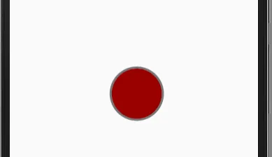
当未被选中时,它看起来如下所示。(您可以在 checked.xml 中添加代码,并修改顶部和左侧以在复选框未被选中时给出 X)
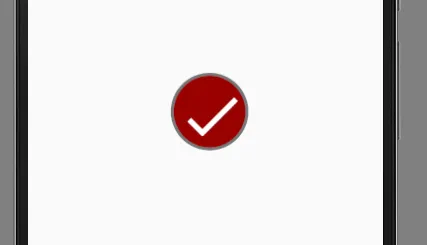
当选中时,它将如下所示:
如果这有效,请将其标记为答案。
以上是我选择的可绘制对象,您可以自定义它们并保存,然后转到appiconmaker.co,使用您创建的可绘制对象生成各种设计尺寸的可绘制对象,例如mdpi、hdpi、xhdpi和xxhdpi,以下是我制作的可绘制对象
 未选中的复选框
 已选中的复选框
完成后,您可以将可绘制对象添加到具有相应名称的drawables文件夹中的已选中和未选中,完成所有操作后,现在按照chirag90的答案创建custom_checkbox.xml文件
<?xml version="1.0" encoding="utf-8"?>
<selector xmlns:android="http://schemas.android.com/apk/res/android" >
    <item android:state_checked="true"
        android:drawable="@drawable/checked" />
    <item android:state_pressed="true"
        android:drawable="@drawable/checked" />
    <item android:state_pressed="false"
        android:drawable="@drawable/unchecked" />
</selector>
现在,在您的布局中按照以下方式创建复选框
<CheckBox
 android:id="@+id/checkman"
 android:layout_width="wrap_content"
 android:layout_height="wrap_content"
 android:layout_alignParentEnd="true"
 android:layout_alignParentRight="true"
 android:layout_centerVertical="true"
 android:layout_marginRight="15dp"
 android:layout_marginEnd="15dp"
 android:button="@drawable/custom_checkbox"
 android:scaleX="0.8"
 android:scaleY="0.8" />
android:scaleX="0.8"和android:scaleY="0.8"来适应你的布局。 未选中
未选中
 已选中
已选中<?xml version="1.0" encoding="utf-8"?>
<shape xmlns:android="http://schemas.android.com/apk/res/android" android:shape="oval">
<solid android:color = "@color/lightgray" />
</shape>
经过验证的XML:
<?xml version="1.0" encoding="utf-8"?>
      <layer-list xmlns:android = "http://schemas.android.com/apk/res/android">
            <item>
                <shape android:shape="oval">
                    <solid android:color="@color/colorPrimary" />
                </shape>
                </item>

            <item
                         android:drawable="@drawable/check_arrow_png" />
        </layer-list>
inset属性。
注意:@chirag90的解决方案仅适用于API 23及以上版本。
注意:vector drawable可能会渲染得不好。
Checked.xml
<?xml version="1.0" encoding="utf-8"?>
<layer-list xmlns:android="http://schemas.android.com/apk/res/android">
    <item>
        <shape android:shape="oval">
            <solid
                android:color="@color/col_chat_selected"/>
            <size
                android:width="35dp"
                android:height="35dp"/>
        </shape>
    </item>

    <item>
        <inset
            android:drawable="@drawable/shape"
            android:insetBottom="10dp"
            android:insetLeft="10dp"
            android:insetRight="10dp"
            android:insetTop="10dp"/>
    </item>

</layer-list>

Create TWO animations Start_to_End and End_to_Start;
Export the created animation in the format AnimationVectorDrawable;
Move your animation to the resources folder drawable;
Place ImageView in XML;
For convenience, create CustomImageView { Do not worry below will be an example };
@RequiresApi(Build.VERSION_CODES.M)
class CustomCheckBox(
context: Context,
attrs: AttributeSet
) : AppCompatImageView(context, attrs) {

private val TAG = this::class.simpleName

private val check =
  resources.getDrawable(R.drawable.avd_anim_start_to_end)!!.toAnimationVectorDrawable()
private val uncheck =
   resources.getDrawable(R.drawable.avd_anim_end_to_start)!!.toAnimationVectorDrawable()

init {
  setImageDrawable(check)
  setOnClickListener { animateCheckOrUncheck() }
}

private fun animateCheckOrUncheck() {
  check.registerAnimationCallback(object : Animatable2.AnimationCallback() {
      override fun onAnimationEnd(drawable: Drawable?) {
          Log.i(TAG, "onAnimationEnd: check")
          check.reset()
          setImageDrawable(uncheck)
      }
  })

  uncheck.registerAnimationCallback(object : Animatable2.AnimationCallback() {
      override fun onAnimationEnd(drawable: Drawable?) {
          Log.i(TAG, "onAnimationEnd: uncheck")
          uncheck.reset()
          setImageDrawable(check)
      }
  })

  (drawable as AnimatedVectorDrawable).start()
 }
}

@RequiresApi(Build.VERSION_CODES.LOLLIPOP)
private fun Drawable.toAnimationVectorDrawable(): AnimatedVectorDrawable {
return (this as AnimatedVectorDrawable)
}