如何使用CSS实现折叠带状效果?

7

我正在尝试将基于图像的信息图形转换为HTML和CSS。我能够完成90%,但需要在折叠缎带效果方面寻求帮助。

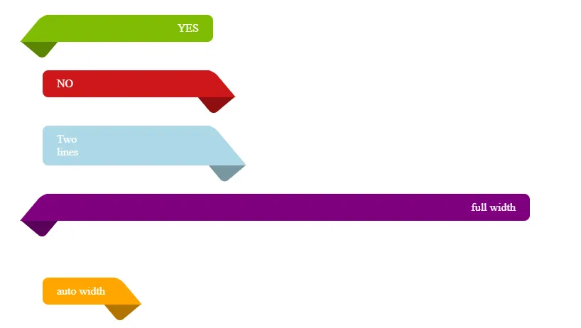
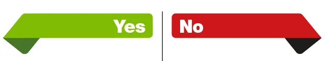
信息图具有Yes / No方向,如下所示:

"缎带"的末端被折叠在下方,并以主要颜色的较暗阴影露出。

CSS ribbon shape

这是我目前的代码:

<style>
 .container { display: flex; flex-wrap: wrap; background-color: white; border-radius: 1em; }
 .container .header { width: 100%; font-size: 3em; font-weight: bold; line-height: 0.9; padding: 1em 3em !important; text-align: center }
 .container .child:first-child { width: 100%; }
 .container .child:not(:first-child) { width: 50%; font-size: 13px; }
 .container .child { display: inline-block; padding: 1em; }
 .container .leftcol { border-right: 2px solid black; }
 .container .redright { position: relative; background-color: #cd1719; color: white; font-size: 3em; font-weight: bold; padding-left: 0.5em; border-radius: 0.25em; margin-bottom: 0.5em; }
 .container .greenleft { position: relative; background-color: #7fbc03; color: white; text-align: right; font-size: 3em; font-weight: bold; padding-right: 0.5em; border-radius: 0.25em; margin-bottom: 0.5em; }
 .container .greenleft::before { content: ""; position: absolute; top: 0; left: 0; border-width: 1.5em 1em 1.25em 0; border-color: white #7fbc03 transparent transparent; display: block; border-style: solid; bottom: -1em; }
</style>
    <div class="container">
        <div class="child header">Header</div>
        <div class="child leftcol">
            <div class="greenleft">Yes</div>
            <p>Content on the left</p>
        </div>
        <div class="child rightcol">
            <div class="redright">No</div>
            <p>Content on the right</p>
        </div>
    </div>


嗨,欢迎来到SO!我相信这个 Codepen 的代码会对你有所帮助。 - Rene van der Lende
谢谢@Rene,这很接近了,但三角形最终会有一条垂直线 - 如果可能的话,我想要更接近等边三角形的东西。 - RodCoate
1个回答

9
我会像下面这样做:

.box {
  width: 200px;
  padding: 10px 20px;
  margin: 40px 80px;
  color: #fff;
  text-align: right;
  background: #7fbc03;
  border-radius: 8px;
  position: relative;
  z-index: 0;
}

.box::before,
.box::after {
  content: "";
  position: absolute;
  z-index: -1;
  top: 0;
  bottom: 0;
  background: inherit;
  border-radius:inherit;
  border-bottom-left-radius:0;
  transform-origin: top left;
}

.box::before {
  left: 0;
  right: 20%;
  transform: skewX(-40deg);
}

.box::after {
  z-index: -2;
  left: 1px;
  height: 130%; /* ~ 100%/cos(40deg) */
  width: 40px;
  filter: brightness(0.7);
  transform: rotate(40deg);
}

.right {
  text-align: left;
  background: #cd1719;
}

.right::before {
  right: 0;
  left: 20%;
  border-bottom-right-radius:0;
  border-bottom-left-radius:inherit;
  transform: skewX(40deg);
}

.right::after {
  right: 1px;
  left: auto;
  transform-origin: top right;
  border-bottom-right-radius:0;
  border-bottom-left-radius:inherit;
  transform: rotate(-40deg);
}
<div class="box">YES</div>

<div class="box right">NO</div>

<div class="box right" style="background:lightblue;">Two <br> lines</div>

<div class="box" style="background:purple;width:auto;">full width</div>

<div class="box right" style="background:orange;width:auto;display:inline-block">auto width</div>

CSS folded ribbon


我在某处看到过这段代码。似乎使用了上方的“fork ribbon”技巧之类的东西?(只是想了解一下,谢谢) - Rene van der Lende
@RenevanderLende 我刚刚从头开始编写了这段代码。 - Temani Afif
我曾经在与“fork ribbon”相关的内容中看到过height: 130%; /* ~ 100%/cos(40deg) */。尽管如此,这里提供了一个不错的解决方案,但还是引发了我的“如何使其响应式”的想法(只是为了好玩)。一个月前做了这个Fork Ribbon,所以我才问的(代码)。 - Rene van der Lende

网页内容由stack overflow 提供, 点击上面的
可以查看英文原文,
原文链接