我尝试使用Plotly在shiny中实现这一点,但没有像上面展示的那样使用layers。虽然这可能是一个旧的主题,但对于其他人可能有帮助。
在以下示例中:
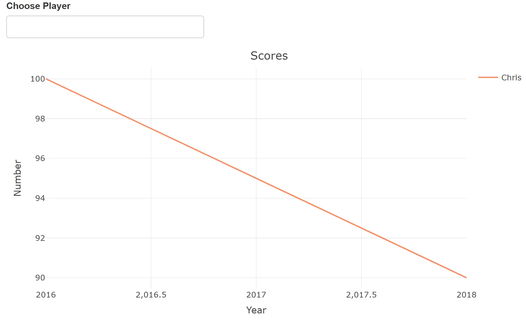
- 首先显示基于一个人的成绩的图表。
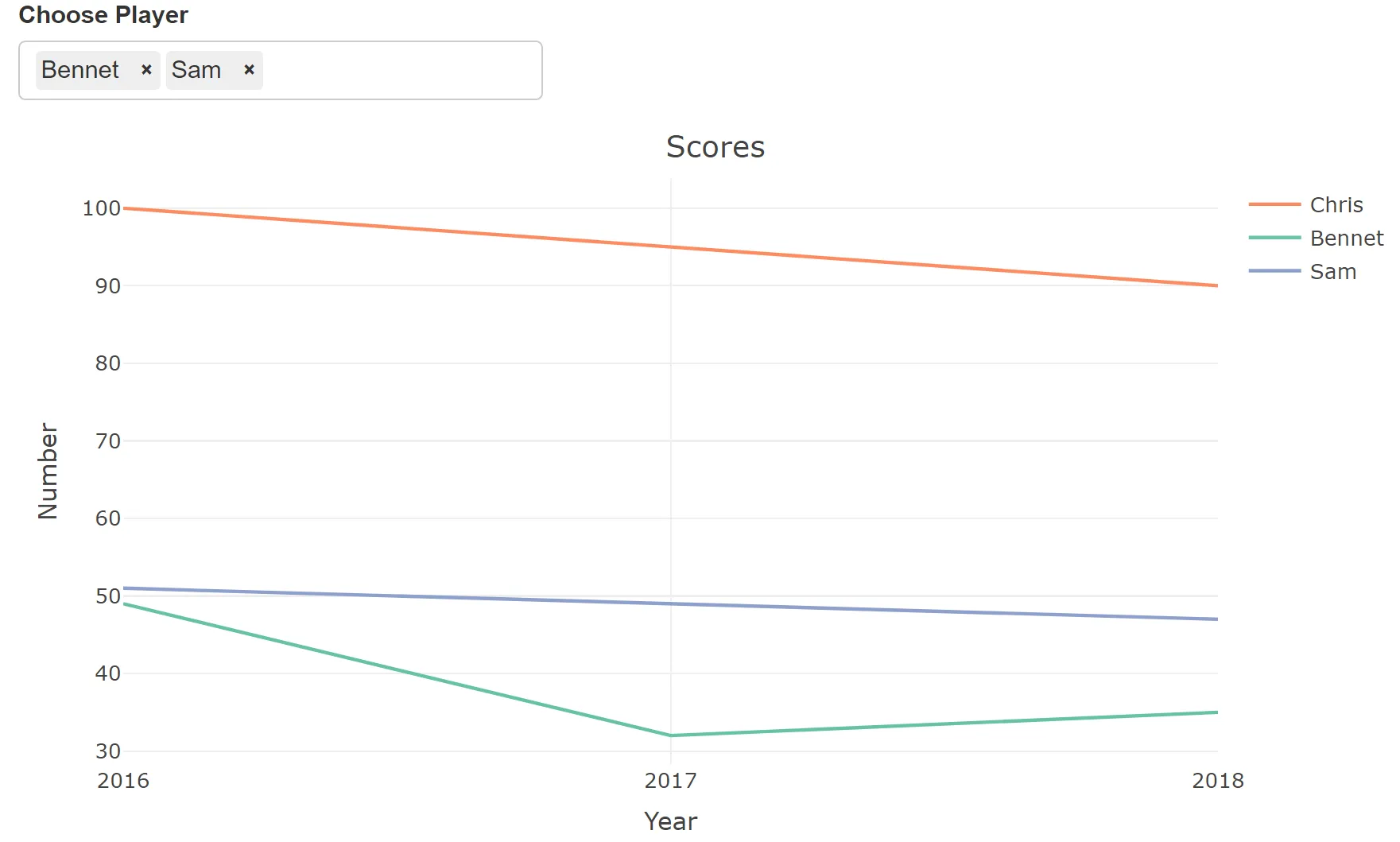
- 然后,随着我们从列表中选择输入,其他人的分数更新在同一张图表上。
library(shiny)
library(plotly)

ui <- fluidPage(
  selectizeInput(
    inputId = "Player",
    selected = NULL,
    multiple = TRUE,
    label = " Choose Player",
    choices = c("Sam", "Bennet", "Orlando"),
    options = list('plugins' = list('remove_button'))
  ),
  plotlyOutput("Plot1")
)

server <- function(input, output, session) {
  output$Plot1 <-  renderPlotly({

    scores <- data.frame(Name = c("Sam", "Bennet", "Orlando", "Sam", "Bennet", "Orlando", "Sam", "Bennet", "Orlando" ),
                        Number= c(47, 35, 40, 49, 32, 31, 51, 49, 44 ),
                        Year = c("2018","2018","2018", "2017", "2017", "2017", "2016","2016","2016")
    )

    chris_goals <- data.frame(Name = c("Chris", "Chris", "Chris"),
                        Number= c(90, 95, 100 ),
                        Year = c("2018","2017","2016")
    )

    filteredScores <- reactive({

      plot_ly(chris_goals, x = ~Year, y = ~Number, type = 'scatter', mode = 'lines', color = ~Name)%>% layout(showlegend = TRUE) %>%
        layout(title = 'Scores') %>%
        add_trace(data =  scores[scores$Name %in% input$Player, ], x = ~Year, y = ~Number, type = 'scatter', mode = 'lines', color = ~Name)
    })

    filteredScores()
  })
}
shinyApp(ui, server)
默认值: