SVG进度圆形图像旋转方向

3

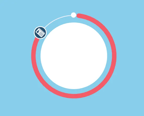
我正在尝试创建一个圆形进度条(如下图所示)。 进度基于百分比,并将在圆圈上移动到该百分比。 我已经让进度在圆圈上移动,但是与其一起移动的图标需要具有正确的方向。 如下图所示,当它应该面向屏幕底部时,图像底部朝向中心。 图像需要随着进度条一起移动。

<div class="case_progress_wrapper" data-percent="80">
 <svg class="case_progress_circle" height="100%" width="100%" viewBox="0 0 140 140">
  <circle id="case_progress__path" cx="70" cy="70" r="54" fill="none" stroke="#EBEDF8" stroke-width="1" />
  <circle class="case_progress__value" cx="70" cy="70" r="54" fill="none" stroke="#f00" stroke-width="6" />
  <circle class="case_progress__inner" cx="70" cy="70" r="44" fill="#fff" stroke="#fff" stroke-width="1" />
  <circle class="case_progress__start" cx="124" cy="63" r="3" fill="#fff" stroke="#fff" stroke-width="1" />
  <g id='case_progress__prog_fill' class="case_progress__prog" viewBox="0 0 60 60">
    <circle fill="url(#image)" cx="124" cy="63" r="8" stroke="#fff" stroke-width="1" />
  </g>
  <defs>
    <pattern id="image" x="0%" y="0%" height="100%" width="100%" viewBox="0 0 60 60">
      <image x="0%" y="0%" width="60" height="60" xlink:href="https://via.placeholder.com/150x150"></image>
    </pattern>
  </defs>
 </svg>
</div>


(function(){
            var $wrapper = $('.case_progress_wrapper'),
                $progress = $('.case_progress__value'),
                $circle_path = $('#case_progress__path'),
                $complete_circle = $('.case_progress__prog'),
                $percent = $wrapper.data('percent');

            setTimeout(function () {
                $progress.css('transition', 'all 2s');
                $progress.css('stroke-dashoffset', 'calc(339.292 - (' + $percent + ' * 339.292 / 100))');
                $complete_circle.css('transition', 'all 2s');
                $complete_circle.attr("transform", 'rotate(' + (360 - ($percent - 25)) + ',' + $circle_path.attr('cx') + ',' + $circle_path.attr('cy') +')');

                setTimeout(function () {
                    $progress.css('transition', 'none');
                    $complete_circle.css('transition', 'all 2s');
                }, 2000);

            }, 1000);

        })();

this is what I currently have

2个回答

3

通过纯SVG解决方案和一些JS输出百分比

进入图像描述

就像在这个问题中所述

为了解决这个问题,需要结合两种动画:

  1. 从开始到结束的圆弧绘制
  2. 带有图像的圆内部移动的动画

同时设置两种动画的时间

请阅读代码中的注释。

var count = $(('#count'));
$({ Counter: 0 }).animate({ Counter: count.text() }, {
  duration: 10000,
  easing: 'linear',
  step: function () {
    count.text(Math.ceil(this.Counter)+ "%");
  }
});
</script>
<script src="https://ajax.googleapis.com/ajax/libs/jquery/2.1.1/jquery.min.js"></script>
<div class="case_progress_wrapper" data-percent="80" style="width:50vw; height:50vh;">
 <svg class="case_progress_circle"  viewBox="0 0 140 140">
<defs>
    <pattern id="image" x="0%" y="0%" height="100%" width="100%" viewBox="1 0 58 58">
      <image  x="0%" y="0%" width="60" height="60" xlink:href="https://istack.dev59.com/uQMJ3.webp"></image>
    </pattern>
  </defs>
 <rect width="100%" height="100%" fill="#87CEEB" />
 <g transform="rotate(-90 70 70)" >  
    <!-- Track for rotating a circle with an image -->
 <path id="case_progress__path"       
     style="fill:none;stroke:#ebedf8;stroke-width:1"
     d="M 124,70 A 54,54 0 0 1 70,124 54,54 0 0 1 16,70 54,54 0 0 1 70,16 54,54 0 0 1 124,70 Z"/>
  
   <!-- Circle for the growth of the red progress bar -->
 <circle  
  class="case_progress__value" stroke-dashoffset="339.5" stroke-dasharray="339.5" cx="70" cy="70" r="54" fill="none" stroke="#f00" stroke-width="6" >
     <!-- Bar progress animation -->
   <animate attributeName="stroke-dashoffset" begin="0s" dur="10s" values="339.5;0" fill="freeze" /> 
    </circle> 
 <!-- Starting point -->
<circle class="case_progress__start" cx="124" cy="70" r="3" fill="#fff" stroke="#fff" stroke-width="1" />
  <g id='case_progress__prog_fill' class="case_progress__prog" viewBox="1 0 58 58">
  <circle transform="rotate(90 0 0)" fill="url(#image)" cx="0" cy="0"  r="8" stroke-width="0.25" stroke="#fff"   > 
      <!-- Icon rotation animation -->
        <animateMotion begin="0s" dur="10s" fill="freeze"   >
      <mpath xlink:href="#case_progress__path" /> 
      </animateMotion> 
  </circle>
  </g>  
    </g>

 <circle class="case_progress__inner" cx="70" cy="70" r="44" fill="#fff" stroke="#fff" stroke-width="1" />
  <text id="count" x="50%" y="50%" fill="red" text-anchor="middle" dy="7" font-size="20">100%</text>
 </svg>
</div> 


1
这个非常好用,帮助我达到了我所需要的目的。我不得不编辑代码,所以这不是一个简单的复制粘贴工作,但这让我更了解SVG,并且对我在项目中的其他设计也有所帮助。我会上传我的新代码作为编辑。谢谢! - Bryan88
@Bryan88,我很高兴能够帮助到你。感谢你的积极反馈,祝你在掌握SVG方面取得成功。 - Alexandr_TT

1
你需要做的就是将带有图标/图片的 <circle> 向相反方向旋转同样的角度。
    $complete_circle_circ = $('.case_progress__prog circle'),

    ...

    $complete_circle_circ.css({'transition': 'transform 2s',
                               'transform-box': 'fill-box',
                               'transform-origin': '50% 50%'});
    $complete_circle_circ.attr("transform", 'rotate(' + (-$rotation) + ')');

顺便说一句,我也修复了你的百分比->旋转计算。

$rotation = $percent * 360 / 100;

(function(){
    var $wrapper = $('.case_progress_wrapper'),
        $progress = $('.case_progress__value'),
        $circle_path = $('#case_progress__path'),
        $complete_circle = $('.case_progress__prog'),
        $complete_circle_circ = $('.case_progress__prog circle'),
        $percent = $wrapper.data('percent'),
        $rotation = $percent * 360 / 100;

    setTimeout(function () {
        $progress.css('transition', 'all 2s');
        $progress.css('stroke-dashoffset', 'calc(339.292 - (' + $percent + ' * 339.292 / 100))');
        $complete_circle.css('transition', 'all 2s');
        $complete_circle.attr("transform", 'rotate(' + $rotation + ',' + $circle_path.attr('cx') + ',' + $circle_path.attr('cy') +')');
        $complete_circle_circ.css({'transition': 'transform 2s', 'transform-box': 'fill-box', 'transform-origin': '50% 50%'});
        $complete_circle_circ.attr("transform", 'rotate(' + (-$rotation) + ')');

        setTimeout(function () {
            $progress.css('transition', 'none');
            $complete_circle.css('transition', 'all 2s');
        }, 2000);

    }, 1000);

})();
<script src="https://cdnjs.cloudflare.com/ajax/libs/jquery/3.3.1/jquery.min.js"></script>
```
<div class="case_progress_wrapper" data-percent="80">
 <svg class="case_progress_circle" height="100%" width="100%" viewBox="0 0 140 140">
  <circle id="case_progress__path" cx="70" cy="70" r="54" fill="none" stroke="#EBEDF8" stroke-width="1" />
  <circle class="case_progress__value" cx="70" cy="70" r="54" fill="none" stroke="#f00" stroke-width="6" />
  <circle class="case_progress__inner" cx="70" cy="70" r="44" fill="#fff" stroke="#fff" stroke-width="1" />
  <circle class="case_progress__start" cx="124" cy="63" r="3" fill="#fff" stroke="#fff" stroke-width="1" />
  <g id='case_progress__prog_fill' class="case_progress__prog">
    <circle fill="url(#image)" cx="124" cy="63" r="8" stroke="#fff" stroke-width="1" />
  </g>
  <defs>
    <pattern id="image" x="0%" y="0%" height="100%" width="100%" viewBox="0 0 60 60">
      <image x="0%" y="0%" width="60" height="60" xlink:href="https://via.placeholder.com/150x150"></image>
    </pattern>
  </defs>
 </svg>
</div>
```

```


网页内容由stack overflow 提供, 点击上面的
可以查看英文原文,
原文链接