有没有人知道一种 CSS/JavaScript 技术,可以实现以下效果:全屏背景图模糊,但其中一个浮动的固定部分不模糊,同时该部分保持居中和相同大小,即使浏览器窗口大小改变。背景图片需要随着浏览器窗口大小调整大小,但聚焦部分需要保持居中并具有相同的框大小,而其裁剪的背景图与模糊的背景一起调整大小。参见示例图。必须兼容各种浏览器。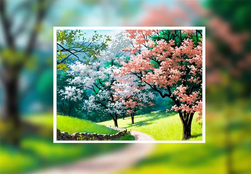
background-attachment为fixed。
html,
body {
  width: 100%;
  height: 100%;
  margin: 0;
}

.blur-group {
  position: relative;
  width: 100%;
  height: 100%;
}

.blurred,
.unblurred {
  background: url('//placekitten.com/1000/750') 50% 50% no-repeat;
  background-size: cover;
  background-attachment: fixed;
}

.blurred {
  width: 100%;
  height: 100%;
  filter: blur(7px);
}

.unblurred {
  width: 400px;
  height: 300px;
  position: absolute;
  top: 50%;
  left: 50%;
  margin-left: -200px;
  margin-top: -150px;
  border: 10px solid white;
}<div class="blur-group">
<div class="blurred"></div>
<div class="unblurred"></div>
</div>请将图像与模糊背景响应式地呈现
标记
<div class="widget center">
  <div class="text center">
    <h1 class="">Responsive Blur</h1>
    <p>Resize me</p>
  </div>
  <div class="blur">
    <img src="https://static.pexels.com/photos/88212/pexels-photo-88212.jpeg" class="bg">
  </div>
</div>
img.bg {
  min-height: 100%;
  width: 100%;
  height: auto;
  position: fixed;
  top: 0;
  left: 0;
  z-index: -2;
    -webkit-filter: blur(18px);
    -o-filter: blur(18px);
    filter: blur(18px);
}

.blur {
  height: 250px;
  width: 100%;
  margin: -20px auto;
  z-index: -1;
  position: relative;
  overflow: hidden;
}

.blur:after {
  content: '';
  height: 100%;
  width: 100%;
  position: absolute;
}

.widget {
  border-top: 2px solid white;
  border-bottom: 2px solid white;
  min-height: 200px;
  width: 45%;
  overflow: hidden;
   background-image: url("https://static.pexels.com/photos/88212/pexels-photo-88212.jpeg");
   -webkit-background-size: cover;
    -moz-background-size: cover;
    -ms-background-size: cover;
    -o-background-size: cover;
    background-size: cover;
}

.center {
  position: absolute;
  margin: auto;
  top: 0;
  bottom: 0;
  left: 0;
  right: 0;
}


/*  NOT REQUIRED  */

.text {
  height: 200px;
  width: 340px;
}

.text h1 {
  text-align: center;
  text-shadow: 1px 1px rgba(0, 0, 0, .1);
  color: #ffffff;
  margin-top: 70px;
  font-family: 'Lora', serif;
  font-weight: 700;
  font-size: 38px;
}

.text p {
  text-align: center;
  color: #ffffff;
  text-shadow: 1px 1px rgba(0, 0, 0, .1);
  margin-top: 0px;
  font-family: 'Lato', serif;
  font-weight: 400;
  font-size: 22px;
}
.parent{
  position: relative;
}

.child{
  position: absolute;
  width: 100%;
}

.child:first-child{
   -webkit-filter: blur(5px);
  -moz-filter: blur(5px);
  -o-filter: blur(5px);
  -ms-filter: blur(5px);
  filter: blur(5px);
}

.child:last-child{
  -webkit-clip-path: inset(20% 18% 15% 20%);
  clip-path: inset(20% 18% 15% 20%);
}
<div class="parent">
  <img class="child" src="http://i.imgur.com/RRUe0Mo.png">
  <img class="child" src="http://i.imgur.com/RRUe0Mo.png">
</div>
使用父容器
transform 居中这个 div下面是代码片段
body {
  position: relative;
  width: 100vw;
  height: 100vh;
}

#parent {
  position: relative;
  height: 100%;
  width: 100%;
}

#mask {
  width: 100%;
  height: 100%;
  position: absolute;
  background: url(https://encrypted-tbn2.gstatic.com/images?q=tbn:ANd9GcSvPdDmWSbJtqGgr8qMOKew03yzJVKc9ZCYDbfzRKTnMrnrfwIsNg);
  background-size: cover;
  -webkit-filter: blur(5px);
  -moz-filter: blur(5px);
  -o-filter: blur(5px);
  -ms-filter: blur(5px);
  filter: blur(5px);
}

#content {
  position: relative;
  width: 50%;
  height: 50%;
  background: url(https://encrypted-tbn0.gstatic.com/images?q=tbn:ANd9GcRney6jjMJ8ZrRKwPb9MNDi7dvF1OLFC78ZpT8Th43WaNnJQV263Q);
  background-size: cover;
  top: 50%;
  left: 50%;
  border: solid white;
  -moz-transform: translate(-50%, -50%);
  -webkit-transform: translate(-50%, -50%);
  -o-transform: translate(-50%, -50%);
  transform: translate(-50%, -50%)
}<div id="parent">
<div id="mask"></div>
<div id="content"> This is some content</div>
<div>
px代替vw和vh。 - Alex