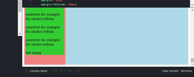
我有一个侧边栏,其高度比屏幕尺寸大,当使用
以下是代码示例:https://jsfiddle.net/zxypmqvg/3/
position: sticky时,直到我滚动到页面底部,我才能看到侧边栏底部部分。
如何确保当滚动时,例如,页面的50%已经显示侧边栏的下部?以下是代码示例:https://jsfiddle.net/zxypmqvg/3/
.main-block {
  display: flex;
}

.sidebar {
  background-color: LightCoral;
  width: 25%;
}

.sidebar-content {
  margin: 5px;
  margin-bottom: 40px;
  background-color: LimeGreen;
  position: sticky;
  top: 0;
}

.main-content {
  width: 75%;
  height: 4000px;
  background-color: LightBlue;
}
<!DOCTYPE html>
<html lang="en">
<head>
<meta charset="UTF-8">
<title>Document</title>
</head>
<body>
<div class="main-block">
<div class="sidebar">
<div class="sidebar-content">
<p>sometext for example for stackoverfrom</p>
<p>sometext for example for stackoverfrom</p>
<p>sometext for example for stackoverfrom</p>
<p>sometext for example for stackoverfrom</p>
<p>sometext for example for stackoverfrom</p>
<p>sometext for example for stackoverfrom</p>
<p>last string</p>
</div>
</div>
<div class="main-content">
</div>
</div>
</body>
</html>