无法使用Polymer 1.x或2.x的Shadow DOM样式化元素。考虑以下在Polymer 2.0中的自定义元素:
在演示中:
<link rel="import" href="../polymer/polymer.html">

<!--
`semantic-ui-button`


@demo demo/index.html
-->

<dom-module id="polymer-button">
  <template>
    <div class$="button {{size}}">{{label}}</div>
  </template>

  <script>
    class MyElement extends Polymer.Element {
      static get is() {
        return 'polymer-button';
      }
      static get properties() {
        return {
          label: {
            type: String,
            value: 'polymer-element'
          },
          size: { type: String }
        };
      }
    }

    window.customElements.define(MyElement.is, MyElement);
  </script>
</dom-module>
在演示中:
<!doctype html>
<html lang="en">
  <head>
    <meta charset="utf-8">
    <meta name="viewport" content="width=device-width, minimum-scale=1, initial-scale=1, user-scalable=yes">

    <title>polymer-element demo</title>

    <script src="../../webcomponentsjs/webcomponents-lite.js"></script>

    <link rel="import" href="../../iron-demo-helpers/demo-pages-shared-styles.html">
    <link rel="import" href="../../iron-demo-helpers/demo-snippet.html">
    <link rel="import" href="../polymer-element.html">

    <style is="custom-style" include="demo-pages-shared-styles"></style>
    <style>
      body { font-family: 'Segoe UI', Tahoma, Geneva, Verdana, sans-serif; }
      .button {
        background: #ccc;
        border-radius: 4px;
        color: #444;
      }
      .button.big {
        font-size: 1rem;
        padding: 6px;
      }
    </style>
  </head>
  <body>
    <div class="vertical-section-container centered">
      <h3>Basic polymer-element demo</h3>
      <demo-snippet>
        <template>
          <polymer-button label="Demo"></polymer-button>
        </template>
      </demo-snippet>
    </div>
  </body>
</html>
在演示中定义的.button和.button.big样式并未应用于阴影元素;然而,在Polymer 1.x中,如果我们使用ShadyDOM,则会应用这些样式(仅限Polymer 1.x):
<link rel="import" href="../polymer/polymer.html">

<!--
`polymer-button`


@demo demo/index.html
-->

<dom-module id="polymer-button">
  <template>
    <div class$="button {{size}}">{{label}}</div>
  </template>

  <script>
    Polymer({

      is: 'polymer-button',

      properties: {
        label: { type: String }
      },

    });
  </script>
</dom-module>
有没有一种方法可以使用外部样式选择/样式化这些内部元素?
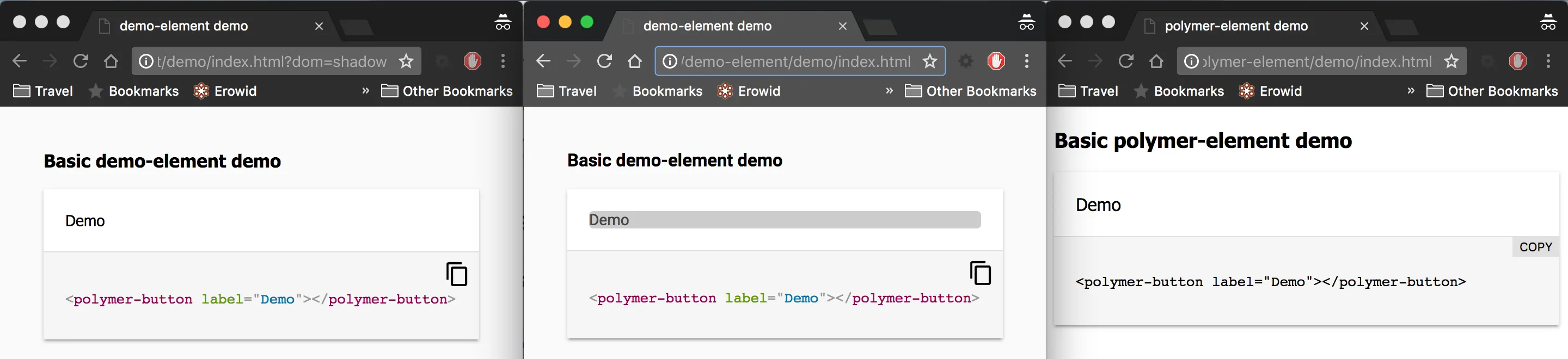
下面是我上面说的以出现顺序为基础的可视化表示:
- 使用 Shadow DOM 的 Polymer 1.x
- 使用 ShadyDOM 的 Polymer 1.x
- Polymer 2.x