模型展示
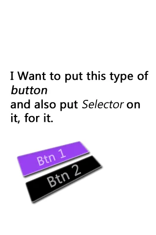
要求
我想要使用选择器添加自定义按钮。
上面给出了模型展示。
如果有人知道解决方案,请分享。
谢谢。
基本上,您需要创建一些新的 XML 文件并将它们应用于您的按钮元素。从模型中可以看出,您需要一个描边以及带有某些渐变效果的背景颜色,您可以进一步研究有关渐变的内容,但背景颜色和描边非常简单明了。
这里是一个例子,done_rounded_btn.xml:
   <?xml version="1.0" encoding="utf-8"?>
<selector xmlns:android="http://schemas.android.com/apk/res/android">
    <item
        android:state_pressed="true"
        android:state_enabled="true"
        android:drawable="@drawable/zzzzzzzzz_btn_orange" />
    <item
        android:state_focused="true"
        android:state_enabled="true"
        android:drawable="@drawable/zzzzzzzzz_btn_orange" />
    <item
        android:state_focused="false"
        android:state_enabled="false"
        android:drawable="@drawable/zzzzzzzzz_btn_inactiv" />
    <item android:drawable="@drawable/zzzzzzzzz_btn_black"/>
</selector>
对于选择部分,您需要创建与模拟设计相对应的自定义可绘制对象。
例如,zzzzzzzzzz_btn_orange:
<shape xmlns:android="http://schemas.android.com/apk/res/android"
    android:shape="rectangle" >

    <solid
        android:color="@color/done_color">
    </solid>

    <corners
        android:bottomLeftRadius="3dp"
        android:bottomRightRadius="3dp"
        android:topLeftRadius="3dp"
        android:topRightRadius="3dp" />

</shape>
然后将其作为背景添加到您的按钮中,main.xml:
<Button
            android:id="@+id/registers_btn"
            android:layout_width="wrap_content"
            android:layout_height="wrap_content"
            android:layout_centerVertical="true"
            android:layout_marginBottom="10dp"
            android:layout_marginLeft="15dp"
            android:layout_marginTop="10dp"
            android:background="@drawable/done_rounded_btn"
            android:text="@string/done_txt"
            android:textColor="@color/white"
            android:textSize="15sp" />
希望这可以帮到您!
您还可以创建一个使用选择器的形状。如果您的形状仅在不同状态下更改颜色,则这样做会更加简洁。
color/color_selector.xml
<selector xmlns:android="http://schemas.android.com/apk/res/android">
    <item android:color="@color/blue_dark" android:state_pressed="true" />
    <item android:color="@color/blue_light" />
</selector>
drawable/shape.xml
<shape xmlns:android="http://schemas.android.com/apk/res/android">
    <solid android:color="@color/color_selector" />
    <corners android:bottomLeftRadius="6dip" android:bottomRightRadius="6dp" />
    <padding android:bottom="0dip" android:left="0dip" android:right="0dip" android:top="0dip" />
</shape>
您可以使用这个替代标准按钮,将选择器设置为xml中的背景:
import android.content.Context;
import android.graphics.Bitmap;
import android.graphics.Color;
import android.util.AttributeSet;
import android.view.MotionEvent;
import android.widget.Button;

/**
 * Custom Shape Button which ignores touches on transparent background.
 */
public class ButtonWithUntouchableTransparentBg extends Button {

    public ButtonWithUntouchableTransparentBg(Context context) {
        this(context, null);
    }

    public ButtonWithUntouchableTransparentBg(Context context, AttributeSet attrs) {
        this(context, attrs, 0);
    }

    public ButtonWithUntouchableTransparentBg(Context context, AttributeSet attrs, int defStyle) {
        super(context, attrs, defStyle);
        setDrawingCacheEnabled(true);
    }

    @Override
    public boolean onTouchEvent(MotionEvent event) {
        int x = (int) event.getX();
        int y = (int) event.getY();

        // ignores touches on transparent background
        if (isPixelTransparent(x, y))
            return true;
        else
            return super.onTouchEvent(event);
    }

    /**
     * @return true if pixel from (x,y) is transparent
     */
    private boolean isPixelTransparent(int x, int y) {
        Bitmap bmp = Bitmap.createBitmap(getDrawingCache());
        int color = Color.TRANSPARENT;
        try {
            color = bmp.getPixel(x, y);
        } catch (IllegalArgumentException e) {
            // x or y exceed the bitmap's bounds.
            // Reverts the View's internal state from a previously set "pressed" state.
            setPressed(false);
        }

        // Ignores touches on transparent background.
        if (color == Color.TRANSPARENT)
            return true;
        else
            return false;
    }
}
带有两种状态(启用/禁用)的圆角按钮:
    <?xml version="1.0" encoding="utf-8"?>
<selector xmlns:android="http://schemas.android.com/apk/res/android">
    <item android:state_enabled="true">
        <shape android:shape="rectangle">
            <corners android:radius="28dp" />
            <solid android:color="@color/white" />
            <stroke android:width="1dp" android:color="@color/orange" />
        </shape>
    </item>
    <item android:state_enabled="false">
        <shape android:shape="rectangle">
            <corners android:radius="28dp" />
            <solid android:color="@color/grey_card_background" />
            <stroke android:width="1dp" android:color="@color/grey" />
        </shape>
    </item>
</selector>
在您的项目中,在选择器XML中放置形状
我的代码示例:
<!-- if pressed -->
<item android:state_pressed="true"><shape android:padding="10dp" android:shape="rectangle">
        <solid android:color="@color/blue" />

        <corners android:bottomLeftRadius="10dp" android:bottomRightRadius="10dp" android:topLeftRadius="10dp" android:topRightRadius="10dp" />
    </shape></item>

<!-- if not pressed -->
<item><shape android:padding="10dp" android:shape="rectangle">
        <solid android:color="@color/Purbble" />

        <corners android:bottomLeftRadius="10dp" android:bottomRightRadius="10dp" android:topLeftRadius="10dp" android:topRightRadius="10dp" />
    </shape></item>