有没有办法使用CSS自动地将每行单词的字母间距调整到一个定义好的宽度,从而实现对文本的自动调整?
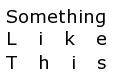
例如,“Something like this”看起来就像这样:
是否有一种不影响其他样式的方法来应用这种样式到我的文本中?我认为纯CSS并没有这个选项(至少不是在CSS3之前的版本,CSS3似乎有一个 text-justify 属性,但目前支持得不够好),所以js解决方案也是可以的。
有没有办法使用CSS自动地将每行单词的字母间距调整到一个定义好的宽度,从而实现对文本的自动调整?
例如,“Something like this”看起来就像这样:
是否有一种不影响其他样式的方法来应用这种样式到我的文本中?我认为纯CSS并没有这个选项(至少不是在CSS3之前的版本,CSS3似乎有一个 text-justify 属性,但目前支持得不够好),所以js解决方案也是可以的。
这里有一个脚本可以实现此功能。它可能不太美观,但也许您可以修改它以满足您的需求。(已更新以处理调整大小)
function SplitText(node) {
  var text = node.nodeValue.replace(/^\s*|\s(?=\s)|\s*$/g, "");

  for (var i = 0; i < text.length; i++) {
    var letter = document.createElement("span");
    letter.style.display = "inline-block";
    letter.style.position = "absolute";
    letter.appendChild(document.createTextNode(text.charAt(i)));
    node.parentNode.insertBefore(letter, node);

    var positionRatio = i / (text.length - 1);
    var textWidth = letter.clientWidth;

    var indent = 100 * positionRatio;
    var offset = -textWidth * positionRatio;
    letter.style.left = indent + "%";
    letter.style.marginLeft = offset + "px";

    //console.log("Letter ", text[i], ", Index ", i, ", Width ", textWidth, ", Indent ", indent, ", Offset ", offset);
  }

  node.parentNode.removeChild(node);
}

function Justify() {
  var TEXT_NODE = 3;
  var elem = document.getElementById("character_justify");
  elem = elem.firstChild;

  while (elem) {
    var nextElem = elem.nextSibling;

    if (elem.nodeType == TEXT_NODE)
      SplitText(elem);

    elem = nextElem;
  }
}
#character_justify {
position: relative;
width: 40%;
border: 1px solid red;
font-size: 32pt;
margin: 0;
padding: 0;
}
#character_justify * {
margin: 0;
padding: 0;
border: none;
}<body onload="Justify()">
<p id="character_justify">
Something<br/> Like
<br/> This
</p>
</body><br/>,它们就无法对齐。你有什么建议吗? - vgru CSS只有一个解决方案,即text-justify: distribute https://www.w3.org/TR/css-text-3/#text-justify,但目前支持度非常低。
A small experiment using text-align-last: justify and adding spaces between letters.
div{
 display:inline-block;
 text-align: justify;
 text-align-last: justify;
 letter-spacing: -0.1em;
}<div>
S o m e t h i n g<br>
l i k e<br>
t h i s
</div><td> </td>里。我知道看起来很繁琐,但如果你只需要做一个词或两个词,那么也可以轻松完成。或者如果太多的话,你总是可以使用JS去填充它。然而,这只是CSS非常通用的解决方案。#justify {
width: 300px;
letter-spacing: 0.5em;
}
<table id="justify">
  <tbody>
    <tr>
      <td>J</td>
      <td>U</td>
      <td>S</td>
      <td>T</td>
      <td>I</td>
      <td>F</td>
      <td>Y</td>
    </tr>
  </tbody>
</table>
跨浏览器安全,几乎没有任何差异,只是CSS。
我在我的网站上使用了它,该网站支持英语和西班牙语。我的名字下面的西班牙语子标题有一个额外的字母,会使宽度超出范围。使用上面解释的表格,可以自动分配相同的宽度。如果手动进行间距设置,则需要为每种语言定义一个完整的条件。
letter-spacing 会在单词末尾添加一个空格,这在其他右对齐内容中看起来不好。 - Robert SynoradzkiHTML:
<div class="stretch">Something</div>
<div class="stretch">Like</div>
<div class="stretch">This</div>
jQuery :
$.fn.strech_text = function () {
    var elmt = $(this),
        cont_width = elmt.width(),
        txt = elmt.html(),
        one_line = $('<span class="stretch_it">' + txt + '</span>'),
        nb_char = elmt.text().length,
        spacing = cont_width / nb_char,
        txt_width;

    elmt.html(one_line);
    txt_width = one_line.width();

    if (txt_width < cont_width) {
        var char_width = txt_width / nb_char,
            ltr_spacing = spacing - char_width + (spacing - char_width) / nb_char;

        one_line.css({
            'letter-spacing': ltr_spacing
        });
    } else {
        one_line.contents().unwrap();
        elmt.addClass('justify');
    }
};


$(document).ready(function () {
    $('.stretch').each(function () {
        $(this).strech_text();
    });
});
我也需要这个功能,所以我将推荐的技术打包成了一个简单易用的jquery插件,你可以在这里找到:https://github.com/marc-portier/jquery-letterjustify#readme。
它的核心使用了相同的过程,并添加了一些用于微调的选项。欢迎评论。
我找到了另一种使用纯CSS实现这个的方法,但是你需要拼出你的单词。
在我的情况下,这是唯一有效的解决方案(一些字母有类),而且它还产生了最直接的右对齐方式,而不需要使用hack。
.box {
  width: min-content;
  border: solid red;
}

.word {
  display: flex;
  justify-content: space-between;
}<div class="box">
<div class="word">
<span>S</span>
<span>o</span>
<span>m</span>
<span>e</span>
<span>t</span>
<span>h</span>
<span>i</span>
<span>n</span>
<span>g</span>
<span> </span>
<span>w</span>
<span>i</span>
<span>c</span>
<span>k</span>
<span>e</span>
<span>d</span>
</div>
<div class="word">
<span>t</span>
<span>h</span>
<span>i</span>
<span>s</span>
<span> </span>
<span>w</span>
<span>a</span>
<span>y</span>
</div>
<div class="word">
<span>c</span>
<span>o</span>
<span>m</span>
<span>e</span>
<span>s</span>
</div>
</div>我知道这个问题很老了,但为什么不在每个字母之间加一个空格,然后使用text-align:justify呢?这样每个字母都会被视为一个“单词”,并相应地进行对齐。
justifyLetterSpacing("sentence");
function justifyLetterSpacing(divId) {
// target element
domWrapper = $('#' + divId).clone().html('');
// construct <td>
$('#' + divId).contents().each(function(index){
// store div id to td child elements class
var tdClass = divId ;
// split text
$textArray = $(this).text().split('');
// insert each letters in a <td>
for (var i = 0; i < $textArray.length; i++) {
// if it's a 'space', replace him by an 'html space'
if( $textArray[i] == " " ) {
$('<td>')
.addClass(tdClass)
.html(" ")
.appendTo(domWrapper);
}// if it's a char, add it
else{
$('<td>')
.addClass(tdClass)
.text($textArray[i])
.appendTo(domWrapper);
}
}
});
// create table
table =
$( "<table id='"+divId+"'/>" ).append(
$( "<tbody>" ).append(
$( "<tr>" ).append(
( domWrapper ).children('td')
)
)
);
// replace original div
$('#' + divId).replaceWith( table );
} #sentence {
width : 100%;
background-color : #000;
color : #fff;
padding : 1rem;
}<script src="https://ajax.googleapis.com/ajax/libs/jquery/2.1.1/jquery.min.js"></script>
<div id="sentence">LOREM IPSUM DOLOR</div>我通常会尽快回答问题。这正好是同样的时间(十年后)=)
myText.innerHTML = myText.textContent
    .split(/\s+/g)
    .map((line) => line.trim().split("").join(" "))
    .join("<br>");
#myText {
display: inline-block;
text-align: justify;
text-align-last: justify;
letter-spacing: -0.125em;
font-family: sans-serif;
}<div id="myText">Something like this</div>处理这个问题的另一种方法可能是使用"vw"大小单位。该单位类型可用于字体大小属性,表示窗口宽度的百分比。
免责声明:虽然不完全符合您的要求,但无需脚本编写。它可以调整文本大小,但也会根据页面的宽度进行缩放。
例如,
.heading {
  font-size: 4vw;
}
将当前字体中一个字符的宽度设为窗口宽度的4%。
如果您希望根据窗口宽度将字体大小锁定到最小值,则可以使用媒体查询。
@media only screen and (max-width: 768px) {
    font-size: 2rem;
}
http://caniuse.com/#feat=viewport-units
https://css-tricks.com/viewport-sized-typography/
视口单位是一种强大的方式,可以用很少的代码来缩放您网站的许多不同方面。