如何让伪元素周围的空白区域也可以点击超链接?

3

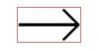
我已经建立了一个可扩展的箭头,我希望白色区域“内部”可点击(整个红色矩形)。

enter image description here

很遗憾,我无法在其周围添加一个div,因此我需要另一种解决方案。

.sageata {
    height: 2px;
    width: 40px;
    position: relative;
    display: inline-block;
    cursor: pointer;
    margin-right: 15px;
    margin-bottom: 4px;
    transition: all .4s ease;
    background: #000000;
    padding: 0 !important;
}

.sageata:hover {
    width: 50px;
    margin-right: 5px;
    background: #000000 !important;
}

.sageata::before,
.sageata::after {
    content: "";
    background: #000000;
    position: absolute;
    height: 2px;
    width: 15px;
    border-radius: 30%;
}

.sageata::before {
    right: -2px;
    bottom: -5px;
    transform: rotate(-45deg);
    top: auto !important;
    left: auto !important;
}

.sageata::after {
    right: -2px;
    top: -5px;
    transform: rotate(45deg);
}
<a class="sageata" href="#"></a>

1个回答

3

您可以增加锚点的高度,并使用背景渐变,而不是全尺寸颜色。

.sageata {
  height: 24px;
  width: 40px;
  position: relative;
  display: inline-block;
  cursor: pointer;
  margin-right: 15px;
  margin-bottom: 4px;
  transition: all .4s ease;
  background: linear-gradient(to bottom, 
    transparent 0%, 
    transparent calc(50% - 1px),  
    #000 calc(50% - 1px), 
    #000 calc(50% + 1px), 
    transparent calc(50% + 1px), 
    transparent 100%
  );
  padding: 0 !important;
}

.sageata:hover {
  width: 50px;
  margin-right: 5px;
}

.sageata::before,
.sageata::after {
  content: "";
  background: #000000;
  position: absolute;
  height: 2px;
  width: 15px;
  border-radius: 30%;
}

.sageata::before {
  right: -2px;
  bottom: 5px;
  transform: rotate(-45deg);
  top: auto !important;
  left: auto !important;
}

.sageata::after {
  right: -2px;
  top: 5px;
  transform: rotate(45deg);
}
<a class="sageata" href="#"></a>


网页内容由stack overflow 提供, 点击上面的
可以查看英文原文,
原文链接